Blog Archives

El Jannah

El Jannah Charcoal Chicken Restaurant Logo and Tagline

The Challenge

What does paradise taste like?

For El Jannah founder Andre, it began in a small village in Lebanon where every meal came from the land and every dish was cooked over an open wood fire. That raw, soulful connection to food became the heartbeat of El Jannah – the charcoal-chicken brand that Sydney fell in love with.

But as the cult favourite spread beyond Sydney, a new challenge emerged. The business needed to evolve from a beloved local icon into a national QSR brand, scaling fast while protecting the warmth, family and authenticity that made it special. It was time to strengthen the El Jannah brand identity, create a clear logo and visual system, and build the foundations for long-term franchise growth.

El Jannah Charcoal Chicken Restaurant Takeaway Bag Packaging

The Insight

To grow a cult brand, you don’t polish the edges – you honour what made people fall in love in the first place. Our goal was to capture that unmistakable charcoal flame and translate it into a system that could flex from one family-run store to a national network.

Through brand audits, qual and quant research, and competitor analysis across the fast-food and QSR sector, we uncovered a simple truth: Australians didn’t just come to El Jannah for chicken – they came for culture. It was the place where flavour met family, and generosity was served with every meal.

The strategy repositioned El Jannah as the undisputed authority in charcoal chicken – a brand built on family, flavour and fierce cultural pride.

El Jannah Charcoal Chicken Restaurant Instore Packaging table

The Creative

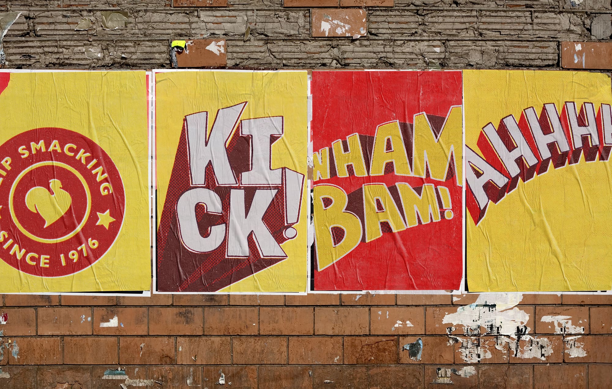
We captured the flame that started it all.

Rooted in the idea “Charcoal at the Heart,” the refreshed El Jannah logo and brand identity system celebrate the brand’s Lebanese-Australian heritage while paving the way for scalable national growth.

A bold, cheeky tone of voice, vibrant colour palette and expressive design language brought attitude and authenticity to every touchpoint. Layered in-store storytelling turned each venue into a living celebration of family, flavour and connection – where the scent of charcoal meets modern design.

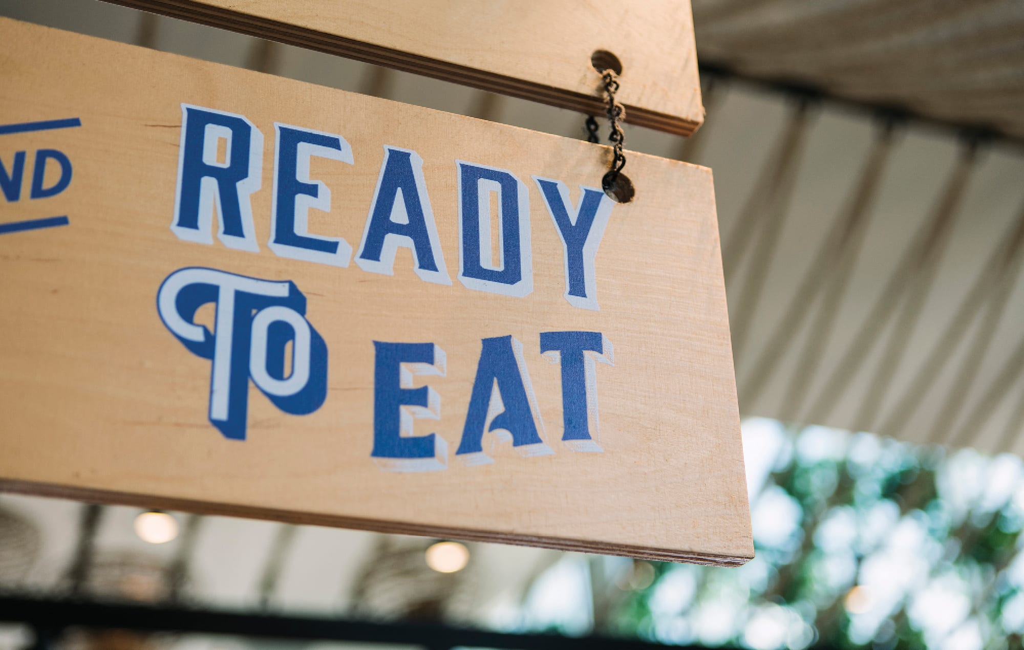
The new visual identity system extended across packaging design, signage, uniforms, digital campaigns and social media, as well as the El Jannah story, creating a cohesive and flexible platform for future expansion. The result is a brand that feels confident, contemporary and culturally rich – a true original in the Quick Service Restaurant (QSR) chicken space.

El Jannah Charcoal Chicken Restaurant Brand Statement - not all charcoal chicken
El Jannah Charcoal Chicken Restaurant Store Signage and Design featuring the El Jannah logo
El Jannah Charcoal Chicken Restaurant Interior Design and Mural in Sydney

The Results

The rise speaks for itself.

– $300M+ annual revenue and counting
– Seamless brand rollout across stores nationwide
– Increased awareness and cultural relevance with younger audiences
– Strengthened franchise appeal and consistent visual execution
– Recognition as Australia’s leading charcoal chicken brand
– The refreshed El Jannah logo and brand identity have become symbols of flavour, culture and pride – proof that staying true to your roots can still fuel explosive growth

El Jannah food statement
El Jannah Charcoal Chicken Restaurant Instore Signage
El Jannah Charcoal Chicken Restaurant Neon Copywriting Mural

“The El Jannah brand refresh led by The Creative Method resulted in a transformation of the customer experience, and stellar results.”

Brett Houldin, El Jannah, CEO

El Jannah Charcoal Chicken Restaurant Copywriting Mural
El Jannah Charcoal Chicken Restaurant Uniform

“The El Jannah brand is expanding across Australia and with the benefits from the new brand assets and positioning, it’s allowing more customers to come and try the amazing products and return more often.”

Brett Houldin, El Jannah, CEO

El Jannah Charcoal Chicken Restaurant Signage Personality
El Jannah Charcoal Chicken Restaurant Apparel Design

El Jannah Logo & Brand Refresh

Turning Flame into Fame

Client
El Jannah Charcoal Chicken

Industry
Fast Casual Dining / Quick Service Restaurant (QSR)

Expertise

Brand Strategy & Positioning
Brand Identity & Logo Design
Tone of Voice Development
In-Store Environment Design
Packaging & Signage
Cultural & Visual Storytelling
Franchise Rollout Framework
Photography & Brand Guidelines


Prime100

Prime100 is one of Australia’s fastest-growing pet food brands, specialising in functional dog food designed to support specific dietary needs and better health for pets.
As the brand expanded across new products and formats, the portfolio needed a clearer pet food packaging design system to help pet owners and pet parents navigate the range.
We partnered with the team to create a structured brand identity and pet food packaging design framework that organised the portfolio, improved shelf visibility, and supported growth in the competitive pet food market.

The Challenge

Prime100’s range was expanding rapidly across dietary solutions and protein formats within the competitive pet food industry. While trusted in veterinary channels, the growing portfolio was becoming harder for pet owners to navigate.
The brand needed a clear pet packaging design system to organise products, communicate nutrition, and maintain a strong brand identity across clinics, pet shops, and retail.
In a crowded pet food market, effective food packaging design is crucial to stand out on shelf and attract potential customers.

Strategic Thinking

Today’s pet food market is driven by trust and transparency. Pet owners are increasingly conscious of natural ingredients, quality ingredients, and the nutritional value of the food they buy.
Our goal was to create a scalable pet food branding and packaging design system that simplified the portfolio while reinforcing Prime100’s position as a premium pet food brand.
A stronger visual identity and clearer packaging hierarchy would help the brand build an emotional connection with customers and strengthen loyalty.

The Solution

We developed a clear pet food packaging design framework that simplified navigation across the growing portfolio.
Key elements included:
  • A clear range architecture separating dietary functions and product formats
  • Simplified on-pack communication highlighting nutritional benefits
  • A structured visual system designed to scale as new products launched
  • Packaging designed for fast recognition and easier navigation across the range

The Impact

The new system provided Prime100 with a clear foundation for portfolio growth, enabling the brand to expand its range while maintaining clarity for vets and pet owners.
The strength of the brand and product portfolio ultimately contributed to Prime100’s acquisition by Colgate-Palmolive in a deal reportedly valued at around $500 million, highlighting the commercial value of building strong, scalable brand systems.

Prime100 Pet Food Packaging Design

Building a scalable brand system for one of Australia’s fastest-growing pet nutrition brands.

Client
Prime100

Industry
Functional Pet Nutrition

Expertise
Brand Strategy
Range Architecture
Brand Identity
Packaging Design
Brand System


Vicar’s Choice Bright Light Wine

The Opportunity

Vicar’s Choice Bright Light was developed to give lighter-style wines a more engaging and contemporary shelf presence. In a category where reduced alcohol products can often feel overly clinical or driven by function alone, the opportunity was to create a wine packaging design that felt premium, positive and easy to understand at a glance.
The Creative Method approached the project by shifting the focus from what the wine had less of to what the brand could offer more of: brightness, freshness and approachability. That strategic thinking led to a packaging concept built around lightness as both a product benefit and a visual world.

The Challenge

Lighter-style wines are often sold through what they have less of, rather than what they offer more of.
For Vicar’s Choice Bright Light, the challenge was to create a packaging identity that could communicate a naturally lighter proposition without feeling compromised, clinical or overly health-led. It needed to hold onto the credibility of Marlborough wine, while creating a fresher, more modern emotional hook for consumers.
The pack had to work hard at shelf: quickly signal lightness, maintain varietal clarity, and feel optimistic enough to attract new drinkers without alienating existing wine buyers.

The Strategic Insight

In wine, lighter doesn’t have to mean lesser.
The opportunity was to shift the conversation away from sacrifice and toward mood. Rather than focusing purely on reduction, the brand could celebrate brightness, ease and drinkability – a more positive, contemporary way into the proposition.
That thinking shaped the core idea behind the range: Bright Light as both a product benefit and a brand world. Something airy, lifted and radiant. Something that felt visually light, emotionally light and easy to understand at a glance.

The Creative

We built the packaging around a simple but distinctive visual language: sky, clouds and halo.
That central device gives the range an immediate sense of elevation and optimism. It cues lightness in a way that feels intuitive and memorable, while avoiding the predictable tropes that often dominate better-for-you wine design. Rather than overloading the label, we kept the expression clean and open, allowing the concept to breathe.
Soft pastel colourways create clear differentiation across the range while reinforcing the mood of each wine. The pale sky blue Sauvignon Blanc feels crisp, fresh and lifted. The blush pink Sauvignon Blanc Rosé brings softness and warmth without losing the overall coherence of the system.
Typography was handled with restraint to keep the range premium and easy to navigate. The Vicar’s Choice name provides familiarity and trust, while Bright Light becomes the hero, framed by clean varietal information and Marlborough provenance. The lighter alcohol callout is integrated as a supporting badge – visible enough to do its job, but not so dominant that it overwhelms the brand.
The result is a label system that feels buoyant and modern, with enough structure to sit confidently in wine, and enough freshness to stretch beyond the usual category codes.
Bright Light low alcohol wine packaging

The Outcome

Vicar’s Choice Bright Light gives lighter-style wine a more appealing face.
It transforms a functional proposition into something more emotional, visual and ownable – a range that feels clear, contemporary and full of positivity. The design makes the product easy to understand, but just as importantly, easy to want.
By combining premium restraint with a brighter, more optimistic brand world, the range creates shelf standout without shouting. It proves that when lighter wines are framed around what they bring, not just what they remove, the result can feel far more compelling.

Vicar’s Choice Packaging Design

Wine packaging design for a lighter Marlborough range

Client
Vicar’s Choice

Industry
Wine

Expertise
Brand Strategy
Brand Identity
Wine Packaging Design


Soul Origin

The Challenge

Founded in 2011, Soul Origin grew rapidly to more than 150 locations across shopping centres, food courts and airports around Australia. The coffee and food offer was strong, but the brand wasn’t keeping pace with the scale of the business. Visibility, distinctiveness and recall in busy retail environments were falling behind consumer expectations and competitor activity.

The smile in the logo is a unique and discoverable element

The strategic challenge was clear: elevate Soul Origin’s presence in a highly competitive QSR landscape, strengthen its reputation for quality coffee and fresh, made-daily food, and inject a more distinctive personality into the brand so it could win attention from a distance and loyalty over time.

The smile in the logo is a clever design feature

The Insight

In a food court or airport, customers make decisions in seconds. They’re not just choosing a coffee or a salad; they’re choosing the brand that feels the freshest, most trustworthy and easiest to understand at a glance. Soul Origin didn’t just need a new logo – it needed a strategic platform that could guide every future decision.

We started with an in-depth workshop with the original founders and key stakeholders to uncover ambitions, diagnose current challenges and map consumer expectations. The insight: if Soul Origin wanted to sustain growth, it needed a strong strategic framework – a north star that linked brand, product and experience – and a visual identity that could scale across hundreds of sites and touchpoints without losing its crafted, handmade soul.

An overhaul of packaging has increased the brand's visual appeal

The Creative

From the workshop, we developed a clear brand strategy that would act as a guiding beacon for future growth – clarifying what Soul Origin stands for, how it should behave, and how it should show up visually and verbally in every context.

This strategic backbone ensured that every design decision, from logo to uniforms to point-of-sale, worked together to strengthen recognition, communicate quality and express a confident, modern QSR coffee and food brand.

New look, same great coffee across the network

A logo that smiles back

For the new Soul Origin logo, we wanted to embody quality and craftsmanship while giving the brand a simple, memorable mark. We selected a sophisticated, premium-leaning typeface and custom-modified it to hide a subtle smile between the S and the O – a discoverable detail that rewards a second look and reinforces the brand’s warmth.

That smile became a flexible brand asset in its own right – able to stand alone as an icon, sit proudly on packaging and signage, or work as a recognisable device across campaigns and digital channels. It’s both a quality signal and a personality moment in one mark.

Premium design with strong emphasis on the smiling face

Illustrations, packaging and the crafted story

To reinforce Soul Origin’s “crafted, handmade” positioning, we created a series of bespoke illustrations inspired by traditional woodcut techniques and reinterpreted them in a contemporary way. These illustrations capture provenance, care and detail, then are combined into simple, modern collages that feel at home across every brand touchpoint – from packaging and in-store graphics to uniforms, menus, the website and point-of-sale displays.

Packaging became a major lever in driving recognition and recall in busy retail environments. We designed an iconic system with bold colour blocking for instant identification at a distance, paired with witty, educational copy that reinforces the brand’s personality and talks directly to customers about freshness, ingredients and craft. The result is packaging that doesn’t just carry the product – it carries the story.

Uniforms, communications and guidelines at scale

We treat uniforms as moving billboards, not afterthoughts. For Soul Origin, apparel was designed as a powerful platform to amplify brand personality, convey values and even educate – pieces that staff are proud to wear and that customers could imagine wearing themselves.

To support marketing and local area activity, we developed a versatile suite of advertising and communication assets, easily adaptable to any product, offer or message. The focus was always on freshness, appetite appeal and a strong, ownable brand voice that could cut through in crowded food courts and social feeds.

Finally, we codified everything in a comprehensive brand manifesto and in-depth style guide. Together, they define the brand’s vision, tone, design rules and standards across every part of the business – ensuring consistency from franchise to franchise and across every touchpoint, from digital to in-store to packaging.

Customers have been excited by the new rebrand

The Soul Origin brand manifesto is a declaration of the company’s core values and vision, guiding every aspect of the brand’s communication and customer experience. The accompanying style guide provides detailed instructions on logo usage, colour palette, typography, and imagery to ensure a unified look and feel. This style guide not only maintains brand consistency across all customer touchpoints, but also supports the rollout of updates to existing stores and ensures a cohesive identity throughout the entire network.

The coffee focused rebrand is helping move the company forward on its journey

Soul Origin Brand Refresh

Elevating Soul Origin from food court staple to standout QSR brand.


Client:
Soul Origin

Industry:
Quick Service Restaurant (QSR) – Coffee & Fresh Food

Scope:
Brand Strategy 
Identity 
Packaging 
Retail Environment 
Brand Guidelines


Boss Coffee

Suntory Boss Coffee Packaging range

The Challenge

Boss Coffee was already a much-loved Japanese canned coffee, but launching into Australia and New Zealand meant more than simply importing the can. The brand needed to connect with local tastes without losing its Japanese roots.

Carefully selected coffee beans are rapidly brewed to unlock and lock in rich aromas and flavours, resulting in a bold yet smooth RTD coffee with a perfect balance
The product’s uniquely Japanese brewing process, featuring the innovative flash brew method, showcases the brand’s masterful expertise and commitment to quality.

The Insight

Australian and New Zealand drinkers were ready for a convenient, barista-style cold brew – but they needed clear cues, flavour navigation and an easy way into a distinctly Japanese brand world.

Carefully selected coffee beans are rapidly brewed to unlock and lock in rich aromas and flavours, resulting in a bold yet smooth RTD coffee with a perfect balance

The Creative

We created a packaging system that translated Boss Coffee’s equity into an Australasian context.

– Packaging design: adapted key brand elements while removing the “pipe” to better suit local sensibilities

– SKU structure: clear variant and flavour communication across the flash brew coffee range

– Messaging: concise copy that nods to Japanese origin while speaking to Australian and New Zealand consumers seeking a caffeine hit

Through continued efforts and dedication, the team consistently delivers high quality coffee for those who demand high quality coffee, setting a new standard for quality RTD coffee in the market.
Suntory create a caffeine hit brewed hot rich flavour for a refreshing afternoon pick me up for the on the go worker
Boss coffee iced mocha flavour packaging
Boss coffee iced caramel latte flavour packaging

The Results

The new design sets Boss Coffee up as a credible, ready-to-drink coffee choice in the ANZ market, balancing local appeal with its Japanese heritage.

This process highlights the unique craftsmanship and pursuit of excellence that defines the best quality RTD coffee.

Suntory Boss Coffee Packaging – No.1 in Japan Goes Local

Client
Suntory

Industry
Beverage

Our Work
Brand Strategy
Brand Identity
Packaging Architecture
Packaging Design
Point of Sale


Chatime

We kicked off the project with a full market analysis to map out competitors and find areas of opportunity, along with rethinking and redefining the brand strategy.

As strategy was a crucial part of this project, we conducted a two day global workshop, bringing together multiple stakeholders across 65 countries to align on the new direction before finally delving into the brand design and creative approach.

Through research and testing it was discovered that Chatime didn’t need or want a massive overhaul – the current mark just required a facelift.

With that in mind, we gave the letterforms a shared baseline, cap height and weight, simultaneously increasing legibility and modernising the word mark.

The updated logo ensures brand recognition while the rest of the visual identity shows off Chatime’s fun and flavourful personality.

The visual language isn’t tied to a certain aesthetic, deliberately done to allow different markets the flexibility to create a look and feel that speaks to their respective demographic.

A consolidated set of strategic and brand guidelines acts as a creative springboard to bring the brand revitalisation to life consistently across all global markets.

“What started as a local brief quickly became a global brand refresh. Tony and the team at The Creative Method were able to adapt to the change in needs and deliver a clear brand strategy and creative direction.

“From the outset we knew we were working with true partners who were passionate about our business and finding the best way to connect with our consumers all over the world.

“They challenged us to think differently and bring energy back into the Chatime brand from all aspects from brand strategy, visual identity, menu design, packaging and more.”

Carlos Antonius, CEO, Chatime Global

Chatime

Working with Chatime Australia to revitalise their brand locally quickly turned into a full global brand review and refresh to ensure a unified approach and brand consistency across all markets – a strategic imperative for future global success.

Client
Chatime

Our Work
Brand Strategy
Visual and Verbal Brand Identity
Logo Refinement
Copywriting
Packaging
Environmental Graphics
Menu Design
Photography Art Direction


Kind of Wild Wines

The Challenge

Great wine starts in the soil.
Too often, that soil is pushed, stripped and overworked in the pursuit of yield. Kind of Wild was built on a different belief, that better farming leads to better wine, for people and the planet.
We partnered with Winesellers to bring that belief to life through wine packaging and branding, including brand identity, wine label design, packaging and website.
The challenge was to turn a principled product into a visually compelling wine brand that could stand out in a competitive market – and extend into a direct-to-consumer subscription experience.

Strategic Insight

Sustainability alone doesn’t drive choice – it needs to be felt.
In a crowded product category, consumers don’t read every label. They scan. They choose quickly. Shelf presence becomes a crucial element.
To win consumer attention, Kind of Wild needed to move beyond explaining its process and instead express its brand’s story through strong visual elements.
Because in wine packaging design, the brands that succeed are the ones that balance clarity, creativity and emotion, turning knowledge into something instinctive.

Creative Solution

We created a distinctive wine branding and packaging design system that balances nature with modernity.
At the core is a confident wordmark and a bold, organic shape – housing a series of custom illustrations. Each piece of art reflects the individuality of the wine, its origin and its connection to the natural world.
These expressive wine labels bring personality to every bottle, while a clean layout and considered colour palette ensure clarity across the range.

The Result

A scalable wine packaging solution that works across multiple varietals, regions and future expansion.
Beyond the bottle, we designed a wine subscription model experience, including wine box packaging and outer shipping cartons. Using simple, considered materials, the boxes are designed to protect the product while reinforcing the brand at every touchpoint, from delivery through to unboxing.
The identity extends across website, eCommerce and digital – creating a cohesive, end-to-end wine brand experience.

The Impact

Kind of Wild stands apart in the modern wine packaging landscape.
It transforms a complex sustainability message into a clear, engaging and visually appealing brand – one that resonates with today’s more conscious target audience.
By combining strategic wine branding, packaging design and illustration, we created a system that captures attention, builds recognition and drives choice.
A brand designed to reflect its values, and built to compete on shelf.

Kind of Wild Wine Branding & Packaging Design

From soil to shelf: creating a wine brand built on better choices

Client
Winesellers Ltd

Industry
Wine

Expertise
Brand Strategy
Brand Identity
Wine Packaging Design
Illustration System
Website & eCommerce Design


Nexba

Our brief from Nexba was to help them transition into multiple drink categories whilst injecting personality and fun into their packs and retaining their Nexba-obsessed consumers.

We needed to create a packaging architecture that would work across multiple categories and pack structures, from kombucha and soda to non-alcoholic seltzer and tonic water.

These categories have vastly different design codes so creating a design architecture that would work cross-category was a challenge, as the packs needed to be visually consistent whilst maximising unique category semiotics.

The versatile packaging structure allows for colour, type and illustration to be swapped so each range feels as though it’s a part of the Nexba brand whilst still sitting comfortably in its category.

The idea of having an area to swap out illustrations permits various styles to be used for different target audiences such as families or young adults.

Nexba wanted to firmly position themselves as the brand that does sugar free differently, whilst being all natural.

We introduced a natural textured background where possible, kept a handcrafted look and feel to each illustration, used script fonts and created an ‘All natural, sugar free’ device that Nexba could own.

Nexba

How do you give drinks packaging legs to jump into different categories and succeed whilst still feeling like one brand?

For Nexba, it was a case of strong packaging architecture, modular illustration and graphics, and consistency.

Client
Nexba

Our Work
Brand Strategy
Brand Identity
Logo Design
Packaging Design
Copywriting
Advertising
Point of Sale


Max Brenner

The goal of the Max Brenner brand refresh was to infuse the brand with a youthful energy, injecting personality across every touchpoint while amplifying the experience of consuming their products.

We set out to build a stronger emotional connection with the next generation of chocolate lovers, making every interaction with
the brand as enticing as the chocolate itself. By focusing on appetite appeal and crafting a vibe that resonates with today’s audience, we transformed the brand into a magnet for passionate chocolate enthusiasts, both young and old.

We began with comprehensive brand research to pinpoint Max Brenner’s position within the dessert bar and chocolate category. This process included an in-depth audit and analysis of the competitive landscape, focusing on both direct chocolate competitors and broader dessert experiences.

We carefully reviewed all existing assets and brand positioning to identify strengths, gaps and opportunities. From this foundation, we crafted a new strategic positioning that aligns with the brand’s core essence, developed a compelling reason to believe, and infused the brand with a refreshed, distinctive personality that looks pretty sweet!

While we were asked to keep our sticky fingers off the Max Brenner logo, we did sprinkle it with a new tagline that plays nicely between chocolate credentials, obsession and fun.

Centered on the core strategy of “making life sweet for everyone”, we embarked on creating distinctive brand assets that would truly stand out.

We created a unique illustration style that captures the fluidity and richness of melted chocolate, presented in a modern, contemporary way. These visuals weren’t just eye-catching – they told a deeper story, highlighting the craftsmanship behind the products and the joy they bring to people. Through this approach, we seamlessly connected the process and the people, infusing the brand with both warmth and a coolness.

Great packaging is all about sparking an emotional connection. We create that bond between the brand and its customers through thoughtful packaging design. By blending expressive illustrations with clever, personality-driven copy, we crafted packaging that not only stands out but resonates.

We also introduced a distinctive typeface that mirrors the playful flow of chocolate, adding an extra layer of charm and cohesiveness to the overall design.

The result? Packaging that not only catches the eye but also connects with the heart.

We extended this visual style and its assets across promotional posters, communication platforms, and brand architecture. The design had to be versatile, seamlessly adapting to product-centric ads, people-focused campaigns, and personality-driven messaging.

The unifying elements? Max Brenner’s signature flowing lines and playful copy, which tied everything together into a cohesive brand experience. This approach ensured that every touchpoint, whether highlighting a product or an attitude, felt undeniably Max Brenner.

At the heart of our philosophy is the belief that a great brand is one that both staff and customers are proud to wear. A significant aspect of the Max Brenner brand refresh involved reimagining their staff uniforms and merchandise.

We designed a fresh, vibrant look that not only reflects the brand’s personality but also fosters a sense of pride and connection among team members and customers alike. This revitalised approach transforms uniforms and merch into a canvas for the brand, creating a unified experience that everyone can embrace.

The final pieces of the Max Brenner rebrand puzzle focused on envisioning how the new identity would come to life both inside and outside the stores. Our mission was to craft engaging chocolate stories that not only brought smiles but also visually disrupted the spaces available. By infusing creativity into every element of the environment, we aimed to create immersive experiences that captivated customers and transformed ordinary moments into memorable chocolate ones!

“The Creative Method did an exceptional job developing a new brand architecture and visual identity for Max Brenner, bringing contemporary relevance to our iconic brand.

“They successfully modernised our look, finding the right balance with the chocolate-fuelled passion and key assets that have been core to our brand for the past 20 years.

“Their energy, creativity, professionalism, and deep passion for our brand and our customers made them a pleasure to work with.”

Sarah Ryan, Head of Marketing and Innovation, Max Brenner

Max Brenner

Max Brenner needed some love. Here was the best hot chocolate in Australia, wrapped in a brand that lacked the warmth and excitement it deserved.

Our challenge was to reignite that passion, breathing life and energy back into the brand.

Client
Max Brenner

Our Work
Brand Strategy
Visual Brand Identity
Logo Design
Copywriting
Packaging
Staff Uniform
Advertising
Signage


Wild Turkey Rare

The ready-to-drink packaging design needed to be sophisticated and have strong premium and quality credentials, whilst remaining masculine.

We took small elements of the existing brand design, stripped it back, and re-laid it out.

The bottle was black so gold was chosen to allow the most important typography to pop off the pack.

A watermark of the turkey is screened in the background and foil is used to drive the quality credentials, with embossing and foiling on the 4-pack to drive further premium cues.

Wild Turkey Rare

Wild Turkey Rare is a premium bourbon that uses measures of Wild Turkey Rare Breed Bourbon to produce a more premium and quality tasting product.

The premium end of the RTD bourbon category was in strong growth and the Wild Turkey team wanted a product that would over-deliver on consumers’ demand and expectation.

Industry
Spirits / Ready-to-drink

Client
Campari – Wild Turkey Rare

Our Work
Packaging Design
Advertising
Point of Sale


Guzman Y Gomez

The Challenge

When Guzman y Gomez (GYG) launched, Mexican food in Australia barely existed outside supermarket kits and sad Tex-Mex clichés. Fast food was ruled by global giants, and “Mexican” meant greasy, not fresh. GYG’s founders wanted to flip that script. Their mission: bring real Mexican flavour, made fresh daily, to the fast-food world – and do it with speed, swagger and soul.

To break through a crowded Quick Service Restaurant (QSR) market and scale globally, they needed more than good burritos. They needed a bold, distinctive brand and logo with serious bite.

Gomez Guzman

The Insight

You don’t just introduce a new cuisine – you introduce a new mindset.

Guzman Y Gomez saw the chance to redefine Mexican fast food branding by creating a brand that felt authentic, youthful and full of fire. This wasn’t about polite design or corporate polish, it was about energy, culture and optimism. The aim was to make people crave the food and the brand in equal measure.

GYG first restaurant
Guzman Y Gomez Logo - QSR Brand Identity & Packaging Design Australia Mexican Food

The Creative

We built the Guzman y Gomez logo and visual identity system from scratch – bright yellow, bold black and those unmistakable founder portraits. The result? A logo that grins back at you. Energetic, confident and impossible to ignore.

That mark became the heartbeat of a visual system stretching across packaging, store design, menus, uniforms and digital. Every element of the GYG brand design was crafted to feel fast, fresh and culturally sharp – a reflection of modern Mexico with the polish of a global brand that gained instant trust.

The tone of voice? Cheeky, unfiltered and self-assured – just like the food.

Guzman Y Gomez QSR Packaging Design Australia
Everything GYG
GYG sticky tape font design

The Results

The impact speaks for itself.

Guzman Y Gomez grew from a single burrito shop into a $3B global QSR brand, expanding across Australia, Singapore, Japan and the U.S.

The Guzman y Gomez logo remains the face of a brand loved by millions. A symbol of quality, authenticity and unstoppable energy. Proof that with the right attitude (and a damn good burrito), you can change what fast food looks (and tastes) like.

GYG Advertising
Guzman Y Gomez - QSR Hot Sauce Packaging Design Australia

“The Creative Method has been an integral part of our success. The team has never failed us, and has always exceeded our expectations on quality, creativity and execution.”

Steven Marks, Founder and CEO, Guzman Y Gomez

Guzman Y Gomez Restaurant Opened

Guzman Y Gomez Logo & Brand Creation – From Burritos to a $3B Brand

Client
Guzman Y Gomez

Industry
Fast Casual Dining / Quick Service Restaurant (QSR)

Expertise

Brand Creation, Strategy & Logo Design
Visual Identity System
Tone of Voice & Messaging
Restaurant Experience Design
Packaging & Menu System
Campaign Design & Activation
Global Rollout Framework


Doughkyo

The brand needed to convey a sense of fun and approachability whilst appealing to Westerners, all without compromising on quality.

The name Doughkyo arose.

When developing the logo, we took a modern serif typeface that would communicate quality, inspired by the sharp edges and angular forms of Asian characters.

Paired with the typeface, a red circle sits alongside the name Doughkyo to evoke the idea of the rising sun of Japan.

Clever copy and use of the red circle as a distinctive brand asset merges the ideas of rising dough, the rising sun, and Asia.

“The Creative Method team has a deep understanding of consumers and brand that drives the strategic and creative process.

“Their strategic and nimble approach means you’re getting disciplined thinking while also being highly creative, as was evidenced by their work on Doughkyo which we were so happy with.

“A fantastic team to work with who are responsive and make the process enjoyable.”

Loane Avenell, Head of Marketing, Doughkyo

Doughkyo

Our client approached us with the opportunity to create the brand for a new bakery concept that would introduce a fusion of Asian and European baking styles and pastries to the Australian market.

Client
Doughkyo

Our Work
Naming
Logo Design
Packaging
Signage and Wayfinding
Environmental Graphics
Menu Design
Photography Art Direction
Copywriting


Top Juice

We kicked off the project with a strategic review and audit of the juice and complimentary categories to understand the Top Juice brand’s position in the market, as well as consumer trends, and competitors we needed to consider.

After an evaluation of existing Top Juice brand assets to identify strengths and areas for improvement, a workshop with key stakeholders helped to uncover unique selling points, story, and opportunities, culminating in a concise brand strategy to serve as the guiding North Star for creative territories and the brand as a whole.

Carefully crafted, the new Top Juice logo exudes freshness, with a more organic, natural feel than the original black and white logo.

The logotype is modern and confident, with a leaf on the tittle. The ‘TJ’ mark is derived from the updated logotype and forms a pineapple motif to further push real freshness.

We developed a series of visual assets that centre around a fresh and modern take on the PLU sticker to pay homage to Top Juice’s humble fruit market origins and credentials.

Continuing with the idea of PLU stickers and the pineapple-inspired logomark, we developed a bespoke packaging range that has maximum stand out and is distinct to Top Juice.

Next, we overhauled the menu design and structure with the objective of driving sales by streamlining the ordering process, improving navigation between categories, maximising legibility, and enhancing the menu’s overall visual appeal.

We extended the new Top Juice brand throughout stores and kiosks to improve standout and initiate further brand engagement and, ultimately, sales.

“We had the pleasure of working with Tony and his team at The Creative Method only a short time ago where we gave them the significant task of reviewing our brand as we knew it, and creating something new that still honours and respects our roots whilst catapulting us into the future.

“The process was amazing; at each phase we were provided with amazing options which gave us opportunity to weigh-in with feedback to ensure the final product was 100% aligned to our company.

“The task of rebranding ultimately became a fun and exciting period which has ultimately transformed our entire business!”

Emmanuel Attard, General Manager, Top Juice

Top Juice

Top Juice began serving up kale and coconut water in their beverages while others were still wondering what kale even was. 

With a ‘100% real’ philosophy, they are committed to providing juices that naturally fuel real function, health and happiness for everyone, everyday.

There was a disconnect between what the brand looked like, and what it delivers.

Our brief was to freshen up Top Juice, leveraging its history and commitment to quality by infusing more love, distinctiveness, personality and story into the brand.

The goal was to build a stronger, more engaging brand, that would elevate customer loyalty, and establish Top Juice as a leader in the dynamic juice category.

Client
Top Juice

Our Work
Brand Strategy
Visual and Verbal Brand Identity
Logo Design
Copywriting
Packaging
Environmental Graphics
Menu Design
Photography Art Direction


Hello Sarnie

We began by taking a step back to delve into the brand’s story, exploring why it existed and why people should care.

This led us to a strategic shift – emphasising the brand’s English roots, celebrating quality and craftsmanship, while also highlighting the shared personality between the British and Aussies. After all, both cultures appreciate a well-made sarnie and a good laugh.

This connection became the heart of the brand’s narrative, blending tradition with a dash of humor that resonates with locals and expats alike.

The first step in the design process is The Creative Method’s bread and butter: crafting a tasty logo. We created a design with strong visual impact, timeless quality, and a touch of personality with the playful bowler hat.

We added a clever detail with sandwich triangles forming quotation marks, emphasising the brand’s warm, welcoming nature.

The tagline, “Proper Sandwiches,” was the final touch, reinforcing the brand’s heritage, commitment to quality, and a nod to its service excellence.

One of the biggest challenges in the pre-packaged sandwich market is rising above the stale crust of the mass-produced offerings found in supermarkets and service stations.

Exceptional packaging is essential – it has to elevate the brand, convey a sense of premium quality, standout on the shelf, and educate the consumer. And if it can bring a smile to their face, even better.

A great sandwich is all about the ingredients, and the same goes for a brand refresh. We created a series of posters that not only told the brand’s story but also sparked appetite appeal and informed the audience.

The secret sauce? A blend of visually striking interiors, bold signage, and mouthwatering photography to wrap it all up.

“Working with Tony and the team was a fantastic experience. They got to know us on a deep level. They kept asking questions. They kept digging – to find our brand DNA and what makes us tick; how we could then position our DNA and, importantly, take it to market.

“We’ve always known who we are and felt it internally, but The Creative Method have been able to bring it to life in all of our branding elements. The elevation of our brand is clear to see and Tony, Lee and the team properly nailed the brief. We will be back for more.”

Mike Kendall-Smith, Co-Founder and Director, Hello Sarnie

Hello Sarnie

When it comes to sandwiches, the English know a thing or two. Hello Sarnie is on a mission to show Aussies just how good a pre-made sarnie can be – whether it’s for in-office catering, lunch on the go, or an afternoon pick me up.

They are committed to baking and making their sarnies to be eaten the same day, and anything left over is donated to charity.

Our job was to bring the strategic and creative seasoning.

Client
Hello Sarnie

Our Work
Brand Strategy
Visual Brand Identity
Logo Design
Copywriting
Packaging
Signage and Wayfinding
Environmental Graphics
Menu Design
Staff Uniform


Son of a Nun

With the explosion of lower alcohol and alcohol free beverage options, and born out of the belief that no one should be left out of having a toast with mates, Australian Beer Co. approached us with the concept of a better for you beer range for which they needed a name, brand identity and packaging design.

Following a comprehensive market audit, multiple workshops and naming exercises, “Son of a Nun” was born; a play on the saying “Son of a gun” and the perfect embodiment of a truly guilt-free brew.

The Son of a Nun concept was so well received that zero alcohol and low carb variants were launched.

Our design strategy focused on simplicity and a clean look to hone in on the guilt free aspect of the brand, and to align with the visuals cues of the better for you beverage category, whilst also crafting a distinct persona to capture the essence of the Son of a Nun.

“Quite simply, Tony, Craig and the team from The Creative Method were absolute legends to work with and the thinking that they bought to the table demonstrated that they are at the top of their game. Strategic, nimble, pragmatic, creative, smart, fun… what more can I say about those characters?”

Chris Blockley, Head of Sales, Australian Beer Co.

Son of a Nun

Following the success of P.O.E.T.S Lager and Ranga Tang Hard Ginger Beer, Australian Beer Co. engaged us to create the name, identity and packaging for a better for you beer range.

A miracle was born.

Client
Australian Beer Co.

Our Work

Naming
Visual and Verbal Brand Identity
Logo Design
Copywriting
Packaging


Ooshman

We set out to make the Manoosh brand the food of choice in the pizza category by creating stronger ownable and unique brand assets.

We wanted to drive harder core customer experiences through multiple touch points that included in-store, uniforms, packaging and POS, and have customers feel connected, educated and welcome through the joy of great food experiences.

Looking at the QSR landscape, specifically the Mediterranean restaurant category, we discovered key category codes, design semiotics and insights for success.

Following a review of all existing assets, TOV, colours, positioning and packaging we explored multiple design territories to reflect the brand essence and positioning.

With a design direction agreed upon, the Ooshman character went through a facelift to modernise it. We decided it was important to retain some of the essential components of the original character, especially the round face, the fez and the moustache. The new character remains familiar to loyal fans while attracting new ones with a modernised appearance.

We drew inspiration from Mediterranean tiles to create an ownable pattern, adding a unique touch by incorporating the letterforms from the logo into the tile design.

The brand colours were also reconsidered. The new colour palette was chosen to make the brand appear fresh and better for you.

We see packaging as a walking advertisement for a brand so created a set of unique, high impact pieces with clever copy that drives personality and adds to a positive, engaging customer experience.

We explored multiple ways to bring the brand to life in-store to ensure maximum street appeal regardless of size or location.

“Just one month after rolling out the new look and feel, OOSHMAN experienced a 15% increase in sales across the board, which we attribute to the new brand.

“We did it for the future of the company, and now we feel like we are born again, which is an encouraging feeling to have.”

Charlie Hoyek, Owner and Director, OOSHMAN

OOSHMAN

Lost in a sea of similarly named restaurants, Manoosh, a takeaway Lebanese pizza joint with 18 locations, decided to flip their name on its head and rebrand as OOSHMAN.

They approached The Creative Method with the challenge of transforming the brand into something distinctive yet recognisable to loyal customers that embraced their Mediterranean heritage.

Client
Ooshman

Industry
Quick Service Restaurant

Our Work

Brand Strategy
Brand Identity
Rebranding
Copywriting
Custom Typeface
Packaging Design
Interiors
Uniforms
Illustration


POETS

Our brief from Australian Beer Co. was this:

Give us a new beer brand we can make and market in the country, with a view to scale at a later date.

Launch locally and build from there.

Be born as a beer by the country, for the country, but recognise an ambition to possibly ‘rock up in the big smoke’ later in life.

We wanted to create a name that was intelligently disruptive in the beer category; memorable but with a sense of the easygoing country personality.

On the surface the name POETS doesn’t seem to relate. The discoverable acronym of this name is where the magic, the humour and the emotional connection lie. Look it up!

Through a comprehensive beer category audit and deconstruction, we knew that we needed to create an ownable country mascot that reflected the brand positioning and personality.

There are few things more country Australia than a laughing kookaburra.

None of the big beer players in the market owned red and we wanted our primary, secondary and tertiary packaging to stand out like the proverbial dog’s balls.

A part of our job was to envisage how the brand would come to life outside of the packaging across multiple comms and touch-points.

Consistency, stand-out and a smidge of ready wit to refresh the soul was the order of the day.

From ground zero after one year in market, and with no above or through the line spend, top-line numbers are currently forecast at 250k cases annually, and POETS is the largest growing beer in mainstream category.

“In early 2022, we embarked on a daunting yet exciting journey. We had the ambition to disrupt the giant, incumbent mainstream beer brands with a new to world brand that offered the balance of safe traditional mate-ship cues with the excitement of amore modern brand expression. A brand born in the country that could one day travel into the metropolitan areas and deliver for those consumers to access the significant profit pools and build a sustainable powerhouse brand for the future.

“It was a difficult brief, but one made possible thanks only to a crack team. From category de-coding, through to insights, brand identity, visual design, launch plans and future innovation pipeline, it was a highly collaborative effort which is what was required to soak up all the experience and creativity of the project team.

“P.O.E.T.S launched in late 2022 and is already flying along well ahead of expectations and will be a significant beer brand in the marketplace for years to come.

“Quite simply, Tony, Craig and the team from The Creative Method were absolute legends to work with and their thinking that they bought to the table demonstrated that they are at the top of their game. Strategic, nimble, pragmatic, creative, smart, fun… what more can I say about those characters?”

Ben Slocombe, Marketing Director, Australian Beer Co.

POETS Country Lager

We were challenged by Australian Beer Co. to create a new beer brand that would stir-up the big boys and take market share off Australia’s largest selling beer, Great Northern, and Furphy.

Oh, is that all?

Client
Australian Beer Co.

Our Work
Brand Strategy
Brand Identity
Logo Design
Naming
Packaging
Copywriting
Advertising
Point of Sale


Ranga Tang

As part of a number of innovation projects we partnered on, Australian Beer Co. wanted to capitalise on the increasing popularity of hard ginger beer in time for the 2022 summer.

The idea originally came from a broad ideation session looking at the ginger beer category and identifying common threads and creative opportunities.

The name Ranga Tang captures the flavour profile of the drink, whilst giving us scope to create a brand full of character and quirk – you’d be hard-pressed to find a ranga that knows more about ginger beer and what hits the spot.

We created multiple versions of the ranga character and finally settled on this fun-loving beast… Who isn’t overly pleased that you are drinking all his beloved ginger beer.

The dark substrate used on the packaging helps the ranga stand out on the pack, whilst the texture adds to the grunginess and attitude of this hard ginger beer.

This solution was a winner from the moment we came up with the name – it almost designed itself!

Ranga Tang

When approached by Australian Beer Co. to name and design a new hard ginger beer, we wanted to create a brand that was memorable and emotive, with packaging that really stood out in the fridge.

Client
Australian Beer Co.

Our Work
Brand Strategy
Brand Identity
Logo Design
Naming
Packaging Design
Copywriting
Advertising
Point of Sale


Shareefs

We are graphical story tellers. Our task was to bring back the vibe of the 70s and create a distinctive and unique look and feel for the brand.

Our first task was to design a logo that would bridge the gap between the rich, retro heritage of 1970s Lebanon and a timeless modern appeal. We aimed to create a mark that not only honoured the past but also felt relevant for the future.

The result? A logo with a subtle yet clever twist— a ‘smile in the mind’ moment — where the letter ‘A’ was transformed into a Shawarma roll. This playful element added depth to the design, creating a sense of discovery.

We took it a step further with an animated version, bringing the concept to life and amplifying its impact.

In the QSR landscape, packaging isn’t just functional — it’s a powerful tool for shaping brand perception. This was especially critical for us, given the challenges surrounding the quality perception of Shawarmas in the Australian market, where they are often misidentified as kebabs. Our packaging design took a strategic approach, aiming to elevate the product’s image by infusing it with personality, quality, and a crafted sense of cool.

We drew inspiration from vintage Lebanese posters and ads, tapping into the nostalgic charm of that era. This connection to heritage not only reinforced the authenticity of the product but also created a visually compelling experience that resonates with modern consumers.

At The Creative Method, we believe that exceptional design and compelling copy are inseparable partners. Our goal is to evoke a smile, spark a laugh, and seamlessly weave in stories about the food.

For this project, we infused our copy with the charm of old Lebanese quotes and sayings, adding a layer of personality that resonates with both Lebanese and Australian audiences. By blending cultural nostalgia with a touch of humour, we created a unique connection that celebrates heritage while engaging a diverse, modern audience.

Our mission was to elevate the brand by crafting a vibe that blends nostalgia with aspirational cool. To achieve this, we dove deep into the archives, uncovering captivating vintage images that exude authenticity and charm. We paired these gems with sharp, engaging copy and bold, dynamic graphics, creating in-store posters that not only capture attention but also evoke a sense of retro fun.

The result? A customer brand experience that resonates with both memory and modernity, creating a sense of escapism and leaving a lasting impression.

“I couldn’t be happier with the exceptional work The Creative Method did for Shareefs. Their team captured the essence of our brand, blending modern flair with vintage charm. The result? A stunning visual identity that has elevated our customer experience and set us apart in the market.

“From concept to delivery, The Creative Method’s expertise, creativity and attention to detail were impressive. Their ability to understand our vision and translate it into captivating designs exceeded expectations.

“Thank you, TCM, for transforming Shareefs’ brand story. I highly recommend your agency to anyone seeking innovative branding solutions.”

Charles Estephan, Owner, Shareefs

Shareefs

The Shareefs story starts back in Beirut in the 60s and 70s. At the time Beirut was lovingly referred to as the ‘Paris of the Middle East’. A place of unparalleled beauty where the pristine sparkling waters of the harbour caressed the coastline.

It was a playground for the world’s coolest cats and cashed up tourists. Cafe culture was in full swing where intellectuals, artists, poets, writers and singers would chat at length over countless coffees hoping to spot Brigitte Bardot or Omar Sharif.

Beach Clubs were buzzing with blokes and babes boozing and bathing. It was bliss. Everyone wanted a taste of this cool culture.

Client
Shareefs

Our Work
Brand Strategy
Naming
Visual Brand Identity
Logo Design
Copywriting
Packaging
Signage and Wayfinding
Environmental Graphics
Menu Design
Staff Uniform
Social Media Design


Oporto

In recent years Oporto had modernised its interiors and brand identity, however the in-store and drive thru experience lacked consistency and authenticity.

They were missing an opportunity to talk up their Portuguese credentials throughout their QSR stores, and other brand touchpoints were not being capitalised on.

We were asked to define opportunities within stores due for upcoming renovation or build.

Taking the bare bones interiors and exteriors of restaurants and drive thrus, we looked at every potential brand touchpoint we could to engage with customers and inject some humour, Portuguese personality, and the Oporto brand story.

A modernised graphics package pays homage to their roots with design inspired by Portuguese tile (azulejos) for flexible scaling and application across an array of touch points.

We created a modular tile-based typeface for display and large format graphics.

We combined silhouettes of the chicken and flames with bright Portuguese sayings and the tile to bring authenticity and to shift the brand positioning away from the Bondi burger to flame grilled chicken.

The result of the rebrand was a vibrant and playfully positive blend of Portuguese culture and Australian humour that helped contribute to a 40 point increase in store Net Promoter Score.

“From the moment we met The Creative Method, we knew they would be part of our Oporto familia.

“They pushed us to think differently and really get to the core of what made our brand so special. They brought it to life in so many different ways – through the branding on our packaging, to our in-store designs and team uniforms, which have all had a really positive impact on our business.”

Craig Tozer, Former CEO, Craveable Brands

Oporto

Oporto quick service restaurant was perhaps better known as ‘the famous’ Bondi Beach chicken burger restaurant by Sydney-siders.

As the QSR brand moved into new regional areas across Australia, Oporto saw the need for it to move away from its ‘Bondi’ brand positioning and be more reflective of its Portuguese origins, and as expert in ‘Portuguese Flame Grilled Chicken’.

Client
Craveable Brands – Oporto

Industry
Quick Service Restaurant

Our Work

Brand Strategy
Brand Identity
Rebranding
Copywriting
Custom Typeface
Packaging Design
Signage and Wayfinding
Environmental Graphics
Illustration
Customer Experience
Menu Design
Point of Sale
Advertising
Internal Comms


Yenda Brewing Co.

We were challenged to create beer packaging that worked hard and jumped out on shelf whilst also establishing a number of visual assets that could be used over various brand touchpoints moving forward.

The Yenda beer logo device was deliberately created and crafted to be a unique shape and punch off the bottle. With so many beers on the market, it was crucial that that packaging intelligently disrupted on-shelf.

The creation of the large Y as a core visual brand asset on the label strongly reflects the brand name and also ensures the brand is easily seen and identified from a distance.

The colour of the Y changes on each beer variant, making it a strong device for wraps, shippers and bar taps alike.

“We were at something of a crossroads with Yenda as the craft beer market exploded around us and the brand got lost on shelf.

“The Creative Method helped to not only deliver a strong distinctive brand identity but helped us build a stronger brand.

“The customer, end consumer and salesforce reaction to Yenda has been phenomenal – a truly inspired brand redesign!”

Stuart Boag, Brand Marketing Manager, Coca-Cola Amatil

Yenda Brewing Co.

Yenda Brewing Co. has been around for a number of years and is the current sponsor of the Wallabies Rugby Union team.

Due to a massive influx of players into the craft beer space, Yenda had lost market share against its competitors. 

We were engaged to refresh the Yenda brand identity and drive more of a mainstream craft beer positioning.

Client
Coca-Cola Amatil – Yenda Brewing Co.

Industry
Beer

Our Work
Brand Identity
Rebranding
Logo Design
Copywriting
Packaging Design
Merchandising


Red Rooster

The Challenge

The Aussie chicken shop icon was losing its spark. Red Rooster had history, heart and national recognition – but the brand was ageing out. Fast-food rivals like KFC and McDonald’s had captured younger audiences, and the once-loved roast chicken hero was getting left behind in the fried chicken era.

At the same time, Red Rooster was preparing for its first major menu innovation in years – introducing crispy fried chicken and a new burger range to join its famous roast. With these game-changing additions, the brand saw the perfect moment for transformation. It wanted to stay true to its loyal roast chicken fans while re-introducing itself to a new generation of chicken lovers.

Our challenge was clear: modernise the Red Rooster brand identity, reignite cultural relevance and win over a younger audience. All without alienating the families who’d been ordering roasts for 50 years.

The Insight

To compete in a world of global fast food and QSR heavyweights, Red Rooster’s branding had to lean into what made it uniquely Australian: nostalgia, warmth and that unmistakable “no-nonsense” attitude, then evolve it for today’s culture.

We participated in qual and quant research with consumers nationwide to understand what Australians still loved (and didn’t love) about the brand. The findings were clear: people didn’t want Red Rooster to become another KFC. They wanted it to remain the Aussie chicken shop they grew up with – just fresher, bolder and more relevant.

So we asked: How do you take a national icon, honour its past, and make it feel modern, confident and proudly Aussie again? The answer lay in blending Red Rooster’s roast heritage with the appetite and attitude of contemporary fried-chicken culture, giving the brand fresh flavour and a reason for being.

The Creative

We didn’t play it safe. We gave Red Rooster its fight back.
A bold new brand identity and logo refresh anchored in heritage but rebuilt for a new generation. The refreshed logo, inspired by the original 1970s design, celebrates the brand’s roots while signalling a modern, confident future.

The new visual identity system extended across every touchpoint – from packaging design, signage and store interiors to digital campaigns, uniforms and social. Standout illustrations, fresh typography and bold storytelling re-introduced warmth, humour and everyday Aussie character.

We gave the brand a stronger voice – cheeky, self-assured and proudly local. It talks like a mate, not a marketing machine. Together, these elements formed a scalable brand and identity system that rolled out consistently across franchises, bringing alignment, energy and confidence back to Australia’s original chicken shop.

The Results

The comeback has been loud. Red Rooster’s rebrand reignited consumer love for the classic Aussie chicken brand, delivering measurable growth and renewed pride across the franchise network:

– +26% sales growth following the Red Rooster rebrand rollout
– +5% uplift in customer consideration and improved brand sentiment
– Increased profitability across Craveable Brands and franchise partners
– Stronger franchisee confidence and trust, with improved engagement across the system
– A unified QSR brand design system enhancing consistency and in-restaurant experience
– The refreshed Red Rooster logo and brand identity now stand as symbols of proud heritage meeting modern appetite. A national favourite reborn with edge

“It was a chance to take the reins of a well known brand that had lost touch with customers and wasn’t recruiting new. But it required a fresh approach to positioning and the way it showed up in culture.”

Ashley Hughes, Marketing Director, Red Rooster

Red Rooster Logo & Brand Refresh – New Look, New Generation

Client
Red Rooster

Industry
Quick Service Restaurant (QSR)

Expertise
Brand Strategy
Brand Identity & Logo Design
Tone of Voice & Messaging
Illustration & Typography
In-Store Environment Design
Packaging & Visual Assets
Digital & Campaign Rollout
Franchise Brand System
Brand Guidelines


Fire Road Wines

Fire Road is a Marlborough wine brand built on a powerful story of resilience, transformed into a distinctive wine branding and packaging design system created to stand out on shelf in a competitive global wine market.

The Challenge

The Marlborough wine region is globally recognised, but that success has created a saturated market where wine packaging, label design and brand identity often look the same.
For a modern boutique winery, this creates a challenge.
Standing out on shelf requires more than a well-produced product. It demands strategic wine packaging design and branding that meets the evolving expectations of customers and consumers.
Fire Road needed a wine label design and packaging system that would:
– Capture attention instantly on shelf
– Break category conventions in wine packaging
– Reflect the unique nature of the brand
– Build a recognisable and premium brand identity

Strategic Thinking

Wine decisions happen fast.
Before customers read the label; before they understand the story; before they even pick up the bottle.
This means wine packaging design, label design and bottle design are not just aesthetic, they are critical business tools that influence choice.
To succeed, Fire Road needed to create an immediate visual impact while ensuring the brand felt authentic and considered.

The Idea: Turning Destruction into Distinction

Born from one of Marlborough’s most devastating natural events, Fire Road isn’t just a name, it’s a marker of survival.
On Boxing Day 2000, a wildfire tore through nearly 15,000 acres of Marlborough, threatening vineyards, homes and livelihoods. What remains today is a region that didn’t just recover, it thrived.
This idea became the foundation of the wine brand identity, shaping a packaging design system that reflects nature, resilience and renewal.

The Solution: Wine Packaging Design System Built for Shelf Impact

We developed a wine packaging and label design system that brings the Fire Road story to life through a bold and ownable graphic design approach.
Key elements of the packaging design included:
– A burnt label effect that physically embodies the brand name
– A disruptive approach to traditional wine label design
– A flexible wine packaging system designed for a growing collection
– Subtle variation across labels to differentiate each product
The result is a scalable wine packaging design system that supports future product expansion and ensures consistency across the range.

The Impact

Fire Road stands out in a competitive wine category through bold branding, distinctive packaging design and a strong visual identity.
The project demonstrates how thoughtful wine packaging, label design and branding can:
– Increase shelf presence in retail environments
– Build recognition across a growing wine collection
– Create a stronger connection with consumers
– Support long-term business growth
Because in wine, success doesn’t come from blending in, it comes from creating something people notice, remember and choose.

Fire Road Wine Branding & Packaging Design

Turning destruction into distinction through wine packaging design and brand identity

Client
Winesellers Ltd

Industry
Wine

Expertise
Brand Strategy
Range Architecture
Brand Identity
Packaging Design
Brand System


Rum Co. of Fiji

The current range of rum was lacking standout with no quality credentials and nothing ownable to enable storytelling, so we needed to be inventive.

Following a brand and spirits category audit we created multiple ideas to unlock white space and brand innovation.

This included a ranging strategy and brand architecture that would enable premiumisation.

The fresh Rum Co. of Fiji brand identity and packaging centres around locally commissioned warrior and chief tattoo iconography to showcase the brand’s Fijian heritage, history and credentials.

RUM Co. of Fiji was immediately able to expand its global footprint beyond Australia to 10+ countries including the USA, Canada and the UK.

Australian sales in the first year increased five-fold from 1K cases to 5K and are forecast this year to double again.

“I have worked with The Creative Method for over ten years. Their outstanding feature is their unrestrained creativity that is category-breaking, yet possible within the confines of production.

“They bring an imaginative perspective to all projects which forces us to think beyond the predictable.”

Sally Byrne, Marketing Director, Coca-Cola Amatil

RUM Co. of Fiji

Coca-Cola Amatil had a range of award-winning, premium Fijian rums that were under-performing in the spirits category.

Our task was to relaunch this range with packaging that paid respect to the liquid gold inside.

In short, a brand and packaging revolution was needed.

Client
Coca-Cola Amatil

Industry
Spirits – Rum

Our Work
Brand Strategy
Brand Identity
Rebranding
Logo Design
Copywriting
Custom Typeface
Packaging Design
Illustration


RASHAYS

Our first step was to dive into the overarching strategy. Through a series of engaging workshops and insightful interviews, we crafted a concise and impactful ‘Brand on a Page.’ This document clearly articulates all the key pillars of the brand and outlines a strategic roadmap for future growth and success.

With the strategic foundation firmly in place we served up a fresh logo: a timeless wordmark that encapsulates the essence of RASHAYS. What sets RASHAYS apart is its commitment to offering something for everyone -a delightful challenge that we aimed to highlight.

To emphasise this uniqueness, we cleverly integrated an exclamation mark into the negative space of the ‘R,’ creating a distinctive and memorable brand mark that reflects their vibrant spirit.

With takeaway and delivery being a significant part of their business, we set out to design packaging that truly stands out and leaves a lasting impression. Our goal was to forge an emotional connection with customers through warm, personable copy.

To reinforce brand awareness and ensure consistency, we prominently featured a large R monogram across all packaging, making it a recognisable symbol of the RASHAYS experience.

In crafting the RASHAYS brand identity, we embraced the same philosophy that defines their menu: variety. Our design approach centered on creating a series of vibrant and diverse visual assets, each telling a unique story.

From the vibrant depiction of food and fresh ingredients to the dynamic portrayal of people, processes, and personality, each piece was thoughtfully curated to enhance the RASHAYS experience.

Our goal was to elevate each location beyond the typical QSR feel, transforming it into a quality dining destination.

Rather than relying on a singular visual style, we allowed the brand’s signature orange to be the unifying thread, ensuring consistency while celebrating diversity in every corner of the store.

We explored bold advertising solutions across various platforms, from bus livery to billboards and bill posters. Our focus was on capturing the essence of RASHAYS’ commitment to variety and flavour, ensuring that every piece of advertising not only caught the eye but also told the deliciously diverse story of the brand.

RASHAYS

RASHAYS is an Australian family-owned and operated restaurant chain with a rich history that began in 1998, when founders Rami and Shannon Ykmour opened their inaugural restaurant in Liverpool, NSW.

From the very start, RASHAYS was built on the principle of offering something for everyone, creating a welcoming space where diverse tastes and cravings can come together.

Our challenge was to modernise the brand and help it feel as vibrant and warm as the people behind it.

Client
RASHAYS

Our Work
Brand Strategy
Visual Brand Identity
Logo Design
Copywriting
Packaging
Signage and Wayfinding
Environmental Graphics
Menu Design
Staff Uniform
Photography Art Direction
Advertising
Point of Sale
Social Media Design


Vonu Lager

Coca-Cola Amatil wanted the Vonu Pure Lager beer brand to be about more than a refreshing beer – it encapsulates a way of life and living.

With a focus on living free, the brand identity and packaging design needed to appeal to those with a simple love of the ocean, surf, outdoors and exploration.

We designed a new logo that retained the iconic turtle, turning it into a crest with two subtle surfboards as discoverables.

The promise of living free is central to the Vonu brand – “Live Free” is included as a discoverable on pack, only visible on the reverse of the back label once the liquid has been consumed.

The textured wordmark, use of weatherboard, and customised rough graphic style reinforces Fijian craft and island rusticness, to drive a sense of provenance in the brand.

“I have worked with The Creative Method for over ten years. Their outstanding feature is their unrestrained creativity that is category-breaking, yet possible within the confines of production.

“They bring an imaginative perspective to all projects which forces us to think beyond the predictable.”

Sally Byrne, Marketing Director, Coca-Cola Amatil

Vonu Pure Lager

Vonu Pure Lager is a low carb, premium, handcrafted beer that was being marketed as “Pure Fijian rain water turned into beer”.

In a bid to reflect the crisp, refreshing purity of the liquid, Coca-Cola Amatil were moving Vonu from a brown bottle to clear glass and needed a fresh brand identity and beer packaging to support this.

Client
Coca-Cola Amatil

Industry
Beer

Our Work
Brand Identity
Rebranding
Logo Design
Packaging Design


Sneaky Bill Wine

The Opportunity

Sneaky Bill was created as a playful, personality-led secondary label for Saint Clair – a wine that could feel premium, memorable and a little bit dangerous in all the right ways. Inspired by the legend of Bill, the vineyard handyman with a habit of burning anything left lying around, the label system turns cheeky storytelling into a bold, distinctive visual asset.

The Challenge

The brief was to create a secondary label that felt quirky, playful and fun, while still looking premium on shelf. It needed to celebrate Bill’s character, bring his story to life, and elevate the wine beyond novelty into something distinctive and commercially appealing.
At the heart of the challenge was balance: how do you build a wine brand around a mischievous vineyard character without losing sophistication? The answer was to make the personality sharp, the storytelling intriguing, and the design confident enough to do the heavy lifting.

Strategic Thinking

Bill’s story gave the brand an immediate point of difference. Bill is the vineyard handyman, known for being “sneaky” and for loving a bonfire – the kind of character who might quietly throw anything loose around the vineyard onto the flames. That narrative created a natural tension between humour and danger, which opened up a rich creative territory for the label.
Rather than overcomplicate it, the smarter move was to lean into one clear idea: Sneaky Bill as a premium wine with a smoky, cheeky personality. That meant building a label that felt stripped back and elegant at first glance, but revealed more attitude the closer you looked.

The Creative

A crisp white label creates premium contrast against the dark bottle, while the oversized BILL typography gives the pack authority and shelf presence. Above it, SNEAKY sits smaller and more restrained, creating a natural hierarchy that feels both elegant and slightly mischievous.
The smoke detail becomes the masterstroke. Curling across the label, it acts almost like Bill’s fingerprint – hinting at fire, trouble and character without turning the design into a cliché. It adds atmosphere, movement and a sense of story, while preserving the restraint of the overall pack.
The result is a label that feels modern, premium and memorable, with just enough tension between refinement and rebellion.

The Outcome

Sneaky Bill transforms a vineyard anecdote into a distinctive brand asset. It gives Saint Clair a more playful expression within its portfolio, while still feeling grounded in premium wine cues such as clarity, restraint and strong typography.
Most importantly, it proves that personality doesn’t need to come at the expense of sophistication. With the right balance of storytelling and design discipline, even a mischievous character can become the foundation of a premium label that stands out for all the right reasons.

Sneaky Bill Wine Packaging Design

A Marlborough Sauvignon Blanc with a mischievous streak

Client
Sneaky Bill – Saint Clair Family Estate

Industry
Wine

Expertise
Logo Design
Brand Identity
Packaging Design


Delta Estate Wines

Delta Estate Wines are elegant, modern and restrained.

Exceptional quality grapes from a selection of vineyard sites are enhanced by meticulous detail to viticulture and winemaking techniques.

Delta Estate Wines Brand Identity Packaging Design Agency Australia

We created a new brand identity that heroes the Delta triangle, which has been synonymous with the brand since its inception.

Our design solution centred around attention to detail and a closer look at each of the elements used to handcraft the small batch wines to perfection – the soils, climate, and grapes themselves, as well as the people whose passion and pride comes from a desire to be exceptional.

The softness and handcrafted feel of each label is juxtaposed with the strong, clean Delta logo, helping the name stand out on shelf.

“The results from our rebrand have been outstanding, with significantly increased sales both domestically and globally, as well as a brand that is becoming more recognisable throughout the world.

“Delta has been transformed into an elegant, sophisticated and eye-catching brand. The Creative Method vastly exceeded our expectations and we couldn’t be happier with their amazing work throughout this transformation and ongoing.”

Alison Downs, Brand Manager, The Delta Wine Company

Delta Estate Wines

As the wine market becomes increasingly competitive, it is no longer good enough to simply have great wine.

Delta wanted to evolve the brand to stand for something unique; something memorable that would resonate from the grower right through to the consumer, and create the greatest cut-through on shelf.

Client
Delta Estate Wines

Our Work
Brand identity
Logo Design
Packaging
Photography Art Direction
Copywriting
Advertising
Point of Sale

Region
Global


Casella Family Brands

The Opportunity

Casella’s new family brand identity was created to bring greater visibility to the company’s rich history while building a stronger platform for growth. Grounded in the story of the founding family and designed for a more modern corporate presence, the refreshed identity balances heritage, energy and ambition – giving Casella a system that feels both rooted and ready for what’s next.

The Challenge

Casella needed a new brand identity that could do two things at once: celebrate its history and create momentum for the future.
The brief was to develop a mark that would bring Casella’s heritage to life and draw greater attention to the strength of the family story, while also creating a broader platform for growth – one that could support new drinkers, new trends, new innovations and future opportunities.
This wasn’t simply a logo refresh. It was a strategic repositioning of the corporate brand: an identity that needed to feel more expressive, more contemporary and more expansive across every touchpoint.

Strategic Thinking

The most powerful heritage brands don’t live in the past. They use history as an asset to move forward with greater confidence.
For Casella, the opportunity was to shift the company brand from a more functional corporate presence into something richer and more ownable – a family identity that could acknowledge where the business came from while better reflecting where it was headed.
That meant building a visual system that could hold both legacy and optimism. One that felt credible and enduring, but also bolder, brighter and more open to evolution. The answer lay in the family itself.

The Creative

The new identity takes its cues from the original founders, John Casella’s parents, Filippo and Maria Casella – the true architects of the pioneering attitude that continues to shape the business today.
At the heart of the system is a refreshed corporate logo featuring the Casella name beneath a distinctive monogram built from Filippo and Maria’s initials. This device gives the identity immediate symbolism and depth, transforming the family story into a recognisable brand asset.
The mark was designed to reflect the passion and talent for winemaking that has existed in the Casella family for generations. It feels classic in spirit, but contemporary in execution – a logo with enough heritage to carry meaning, and enough clarity to work powerfully across modern brand environments.
A more vibrant corporate colour palette brings fresh energy to the identity. Bold, confident and unexpected, it helps shift the brand away from corporate conservatism and toward something more dynamic and expressive. In that sense, it shares the same disruptive spirit as the [yellow tail] philosophy – optimistic, energetic and willing to challenge category norms.
Original Casella family photographs were woven into the visual system to further strengthen the sense of authenticity and lineage. Rather than treating heritage as a static backdrop, these images become part of the living brand – a reminder that the company’s future has been built on generations of personality, resilience and ambition.

The Rollout

The refreshed identity was designed as a flexible corporate system, extending well beyond the logo itself.
Touchpoints included a redesigned website, product packaging, company email addresses and stationery, on-site signage and internal communications initiatives, including a refreshed intranet portal. Together, these applications helped create a more cohesive and recognisable brand experience – one that could unite the business internally while presenting a stronger, more distinctive face externally.

The Outcome

The new Casella Family identity gives the business a clearer and more compelling corporate presence.
It brings heritage to the surface without becoming nostalgic. It feels proud of where the company has come from, while creating a stronger platform for growth, innovation and cultural relevance. Most importantly, it transforms the family story into a working brand asset – something visible, ownable and ready to travel across every part of the business.
The result is a corporate identity that feels more human, more energetic and more future-facing. A family brand designed not just to commemorate its past, but to keep building on it.

Casella Family Brands Identity

A brand identity built to honour heritage and energise the future

Client
Casella Family Brands

Industry
Wine/FMCG/Global Export Markets

Expertise
Brand Strategy
Brand Identity Development
Packaging & Label Design
Portfolio & Tier Architecture
Storytelling & Tone of Voice
Global Market Adaptation
Limited Edition & Special Release Design
Long-term Brand Stewardship


Bondi Road Spritzer

Colour, line frequency and a clean typographic structure combine to make flavour navigation easy and the brand hard to miss.

The Opportunity

Bondi Road is a wine spritzer brand created to bring freshness, authenticity and contemporary appeal to a rapidly evolving global drinks category. As one of the first available spritzer brands, it helped open up the space with a bold, approachable identity inspired by the spirit of Bondi and expressed through distinctive, beach-towel-led packaging.

The Challenge

The brief began with an opportunity to create a wine spritzer for the US market, but it quickly became clear the offer had broader global potential. Bondi Road needed to feel bold, contemporary and trustworthy, while appealing to younger consumers looking for something more authentic than traditional RTDs.
It also had to introduce a relatively new proposition to market. As one of the first available spritzer brands, Bondi Road wasn’t simply competing within an established segment — it was helping define one. That meant the packaging needed to do more than create shelf impact. It had to make the category feel credible, desirable and easy to understand from the first glance.

Strategic Thinking

Drinks decisions happen quickly, especially in social, flavour-led categories. That means packaging has to do a lot of heavy lifting in a very small window: catch the eye, build trust and communicate energy, flavour and relevance.
For Bondi Road, the strategy centred on creating a brand with immediate recognition and an easy emotional read. The name was chosen in part for its strong comprehension in the US, but more importantly because it gave the brand a story, a setting and a feeling people could connect to.
Because Bondi Road was entering the market early, the brand had an opportunity to shape expectations for what a spritzer could look and feel like. That made clarity and confidence critical. The identity needed to feel contemporary enough to attract younger drinkers, but familiar and trustworthy enough to help bring them into the category.
The brand world extends seamlessly into transit and retail-ready formats, creating standout beyond the single bottle.

The Idea: Turning Bondi into a Brand Asset

Bondi Road was built around the idea of capturing a familiar, optimistic beachside mood in a way that felt simple, iconic and globally understandable. The breakthrough came during a team ideation session in the pub, when the image of a beach towel was suggested. That simple visual cue became the perfect platform for the brand.
The graphic language of stripes brought instant recognition, strong shelf impact and a relaxed Australian sensibility without needing to over-explain itself. It gave the packaging a bold, ownable system that could flex across flavours while keeping the range unmistakably connected.

The Solution: Packaging Designed to Spark a New Category Feeling

We created a packaging system that used colour, line frequency and bold graphic structure to make Bondi Road feel fresh, contemporary and easy to navigate. Each flavour expression was given its own colourway and stripe rhythm, helping the range pop at shelf while keeping the core brand instantly recognisable.
Black-and-white lifestyle photography added another layer of character, grounding the brand in a more social, authentic world and reinforcing its youthful appeal. The crest device and clean typographic hierarchy helped balance playfulness with trust, giving the product enough structure to feel credible while still light, fun and modern.
The result was a packaging system that worked across bottles, multipacks and shelf-ready formats, creating strong standout and consistency wherever the brand appeared.

The Impact

Bondi Road helped introduce the wine spritzer to consumers as a fresh, more contemporary drinks proposition. As one of the first available spritzer brands, it played an important role in making the category feel relevant, accessible and emotionally engaging for a new generation of drinkers.
Both the packaging and liquid delivered the best consumer test results seen in 20 years of research, giving the brand a powerful foundation for launch and signalling the potential to help define a new drinks space.

Bondi Road Wine Spritzer Packaging Design

Turning Bondi and the beach into an ownable brand asset

Client
Casella Family Brands

Industry
Wine

Expertise
Brand Strategy
Range Architecture
Brand Identity
Packaging Design
Brand System


Chicken Treat

First launched in 1976, Chicken Treat had become tired and dated. Stores were closing, sales were in decline and franchising had stalled; it was at risk of being deleted from the Craveable Brands portfolio.

The brand lacked a unique, ownable identity and articulated purpose.

To reinvigorate the brand, we developed a number of strategic platforms and finally landed on the ‘Chicken Heroes’, which was anchored in the 1970s comic book style – a nod to the era Chicken Treat was born.

This platform brought the fun, unique and bold personality of the brand to the forefront of all its touchpoints.

Through tone of voice, storytelling, and a number of onomatopoeic comic book fight scene references, the new look and feel instantly conveys the feeling you get when eating Chicken Treat.

The new brand helped increase sales by 46% and went on to win Best Brand Transformation of the Year at the 2020 QSR Media Awards.

It also enabled Chicken Treat to launch into NSW and ACT as a serious chicken option.

Dang!

“Together with The Creative Method, we set about rediscovering who we are, what makes us different, and what we want to stand for as a brand.

“They helped define our purpose: Saving hungry souls and delivering happiness through unapologetically indulgent and delicious chicken.

“We’re thrilled with their work on the Chicken Treat brand repositioning which also contributed to Chicken Treat winning the QSR Media Award for ‘Best Brand Transformation’ in 2020.”

David Harrison, Head of Marketing, Chicken Treat

Chicken Treat

Chicken Treat has been giving Australian tastebuds a smack in the kisser since 1976.

The brand had a huge following in Western Australia thanks to the likes of Australian legends Heath Ledger and Ricky Grace appearing in their advertising campaigns but lost its way over the decades and quickly became dated as more chicken brands entered the market.

Client
Chicken Treat

Our Work
Brand Strategy
Brand Identity
Copywriting
Packaging
Signage and Wayfinding
Environmental Graphics
Illustration
Customer Experience
Menu Design
Point of Sale
Advertising

Region
Western Australia


Saint Clair Family Estate Wines

Saint Clair Family Estate Marlborough Sauvignon Blanc from New Zealand's leading winemaking team

The Challenge

Founded in Blenheim, Saint Clair Family Estate had the winemaking pedigree and Marlborough provenance, but its brand and packaging needed to catch up with its global ambitions. As the portfolio expanded, coherence and premium presence became critical.
After establishing itself as a leading New Zealand winery, Saint Clair Family Estate’s mission has been to create world class wines, reflecting their commitment to quality and their reputation within the New Zealand wine industry.
Saint Clair Vineyard Kitchen serves pinot noir, sauvignon blanc and chardonnay
Saint Clair Family Estate Origin Marlborough Sauvignon Blanc

The Insight

For a family-owned winery with bold growth plans, brand isn’t a label – it’s a long-term asset. Saint Clair needed a premium, globally recognisable system that could stretch across tiers and markets without losing its family story. The Marlborough region, with its unique terroir, plays a vital role in shaping the distinctive character of Saint Clair’s world class wines, reinforcing the importance of regional identity in their success.
Neal and Judy Ibbotson dedicate the Dawn vintage to the family matriarch

The Creative

Over more than two decades, we have partnered with Saint Clair to build and continually refine a brand that could grow as the business did.
– Long-term brand evolution: foundations developed and honed over 20+ years
– Packaging design: premium, cohesive visual system designed for crowded global wine shelves
– Brand architecture: four core tiers and 30+ secondary labels structured for clarity
– Global consistency: storytelling and design that travel seamlessly across markets
Saint Clair Marlborough pinot noir finished wine

The Results

– Scaled from 4,000 to 780,000+ cases annually
– Distribution in 50+ countries including the UK, US and across Asia
– Recognised as one of New Zealand’s most awarded family-owned wineries
– Sustained global growth and long-term premium perception
– Committed to exceed expectations and maintain excellence across generations, ensuring the family legacy continues
– Saint Clair Vineyard Kitchen offers visitors a unique hospitality experience as part of the winery’s offerings
– Founded in Blenheim, the historical heart of Marlborough wine country
Saint Clair is now recognised as a top New Zealand wine producer, with a reputation for world class wines and international awards that position them among the world’s leading wine brands.
Saint clair family estate are Marlborough region viticulture pioneers
Saint Clair Family Estate is a new zealand family business
“We would thoroughly recommend The Creative Method to develop a brand that lasts – Saint Clair wouldn’t be where it is today without such a strong and trusted brand identity tying it all together.”
Neal Ibbotson, Owner and Director, Saint Clair Family Estate

Saint Clair Family Estate Brand & Packaging

From Boutique Beginnings to Global Winemaking Force

Client
Saint Clair Family Estate

Industry
Wine/FMCG/Global Export Markets

Expertise
Brand Strategy
Brand Identity Development
Packaging & Label Design
Portfolio & Tier Architecture
Storytelling & Tone of Voice
Global Market Adaptation
Limited Edition & Special Release Design
Long-term Brand Stewardship


Soo Zee 23

This project came about at a time when it seemed a new noodle house was popping up every other week in Sydney. We needed a disruptive name that appealed to both Western and Chinese diners.

Soo Zee is Sichuanese for ‘number’, and ‘23’ represents the number of blended herbs and spices used to create their famous broth. 

The Chinese characters for ‘eat’ (吃) and ’23’ (二三) are featured in the brand identity as a discoverable for those familiar with the language, and to reinforce the authenticity of their specialty cuisine.

Our brand design strategy was to bring the traditional beef broth to life with majestic animal imagery and illustrations that reflect the deep flavour profile, and a mix of old and new to appeal to traditional diners as well as those less familiar with the style of cuisine. 

Soo Zee becomes a character of many forms that represents the art of mixing the herbs and spices to create an authentic beef noodle soup that you won’t forget.

Soo Zee 23

The broth used in Soo Zee 23’s authentic beef noodle soup originates from the streets of Sichuan, China, and is handcrafted using a blend of 23 herbs and spices in a process that takes over eight hours.

The Creative Method was asked to bring the story of the soup to life with a name, logo, brand identity, graphics, apparel, menus, tableware, a website and packaging design.

Client
Soo Zee 23

Industry
Fast Casual Dining

Our Work
Brand Creation
Naming
Logo Design
Copywriting
Packaging Design
Menu Design


6 Head

The name pays homage to the six head of cattle first introduced to Australia by the First Fleet – that went rogue when their minder slipped off for lunch. 

The cows – having multiplied substantially – were found several years later roaming the Western Plains of Sydney.

The logo is a simple modified Gill Sans, with the A turned upside down to reflect both a cow and Australia being Down Under.

The ‘A’ has also been offset to reflect the story of the cattle escape.

“Storytelling is at the heart of all brands that endure, and The Creative Method nailed it with 6 Head.

“By digging deep into the history books, we ended up with a story and name that was unique, paid homage to the location, and our expertise in steak.

“The design then complements the story perfectly, giving us a brand look and feel that we are truly proud of.”

David Ovens, Chief Marketing Officer, Seagrass Boutique Hospitality Group

6 Head

As a pioneer in ‘pasture to plate’ dining in Australia, Bradley Michael has developed close relationships with the finest beef cattle producers in Australia. In his newest and most prestigious venue, he champions their efforts with arguably the best-bred beef in the world, paired with outstanding local produce and a carefully selected wine cellar to match – all served overlooking the Sydney Opera House.

Having partnered on several brands in the past, Bradley approached The Creative Method to develop a name and brand identity that carved a space for his restaurant in Sydney’s fine dining arena.

Client
Seagrass Boutique Hospitality Group

Our Work
Brand Creation
Logo Design
Naming
Copywriting
Packaging
Menu Design

Region
Sydney


Genea

The Genea logo’s genesis began like life itself with the dividing of the cells. A visual parallel was drawn between the cell dividing and the shape of a serifed lower case ‘g’.

A timeless serif font was chosen to reflect quality, trust, attention to detail and balance.

The font was modified to highlight the idea of genesis. For the keen eye, if viewed on its side, fallopian tubes are also a discoverable within the logo.

The gradient and associated patient-facing colour of yellow is reflective of a sunrise, a new day, hope and positivity.

The ‘g’ device was also created to be used as a monogram moving forward.

It is used in multiple branding touchpoints to add personality and create a distinctive and ownable visual asset.

Through the in-depth customer journey mapping conducted at the beginning of the brand development project, a major insight was that creating trust, support and expectation management throughout the patient experience was imperative.

This insight drove the development of numerous patient and clinician documents, printed and digital collateral, and other comms.

Any imagery used throughout the new Genea brand needed to be inclusive and empathetic, conscious of the myriad of feelings patients go through on their personal fertility journey.

Genea

Genea was a recognised leader in fertility care, but its brand and patient experience weren’t fully reflecting its authority at the moments that matter most – when patients are deciding whether to trust, commit and proceed.

In a highly competitive, emotionally charged category, we began by diagnosing where confidence, clarity and reassurance were breaking down across the patient journey. This included in-depth customer journey mapping, a full market and competitor analysis, stakeholder and patient interviews, and a review of existing communications and touchpoints – all to understand not just how the brand looked, but how it was experienced when decisions were being made.

Client
Genea World Leading Fertility

Our Work

Category and competitor analysis
Customer journey mapping and decision-point diagnosis
Stakeholder and patient interviews
Brand positioning and value proposition development
Strategic narrative and messaging framework
Brand identity and visual system refresh
Brand guidelines and rollout supportPhotography Art Direction
Social Media Design


Whalebone Bay Wines

Designed to celebrate New Zealand’s long coast and coastal culture.

Each of the five varietals features a different species of whale with unique character. When bottles are lined up on shelf, whales swim through the boundaries of each label, changing from species to species, to create a fun and unique display.

Whalebone Bay

Whalebone Bay is a range of wine grown and produced by Marlborough Valley Wines in Marlborough, New Zealand, and sold around the world.

The packaging was in need of an update to reflect its heritage and quality, and to achieve greater standout on shelf.

Client
Whalebone Bay

Industry
Wine

Expertise
Brand Strategy
Range Architecture
Brand Identity
Packaging Design
Brand System


Casa Gusto

The Challenge

Casa Gusto set out to bring authentic, Italian-inspired ready meals and sauces to Australian commercial kitchens – food made with generosity, simplicity and heart. But their early brand expression didn’t reflect the richness of the story behind the products or the warmth of the culinary experience.

Competing in a wholesale and foodservice environment meant Casa Gusto often ended up stored out of sight, indistinguishable from generic suppliers and lacking the appetite appeal needed to win pride of place in busy kitchens.

To stand out, Casa Gusto needed a brand that transported people – one that captured flavour, nostalgia and a uniquely personal origin story.

The Insight

The brand didn’t just have Italian flavours behind it – it had a remarkable Italian story. The founder’s father spent part of his youth travelling through Italy with a circus, discovering regional foods, family kitchens and the kind of rustic, heartfelt cuisine that inspires the brand today. This was the emotional anchor Casa Gusto needed.

The insight was clear: people connect with brands that feel lived-in, human and real. By tapping into this authentic narrative – a life shaped by travel, curiosity and serendipitous meals – we could give Casa Gusto a soul that typical ready-meal brands simply can’t imitate.

A brand inspired by a circus traveller discovering Italy? That’s not just an origin story – it’s a differentiator.

The Creative

We used the father’s circus travels as an emotional undercurrent for the entire creative system. The brand cues draw from a life lived on the road: curiosity, craftsmanship, character, and the joy of discovering incredible meals in unexpected places.

– Illustrative storytelling: Subtle hand-drawn elements nod to travel journals, ticket stubs, street posters and the textures of old Italian towns. These touches make the brand feel personal, warm and filled with stories.
– Typography & colour: Traditional Italian serifs are paired with rustic, earthy tones – the colours of tomato vines, sun-warmed terracotta, market stalls and well-loved kitchens.
– Packaging with personality and pride: The new packaging feels like it belongs in a family pantry, not a back-of-house storeroom. Appetite-driving imagery, warm textures and crafted layouts bring the Italian journey into the brand in an understated but meaningful way.
– Tone of voice: Straightforward, generous and full of heart – evoking both Italian hospitality and the whimsy of discovering flavours while travelling with a circus. A tone that celebrates food, family, and the magic of meals that become memories.

A system built for kitchens, shelves and stories

We designed the packaging so well that clients started showcasing Casa Gusto out front – not hiding it behind the scenes. Each SKU feels like part of a connected family but has its own flavour-forward moment, supporting retail presence, foodservice usability and future range expansion.

The Results

– A distinct, story-rich brand that feels authentic, warm and full of character – grounded in a unique personal history.
– Packaging that customers proudly display in kitchens and on shelves thanks to its premium, artisan feel.
– Stronger differentiation in a crowded ready-meal category.
– A scalable identity system ready for additional sauces, meals and formats.
– Emotional connection that goes beyond Italian clichés and into a narrative competitors cannot replicate.

Casa Gusto now stands as a heartfelt Italian food brand shaped by one man’s journey – a brand that captures the generosity of home cooking and the wonder of discovering Italy on the road with a circus.

Casa Gusto Brand Development – Bringing Italian Homestyle Warmth to Life

Client
Casa Gusto

Industry
B2B Packaged Food & Ingredients

Our Work
Brand Strategy & Positioning
Visual Identity Development
Packaging Design
Illustration & Graphic Language
Messaging & Tone of Voice
Range Architecture
Foodservice & Retail Application

Region
Australia


Doyles Lager

Doyles is one of the oldest fishing families in Sydney and that story is brought to life on the beer packaging through a traditional etched illustration that wraps around the bottle.

A coarse dot screen reflects the printing of the era during which Doyles was established, but is modernised through a natural uncoated stock and a heavy high build gloss spot varnish.

Doyles Lager

Doyles is Sydney’s oldest fish and chip restaurant, located in Watsons Bay. As part of a full overhaul where we took the brand back to its early roots, we developed packaging for a new lager. It needed to reflect Doyles’ history of local fishing but also look like a traditional, immediately trustworthy beer.

Client
Doyles

Our Work
Brand Identity
Logo Design
Packaging

Region
Sydney, Australia


Superfly

Our client was passionate about introducing traditional Sichuan cuisine to a younger Australian audience.

Superfly brings the authentic cooking from these local fly restaurants to a contemporary setting. Adding ‘super’ to fly, there is a juxtaposition of old and new; old recipes in new locations.

We tied this story into Superfly’s identity, infusing traditional Sichuanese imagery with modern printing techniques. Blue was chosen for the brand colour as this style of cooking is thought of by Westerners as being overly spicy rather than complex with flavour.

One of our challenges was to show a new market that this cuisine is approachable. Superfly’s story is brought to life through naming, logo creation, visual identity, signage and packaging.

Superfly

Mouth-watering aromas of Sichuan cuisine fill its bustling streets, as well as the lively buzz of conversation and music from local tea house operas. Look a little closer and you’ll find a “fly restaurant”, where real Sichuanese food comes from – dubbed “fly restaurants” by locals as they are often impossible to find, cramped and outdated, but full of irresistibly flavoursome dishes which make people swarm like flies.

These hole-in-the-wall kitchens with seating that spills onto the alleyways are run by chefs who master authentic Sichuan dishes that embody the soul of Sichuan cooking.

Client
Superfly

Our Work
Brand Identity
Logo Design
Naming
Copywriting
Packaging
Signage and Wayfinding
Environmental Graphics
Menu Design
Photography Art Direction
Point of Sale

Region
Sydney, Australia


Ambient

Ambient Services Group New South Wales business cards

The Challenge

Ambient started with solid engineering capability and rapid expansion in the building services sector, specifically in commercial building services, but its brand identity looked like a small trades business – not a credible partner for larger builders, developers and national contracts.

In a competitive B2B market, perception was a barrier to growth, and the need for efficiency in operations was critical to compete at scale.

Ambient Services Group Brand Identity Logo Keeping Sydney Running

The brief was clear: craft a brand that projected professionalism, scale and reliability, ensuring high standards and operational excellence without sacrificing the company’s approachable, solutions-first culture.

The Insight

In B2B services, trust isn’t earned in proposals alone – it shows up in how you look, speak and present yourself at every touchpoint, and integrity is demonstrated through every interaction. We learned that the business already delivered reliability and expertise, with quality as a core value; the brand simply needed to reflect that reality.

By anchoring the brand around precision, structure and capability, we could help Ambient step up into enterprise conversations and stand shoulder-to-shoulder with entrenched competitors, exceeding client expectations.

Ambient Services Group air conditioning truck servicing metro Sydney

The Creative

Building a mechanical services system with architectural confidence, we developed a complete brand system that embodies Ambient’s core strengths: strategic thinking, technical excellence and professional delivery.

This system not only defines the brand identity but also reflects the robust operational systems that underpin Ambient’s service delivery. The identity balances strong structural cues with clean, modern execution – signalling both capability and clarity. Our approach ensures professional delivery with meticulous attention to detail in every aspect of execution.

Logo & mark

A bold, architectural emblem built from interlocking forms that suggest collaboration, coverage and technical depth – traits that clients value in complex building projects, brought to life by the expert Ambient team.

Colour & typography

A palette anchored in confident, corporate tones layered with accents that give the brand dimension and energy, creating a unique visual identity. Typography choices prioritise clarity and authority without stiffness.

Collateral & application

From corporate communications to proposals, site signage, vehicles, uniforms and digital assets, the new brand architecture ensures consistency and cohesion across every channel where Ambient meets clients.

Voice, messaging and positioning

We developed a messaging framework that communicates Ambient’s value succinctly and persuasively: problem-solving capability backed by engineering know-how, while supporting strategic campaigns for the brand. Copy is clear, benefit-led and designed to engage the audience effectively, shortening the path from interest to engagement – especially in procurement contexts where clarity matters most, achieving impact through precise messaging.

The Results: A Proven Track Record

The refreshed brand equips Ambient to compete for larger contracts with confidence:

– Stronger credibility in corporate and institutional markets through a brand presence that matches capability and demonstrates a proven track record in the industry.

– Scalable identity system that works from digital proposals to vehicles and site hoardings.

– Clearer differentiation in a category where many brands look and sound the same.

By expressing Ambient’s professionalism, reliability and capacity visually and verbally, the brand now plays a strategic role in winning business – delivering measurable success for clients, not just a checkbox in an RFP, and demonstrating the ability to deliver on its promises.

“With very little conceptual assistance, The Creative Method were able to transform our small construction business idea into an industry leading brand which we believe has unequivocally contributed to our success. Tony and the team are the best in the business!”

James Barden, Founder & Managing Director, Ambient Services Group

Ambient Services Brand: From Trades Identity to Professional Services Brand

Client
Ambient Services Group

Industry
Commercial Building Services / B2B

Expertise
Brand Strategy
Visual Identity
Corporate Logo Design
Messaging Framework
Collateral Design
Website Design
Vehicle Livery
Signage & Environmental Branding
Digital & Proposal Templates
Customer Gifts

Region
New South Wales, Australia


Henrietta

The Challenge

Henrietta was the bold new charcoal chicken concept from MKR star Ibby Moubadder – built on real flavour, real hospitality and real neighbourhood energy. But entering an increasingly saturated charcoal chicken landscape meant the brand needed more than great food. It needed a character – a personality that could lead the category rather than blend into it.

Most chicken brands rely on flames, feathers or farmyard clichés. Henrietta needed an identity that captured the human warmth behind the food, expressed Ibby’s cheeky confidence, and carved out a space that felt stylish, contemporary and full of heart.

The Insight

Henrietta wasn’t just another chicken shop. She was a muse – a character inspired by the spirit of the brand and the people behind it. The name already hinted at personality; our job was to bring that personality to life with authenticity and charm.

Rather than focusing on functional cues (charcoal, marination, technique), we realised the emotional edge lay in crafting a brand world that felt lived-in, expressive and full of story. A brand that made people smile, lean in and want to discover more.

In a sea of sameness, character becomes the competitive advantage.

The Creative

We developed a character-led identity with a playful twist.

At the heart of the visual identity is Henrietta herself – a modern, charismatic figure who embodies the brand’s warmth and wit. The illustration is simple but full of attitude, with one extraordinary detail that rewards a closer look: a chicken, cleverly hidden in her hair.

This “discoverable moment” became a signature element of the brand’s semiotics – a visual wink that captures the brand’s humour and craft. It transforms Henrietta from a static icon into a piece of storytelling. Customers notice it unexpectedly, smile, then point it out to someone else. That small moment of joy becomes part of the brand experience.

This hidden chicken also reinforces a deeper truth: Henrietta isn’t a mascot; she’s the keeper of the flame – the spirit of the kitchen, the character who brings the brand to life.

A visual system designed with flavour and attitude

– Strong black-and-white contrast reflects the char and smoke of charcoal cooking.
– Organic, hand-crafted shapes echo culinary movement, texture and the human art of preparing food.
– Bold typography delivers confidence with a wink – clear, stylish and full of personality.

The overall system feels modern without losing warmth; expressive without losing control; crafted without becoming precious.

Packaging that talks as much as it tastes

Henrietta’s packaging world is bold, humorous and unmistakably her. Playful copy and expressive layouts turn every box, bag and cup into a piece of branded theatre. More than generic containers, they’re mini storytelling canvases that extend Henrietta’s personality into every customer’s hands.

A tone of voice with charm, cheek and confidence

Henrietta speaks like someone you’d want at your table – warm, witty, genuine. The tone balances sophistication with street-level charm, reinforcing the brand’s position as a modern, personality-led charcoal chicken experience.

The Results

Henrietta now owns a distinctive and emotionally resonant space in the charcoal chicken category.

– A character-led brand world customers instantly connect with
– Highly memorable packaging and identity, reinforced through the hidden chicken detail
– A scalable system ready for future stores, digital campaigns and new product lines
– Clear differentiation in a market saturated with generic chicken cues

Henrietta isn’t just a place to eat – she’s a personality customers return to again and again that has allowed the brand to extend from Surry Hills to Bondi Beach and Parramatta.  

“There are a few things that we are certain of when we open a new venue and one of them is that we will use The Creative Method for our branding.

“Not only do we like the work they do, but we love the process from start to finish. It is exciting and the results are always outstanding.

“Tony and his team are a bunch of creative geniuses which is why we always get incredible results, memorable branding and we come back again and again.”

Ibby Moubadder, Restauranteur

For more Esca brands, visit esca.group/

Henrietta Brand & Packaging – Charcoal Chicken with Character

Client
Henrietta

Industry
Fast Casual Restaurant

Our Work
Brand Strategy
Brand Identity & Logo Design
Visual Language & Illustration
Packaging Design
Tone of Voice & Copywriting
Signage & Environmental Graphics
Menu Design
Uniform Design
Website Design
Systems Guidelines for Rollout

Region
Surry Hills, Sydney


Doyles

Doyles restaurant sydney brand packaging design

The Challenge

Doyles Seafood has long been synonymous with the “best fish’n’chips on the beach”, but its customer base was ageing and visits were dwindling. The brand risked becoming a nostalgia act rather than a living icon. Doyles on the Beach, located in Watsons Bay, Sydney, Australia, is renowned for authentic seaside dining, serving seafood freshly caught using traditional hand line methods over five generations.

Doyles Restaurant Sydney brand logo

The Insight

Younger diners aren’t drawn in by heritage alone – they need a story that feels current and an experience worth sharing. Doyles needed to reconnect its history to a fresh, contemporary dining moment.

The Creative

We extended the brand by leaning into history and seaside storytelling, not just visuals.

– Packaging design: a suite of packaging, signage, and newspaper menus was created, with typography, graphics and language that evoke coastal heritage, quality, and reinforce the Doyles brand’s aesthetics.

– In-store branding: historic storytelling brought to life through the iconic Doyles blue.

– Experience cues: fresh, authentic seaside, beach dining expressed across menus, collateral and touchpoints.

– Poster series: a vintage-inspired poster series was developed; the idea and working process behind it gave Doyles a cohesive brand extension that drives recognition and authenticity.

The Results

The refreshed brand puts Doyles back on the radar for a new generation, while reinforcing loyalty with long-time regulars. The new collateral suite and offers have created new experiences, attracting both new and returning diners.

Doyles Restaurant Sydney Brand: A Heritage Seafood Favourite Moves with the Times

Client
Doyles Seafood

Industry
Restaurant

Our Work
Brand Identity
Copywriting
Packaging
Signage
Environmental Graphics
Customer Experience
Menu Design
Uniform
Website

Region
Sydney, Australia


Mount Olympus Wines

A special winery label system built around restraint, clarity and a single striking mountain asset.

The Opportunity

In a wine category often crowded by embellishment, Mount Olympus takes a more disciplined approach.
The Mount Olympus vineyards are located in the foothills of the mountain, where the elevation and unique terrain shape the character of the grapes grown. Benefiting from a Mediterranean climate, the vineyard enjoys warm, sunny days and cool nights, which help the vines develop balanced ripeness and freshness. These unique vineyard conditions and mature vines contribute to the distinctive aromas found in the wines, offering a sensory profile that highlights the region’s terroir.
The opportunity was to create a premium wine packaging system that felt timeless, modern and unmistakably connected to New Zealand. Rather than layering on detail, the design centres around a singular visual idea: the mountain itself. Rendered in cool blue tones and framed by a clean, understated layout, it becomes both the emotional heart of the label and its strongest distinctive asset.
The result is a brand world that feels pure, composed and quietly commanding on shelf.
Floating against a minimal backdrop, the bottle’s clean silhouette and disciplined label design reinforce the brand's quiet confidence.

The Challenge

For premium wine, restraint can be one of the hardest things to get right.
Mount Olympus needed a packaging identity that could communicate quality, provenance and confidence without drifting into cliché or overstatement. It had to feel elevated enough for the premium end of the category, yet simple enough to stand apart from the visual noise that dominates many wine shelves.
The label also needed to balance art and information: create an immediate emotional cue through imagery, while still making varietal, vintage, origin, and important terms – such as recognised designations and classifications related to wine quality and authenticity – easy to read and trust.
The front and back labels of the Pinot Noir balance emotional storytelling from the foothills of the winery with functional clarity, creating a brand that feels both elevated and easy to navigate.

The Insight

The strongest wine brands often do less, but do it with greater conviction.
Consumers still look for familiar trust markers such as varietal, vintage and region, but memorability often comes from one clear, ownable idea. In this case, the mountain became more than an illustration. It became a symbol of purity, altitude, aspiration and place.
That clarity gave the brand its power. By stripping the label back and allowing one image to do the heavy lifting, Mount Olympus Wines could feel premium, distinctive and emotionally resonant all at once.

The Creative

We created a packaging system built around quiet confidence.
At the centre of the label sits a cropped mountain illustration in a vivid field of blue – a simple but powerful visual device that captures the majesty of the name while giving the brand an immediate focal point. It introduces atmosphere and scale without needing to over-explain the story.
Around it, the design is intentionally restrained. A softly textured white label stock adds tactility and premium warmth, while the typography remains elegant and understated. The Mount Olympus name leads with calm authority, supported by clearly set varietal, vintage and provenance cues below.
This balance of image and restraint gives the brand a strong shelf signature. The mountain provides emotion and distinctiveness; the clean structure provides trust and ease of navigation. Together, they create a label that feels both classic and contemporary.
The back label continues that sense of discipline, keeping information clear and functional without breaking the premium tone of the overall system. Tasting notes on the back label highlight the wine’s nose, palate, and acidity, and suggested food pairing.

The Outcome

The final identity gives Mount Olympus Wines a premium presence built on simplicity, symbolism and strong visual discipline.
It feels elevated without becoming cold, artistic without losing commercial clarity, and regional without leaning on predictable wine tropes. Most importantly, it proves that a single strong idea, executed with restraint, can do more for brand memory than layers of decoration ever could.
Mount Olympus is designed to stand tall on shelf – elegant at a distance, rewarding up close, and built to leave a lasting impression.

Mount Olympus Wine Brand and Packaging

A refined wine label system inspired by the altitude, purity and quiet power

Client
Mount Olympus Wines

Industry
Wine

Expertise
Brand Strategy
Range Architecture
Brand Identity
Packaging Design
Brand System


Tuatara Bay Wines

A refined label system for Tuatara Bay Marlborough Sauvignon Blanc and Pinot Noir Wine, designed to reflect the grapes, create standout through restraint, texture and confident varietal colour to signal flavours and aroma.
In a category crowded with cues of heritage, landscape and tradition, Tuatara Bay offered an opportunity to create something more restrained and memorable.
The ambition was to design a premium wine label system that felt unmistakably connected to New Zealand, while avoiding the usual category clichés. As Sauvignon Blanc is a hallmark of the Marlborough region’s wine reputation and a key focus for the brand, the design needed to reflect this celebrated varietal’s authenticity and regional expression. Rather than overloading the pack with story, we built a brand world around subtlety — using texture, symbolism and composition to create intrigue and draw people in.
The result is a wine packaging system that feels elegant, atmospheric, intriguing, and quietly distinctive on shelf.
For the Marlborough Sauvignon Blanc, a natural olive palette signals crisp gooseberry freshness and flavour and clarity while keeping the range cohesive.

The challenge

Wine is one of those categories where familiarity builds trust, but too much familiarity disappears into sameness.
For Tuatara Bay, the challenge was to create a packaging identity that felt premium and credible, while giving the brand a more ownable emotional signature. It needed to communicate provenance and quality clearly, but also offer something deeper — a reason to pause, pick up the bottle and look again. The unique characteristics of the vineyard, including its location, soil, and climate, play a crucial role in shaping the wine’s identity and character, further enhancing the sense of provenance and quality.
The labels had to work across varietals as a cohesive range, while allowing each expression to hold its own.
The Marlborough Pinot Noir expression uses a deep, earthy red to bring warmth, richness and quiet drama from the vines to shelf.

The Insight

The strongest wine brands often balance two things at once: trust and intrigue.
Consumers still rely on familiar markers to navigate the shelf — region, varietal, quality cues, simplicity. But the packs that stay in the mind are often the ones that leave room for discovery. They don’t explain everything at once. They create atmosphere. They invite interpretation.
Tuatara Bay’s name suggested something local, ancient and slightly untamed. That became the core idea behind the design: a label system that feels grounded in place, but charged with quiet mystery.

The Creative

We created a refined packaging system that uses restraint as its strength but still hinted at premium cues.
At the centre of the label is a series of subtle, hand-like markings that act as a discoverable brand asset. These forms evoke something primal and fossil-like — a visual device that hints at creature, landscape and history without becoming literal. It gives the brand an immediate point of intrigue and an ownable storytelling layer that can live across the range.
The overall layout is simple and architectural. Generous negative space allows the label to breathe, while tactile stock and a muted, tonal palette and subtle gold foil elevate the premium feel. The typography was kept elegant and understated, allowing the Tuatara Bay name to lead with confidence.
Colour plays an important role in differentiating the varietals while holding the range together as a family. Deep, earthy red brings warmth and depth to the Pinot Noir, while a fresh olive green gives the Sauvignon Blanc a natural, mineral-like clarity. Together, they create strong shelf navigation without losing cohesion.
Provenance is handled with restraint. Marlborough, New Zealand sits clearly but quietly at the top of the label, anchoring the brand in one of the world’s most recognised wine regions while preserving the calm confidence of the overall design.

The Outcome

The final packaging gives Tuatara Bay a distinctive presence built on mood, texture and memorability.
It feels premium without being overworked. Regional without leaning on cliché. Contemporary without losing warmth. Most importantly, it creates a brand world that invites people in — proving that in wine, standout doesn’t always come from saying more. Sometimes it comes from leaving just enough unsaid.
Tuatara Bay is designed to catch the eye, reward a closer look and leave a lasting impression.

Tuatara Bay Wine Packaging Design

Premium Marlborough wines with a wild edge.

Client
Tuatara Bay Wines

Industry
Wine

Expertise
Brand Strategy
Range Architecture
Brand Identity
Packaging Design
Brand System


Bird’s Eye Wine

The Challenge

Limited edition wines often rely on surface-level change, new labels, new colours, same thinking.
Bird’s Eye was an opportunity to do more.
Created for Marlborough Valley Wines, this wine packaging design project set out to elevate the brand image through a more considered approach to wine packaging and branding.
In a competitive wine industry, where shelf presence is a crucial element in driving consumer attention, the challenge was to create a visually appealing wine brand that could stand apart, and transform a limited release into something more distinctive and memorable.

Strategic Insight

Most wine labels tell their story at eye level.
But the true character of a wine – its landscape, its origin, its place in the world – can be more powerfully expressed from above.
By shifting perspective to a bird’s eye view, we could reframe the brand’s story through abstract, expressive visual elements, creating intrigue while maintaining clarity.
Because in wine packaging design, it’s not just about information – it’s about how you communicate the idea and capture consumers in a split second.

Creative Solution

We developed a wine branding and packaging design system built around a single, unifying idea: perspective.
Each wine label design features aerial-inspired artwork – abstract landscapes that reflect the unique qualities of the wine and its origin. These painterly visual elements introduce a sense of creativity and elevate the perception of quality, positioning the range closer to high end wines.
A restrained layout, refined typography and considered color scheme ensure clarity across the range, while allowing the artwork to lead and enhance shelf presence.
The result is a cohesive wine packaging solution that works across the range of wine bottles – balancing art and function within a competitive product category.
Premium-feeling materials and thoughtful packaging design ensure the labels not only look elegant, but perform in the real world – supporting storage, protection and print consistency.

The Result

Bird’s Eye transforms a limited edition into a more elevated brand experience.
By rethinking perspective, the wine packaging and branding captures attention, enhances the brand image and creates a stronger emotional connection with its target audience.
A wine packaging design that stands out on shelf, and invites consumers to see wine differently.

Bird’s Eye Wine Branding & Packaging Design

Creating shelf impact through distinctive wine packaging design

Client
Marlborough Valley Wines

Industry
Wine

Expertise
Brand Strategy
Brand Identity
Wine Packaging Design
Print Production