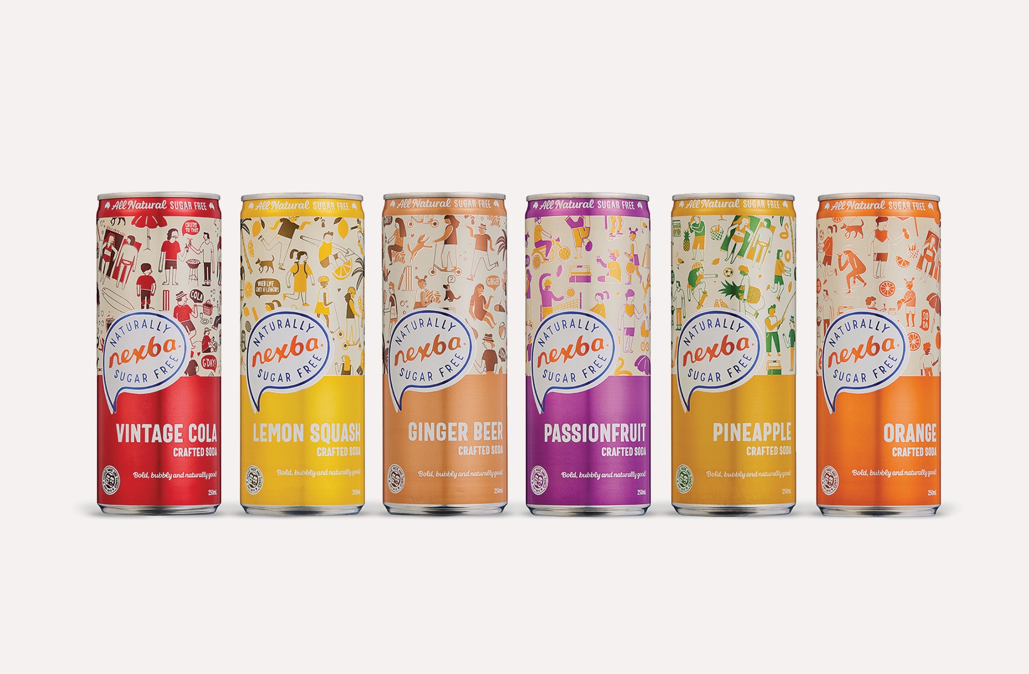

Our brief from Nexba was to help them transition into multiple drink categories whilst injecting personality and fun into their packs and retaining their Nexba-obsessed consumers.

We needed to create a packaging architecture that would work across multiple categories and pack structures, from kombucha and soda to non-alcoholic seltzer and tonic water.


These categories have vastly different design codes so creating a design architecture that would work cross-category was a challenge, as the packs needed to be visually consistent whilst maximising unique category semiotics.


The versatile packaging structure allows for colour, type and illustration to be swapped so each range feels as though it’s a part of the Nexba brand whilst still sitting comfortably in its category.

The idea of having an area to swap out illustrations permits various styles to be used for different target audiences such as families or young adults.


Nexba wanted to firmly position themselves as the brand that does sugar free differently, whilst being all natural.
We introduced a natural textured background where possible, kept a handcrafted look and feel to each illustration, used script fonts and created an ‘All natural, sugar free’ device that Nexba could own.

Nexba
How do you give drinks packaging legs to jump into different categories and succeed whilst still feeling like one brand?
For Nexba, it was a case of strong packaging architecture, modular illustration and graphics, and consistency.
Client
Nexba
Our Work
Brand Strategy
Brand Identity
Logo Design
Packaging Design
Copywriting
Advertising
Point of Sale
