The brand needed to convey a sense of fun and approachability whilst appealing to Westerners, all without compromising on quality.
The name Doughkyo arose.


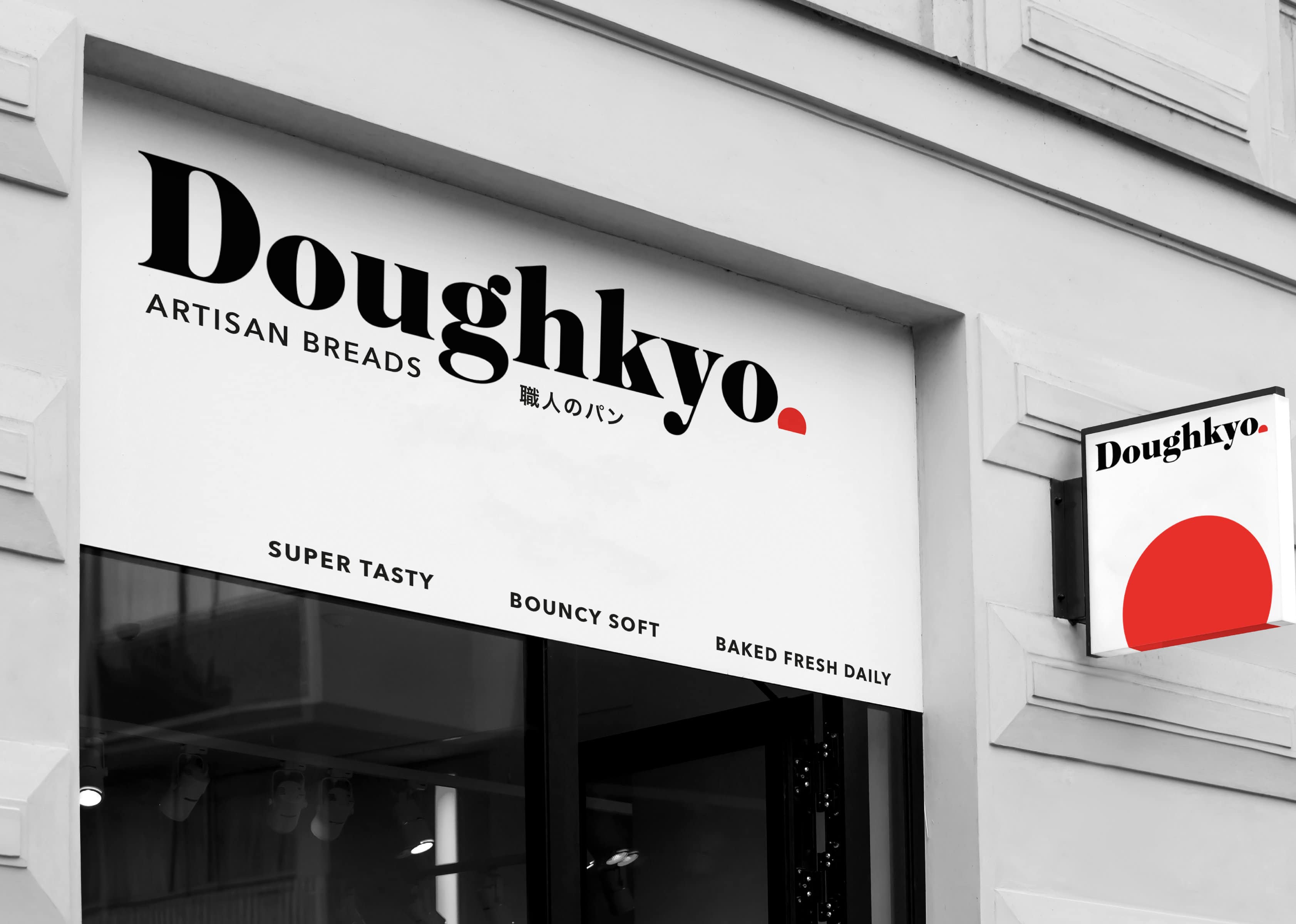
When developing the logo, we took a modern serif typeface that would communicate quality, inspired by the sharp edges and angular forms of Asian characters.


Paired with the typeface, a red circle sits alongside the name Doughkyo to evoke the idea of the rising sun of Japan.

Clever copy and use of the red circle as a distinctive brand asset merges the ideas of rising dough, the rising sun, and Asia.

“The Creative Method team has a deep understanding of consumers and brand that drives the strategic and creative process.
“Their strategic and nimble approach means you’re getting disciplined thinking while also being highly creative, as was evidenced by their work on Doughkyo which we were so happy with.
“A fantastic team to work with who are responsive and make the process enjoyable.”
Loane Avenell, Head of Marketing, Doughkyo

Doughkyo
Our client approached us with the opportunity to create the brand for a new bakery concept that would introduce a fusion of Asian and European baking styles and pastries to the Australian market.
Client
Doughkyo
Our Work
Naming
Logo Design
Packaging
Signage and Wayfinding
Environmental Graphics
Menu Design
Photography Art Direction
Copywriting
