The Challenge
The Aussie chicken shop icon was losing its spark. Red Rooster had history, heart and national recognition – but the brand was ageing out. Fast-food rivals like KFC and McDonald’s had captured younger audiences, and the once-loved roast chicken hero was getting left behind in the fried chicken era.
At the same time, Red Rooster was preparing for its first major menu innovation in years – introducing crispy fried chicken and a new burger range to join its famous roast. With these game-changing additions, the brand saw the perfect moment for transformation. It wanted to stay true to its loyal roast chicken fans while re-introducing itself to a new generation of chicken lovers.
Our challenge was clear: modernise the Red Rooster brand identity, reignite cultural relevance and win over a younger audience. All without alienating the families who’d been ordering roasts for 50 years.


The Insight
To compete in a world of global fast food and QSR heavyweights, Red Rooster’s branding had to lean into what made it uniquely Australian: nostalgia, warmth and that unmistakable “no-nonsense” attitude, then evolve it for today’s culture.
We participated in qual and quant research with consumers nationwide to understand what Australians still loved (and didn’t love) about the brand. The findings were clear: people didn’t want Red Rooster to become another KFC. They wanted it to remain the Aussie chicken shop they grew up with – just fresher, bolder and more relevant.
So we asked: How do you take a national icon, honour its past, and make it feel modern, confident and proudly Aussie again? The answer lay in blending Red Rooster’s roast heritage with the appetite and attitude of contemporary fried-chicken culture, giving the brand fresh flavour and a reason for being.


The Creative
We didn’t play it safe. We gave Red Rooster its fight back.
A bold new brand identity and logo refresh anchored in heritage but rebuilt for a new generation. The refreshed logo, inspired by the original 1970s design, celebrates the brand’s roots while signalling a modern, confident future.
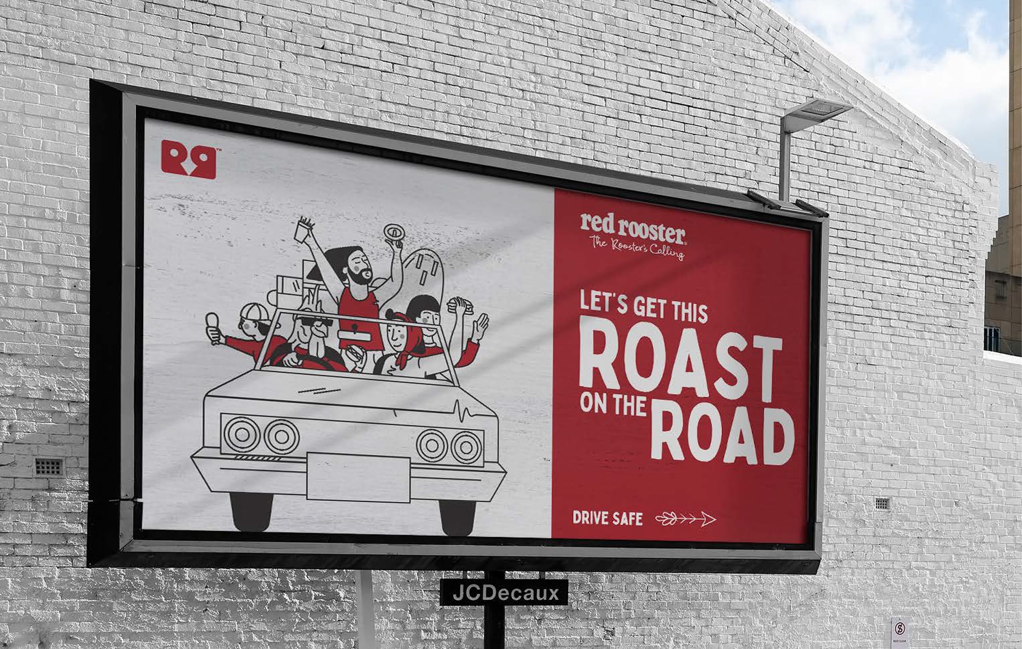
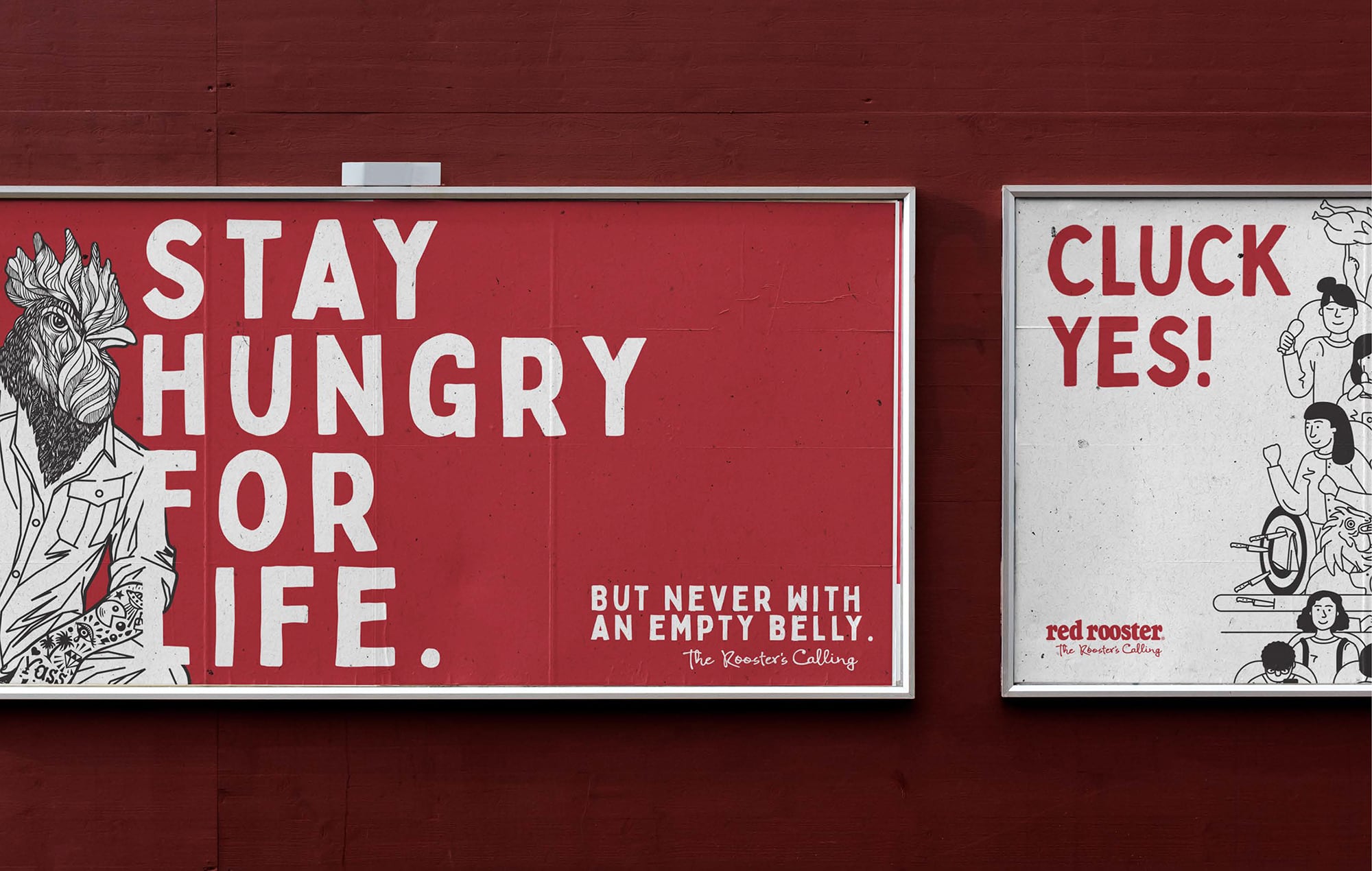
The new visual identity system extended across every touchpoint – from packaging design, signage and store interiors to digital campaigns, uniforms and social. Standout illustrations, fresh typography and bold storytelling re-introduced warmth, humour and everyday Aussie character.
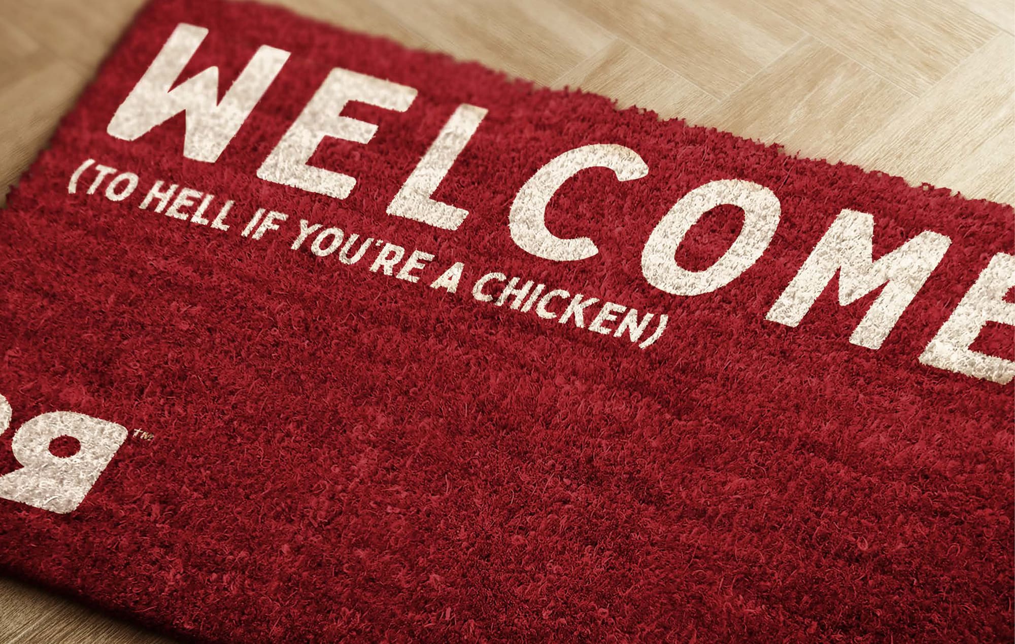
We gave the brand a stronger voice – cheeky, self-assured and proudly local. It talks like a mate, not a marketing machine. Together, these elements formed a scalable brand and identity system that rolled out consistently across franchises, bringing alignment, energy and confidence back to Australia’s original chicken shop.


The Results
The comeback has been loud. Red Rooster’s rebrand reignited consumer love for the classic Aussie chicken brand, delivering measurable growth and renewed pride across the franchise network:
– +26% sales growth following the Red Rooster rebrand rollout
– +5% uplift in customer consideration and improved brand sentiment
– Increased profitability across Craveable Brands and franchise partners
– Stronger franchisee confidence and trust, with improved engagement across the system
– A unified QSR brand design system enhancing consistency and in-restaurant experience
– The refreshed Red Rooster logo and brand identity now stand as symbols of proud heritage meeting modern appetite. A national favourite reborn with edge

“It was a chance to take the reins of a well known brand that had lost touch with customers and wasn’t recruiting new. But it required a fresh approach to positioning and the way it showed up in culture.”
Ashley Hughes, Marketing Director, Red Rooster


Red Rooster Logo & Brand Refresh – New Look, New Generation
Client
Red Rooster
Industry
Quick Service Restaurant (QSR)
Expertise
Brand Strategy
Brand Identity & Logo Design
Tone of Voice & Messaging
Illustration & Typography
In-Store Environment Design
Packaging & Visual Assets
Digital & Campaign Rollout
Franchise Brand System
Brand Guidelines
