
This project came about at a time when it seemed a new noodle house was popping up every other week in Sydney. We needed a disruptive name that appealed to both Western and Chinese diners.
Soo Zee is Sichuanese for ‘number’, and ‘23’ represents the number of blended herbs and spices used to create their famous broth.


The Chinese characters for ‘eat’ (吃) and ’23’ (二三) are featured in the brand identity as a discoverable for those familiar with the language, and to reinforce the authenticity of their specialty cuisine.

Our brand design strategy was to bring the traditional beef broth to life with majestic animal imagery and illustrations that reflect the deep flavour profile, and a mix of old and new to appeal to traditional diners as well as those less familiar with the style of cuisine.
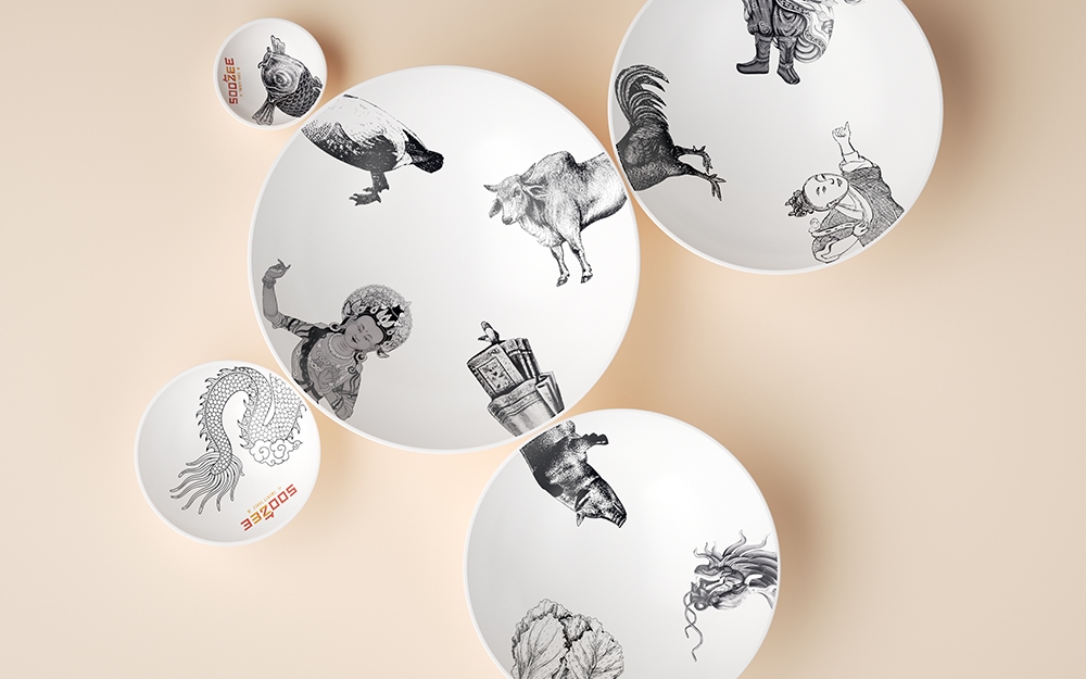

Soo Zee becomes a character of many forms that represents the art of mixing the herbs and spices to create an authentic beef noodle soup that you won’t forget.

Soo Zee 23
The broth used in Soo Zee 23’s authentic beef noodle soup originates from the streets of Sichuan, China, and is handcrafted using a blend of 23 herbs and spices in a process that takes over eight hours.
The Creative Method was asked to bring the story of the soup to life with a name, logo, brand identity, graphics, apparel, menus, tableware, a website and packaging design.
Client
Soo Zee 23
Industry
Fast Casual Dining
Our Work
Brand Creation
Naming
Logo Design
Copywriting
Packaging Design
Menu Design