
We were challenged to create beer packaging that worked hard and jumped out on shelf whilst also establishing a number of visual assets that could be used over various brand touchpoints moving forward.

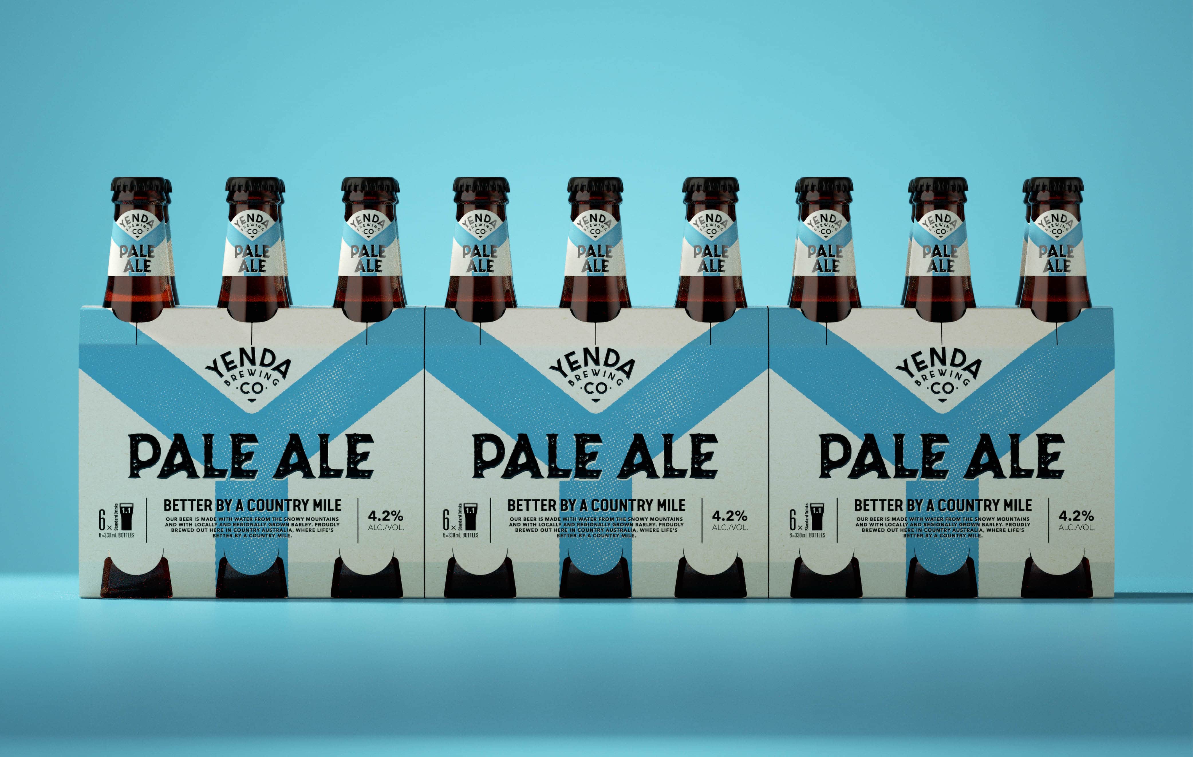
The Yenda beer logo device was deliberately created and crafted to be a unique shape and punch off the bottle. With so many beers on the market, it was crucial that that packaging intelligently disrupted on-shelf.
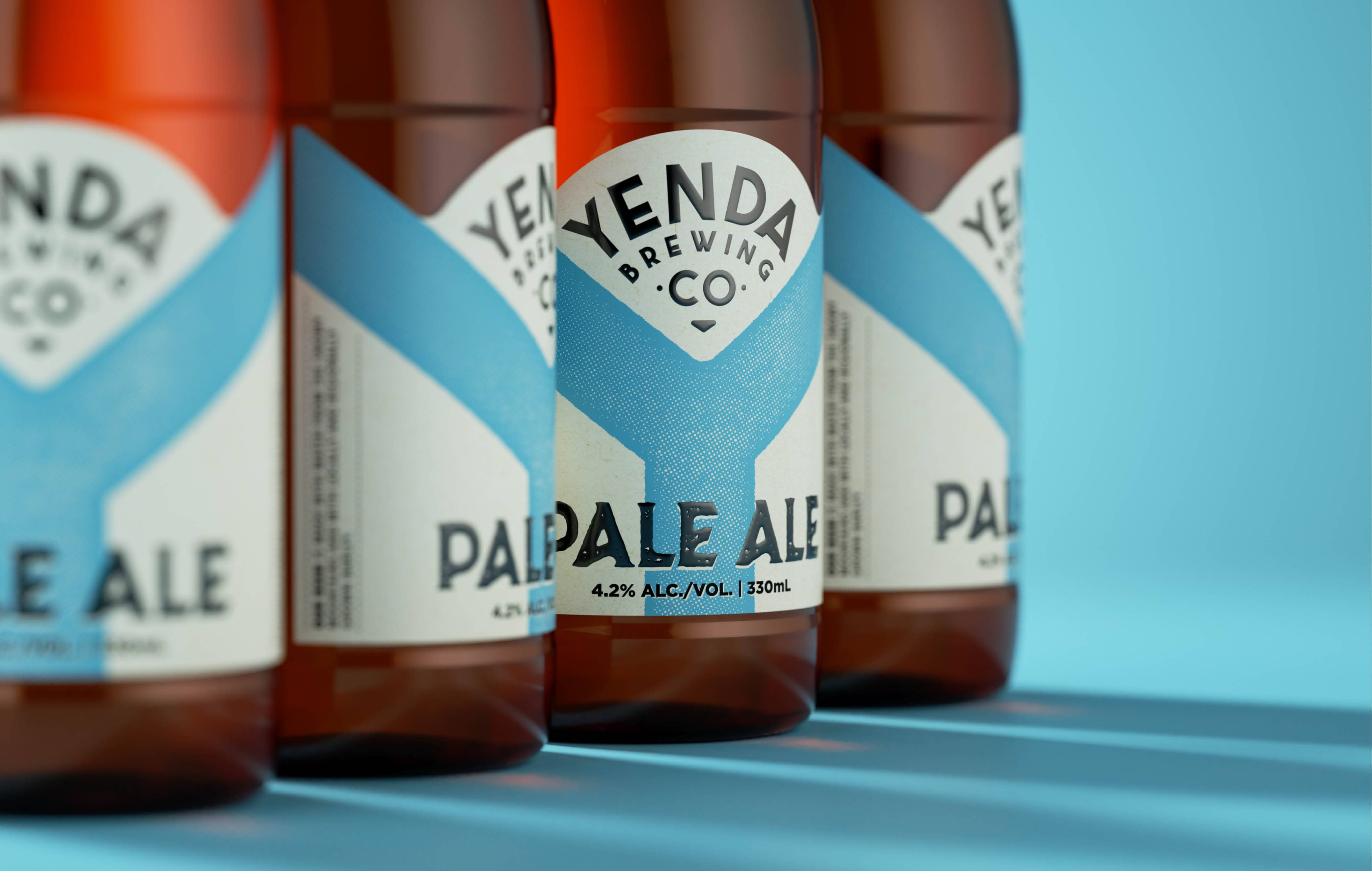
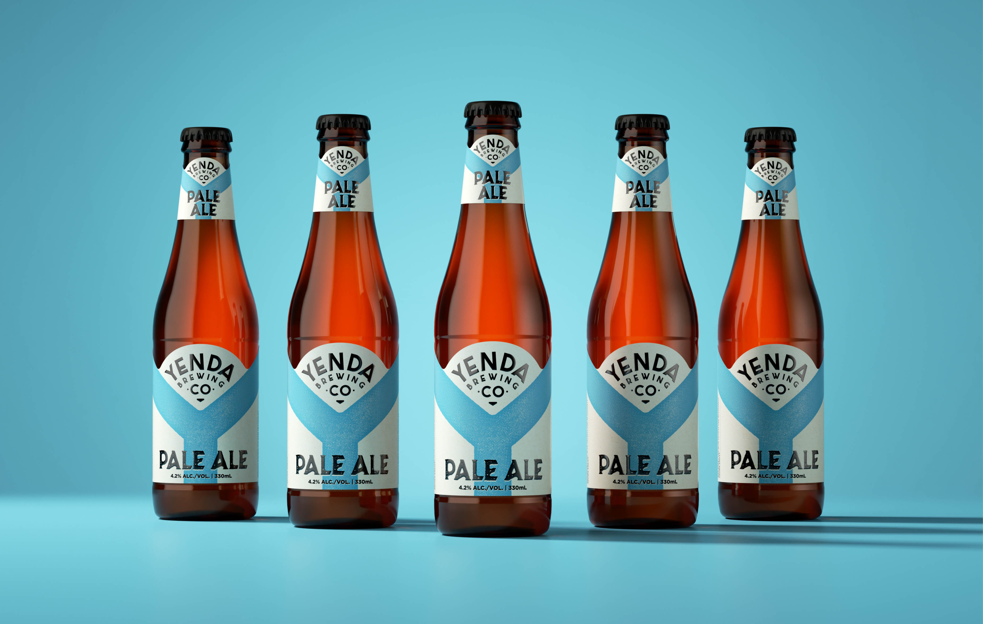
The creation of the large Y as a core visual brand asset on the label strongly reflects the brand name and also ensures the brand is easily seen and identified from a distance.
The colour of the Y changes on each beer variant, making it a strong device for wraps, shippers and bar taps alike.


“We were at something of a crossroads with Yenda as the craft beer market exploded around us and the brand got lost on shelf.
“The Creative Method helped to not only deliver a strong distinctive brand identity but helped us build a stronger brand.
“The customer, end consumer and salesforce reaction to Yenda has been phenomenal – a truly inspired brand redesign!”
Stuart Boag, Brand Marketing Manager, Coca-Cola Amatil


Yenda Brewing Co.
Yenda Brewing Co. has been around for a number of years and is the current sponsor of the Wallabies Rugby Union team.
Due to a massive influx of players into the craft beer space, Yenda had lost market share against its competitors.
We were engaged to refresh the Yenda brand identity and drive more of a mainstream craft beer positioning.
Client
Coca-Cola Amatil – Yenda Brewing Co.
Industry
Beer
Our Work
Brand Identity
Rebranding
Logo Design
Copywriting
Packaging Design
Merchandising