
The Challenge
Casa Gusto set out to bring authentic, Italian-inspired ready meals and sauces to Australian commercial kitchens – food made with generosity, simplicity and heart. But their early brand expression didn’t reflect the richness of the story behind the products or the warmth of the culinary experience.
Competing in a wholesale and foodservice environment meant Casa Gusto often ended up stored out of sight, indistinguishable from generic suppliers and lacking the appetite appeal needed to win pride of place in busy kitchens.
To stand out, Casa Gusto needed a brand that transported people – one that captured flavour, nostalgia and a uniquely personal origin story.

The Insight
The brand didn’t just have Italian flavours behind it – it had a remarkable Italian story. The founder’s father spent part of his youth travelling through Italy with a circus, discovering regional foods, family kitchens and the kind of rustic, heartfelt cuisine that inspires the brand today. This was the emotional anchor Casa Gusto needed.
The insight was clear: people connect with brands that feel lived-in, human and real. By tapping into this authentic narrative – a life shaped by travel, curiosity and serendipitous meals – we could give Casa Gusto a soul that typical ready-meal brands simply can’t imitate.
A brand inspired by a circus traveller discovering Italy? That’s not just an origin story – it’s a differentiator.


The Creative
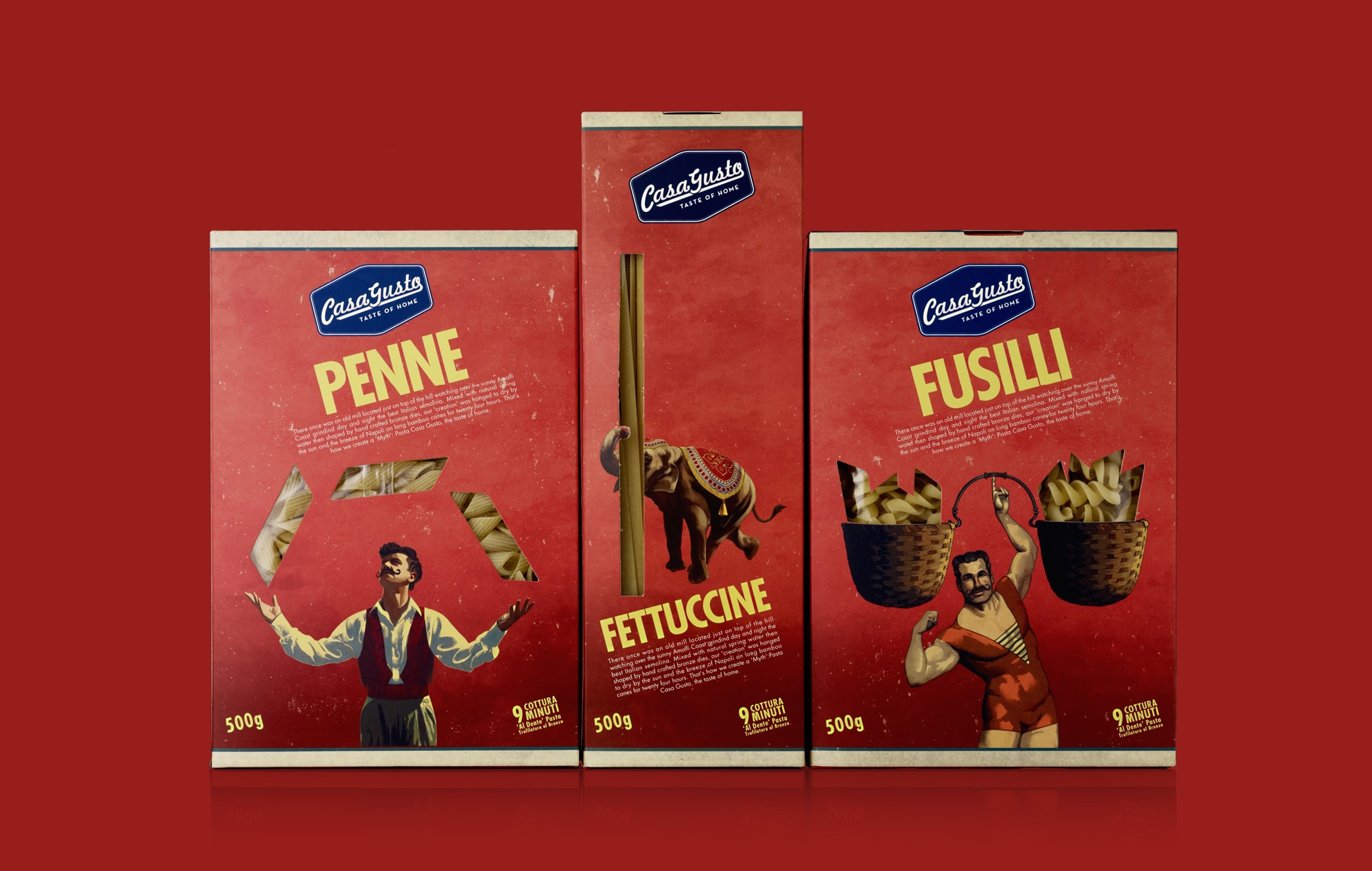
We used the father’s circus travels as an emotional undercurrent for the entire creative system. The brand cues draw from a life lived on the road: curiosity, craftsmanship, character, and the joy of discovering incredible meals in unexpected places.
– Illustrative storytelling: Subtle hand-drawn elements nod to travel journals, ticket stubs, street posters and the textures of old Italian towns. These touches make the brand feel personal, warm and filled with stories.
– Typography & colour: Traditional Italian serifs are paired with rustic, earthy tones – the colours of tomato vines, sun-warmed terracotta, market stalls and well-loved kitchens.
– Packaging with personality and pride: The new packaging feels like it belongs in a family pantry, not a back-of-house storeroom. Appetite-driving imagery, warm textures and crafted layouts bring the Italian journey into the brand in an understated but meaningful way.
– Tone of voice: Straightforward, generous and full of heart – evoking both Italian hospitality and the whimsy of discovering flavours while travelling with a circus. A tone that celebrates food, family, and the magic of meals that become memories.
A system built for kitchens, shelves and stories
We designed the packaging so well that clients started showcasing Casa Gusto out front – not hiding it behind the scenes. Each SKU feels like part of a connected family but has its own flavour-forward moment, supporting retail presence, foodservice usability and future range expansion.


The Results
– A distinct, story-rich brand that feels authentic, warm and full of character – grounded in a unique personal history.
– Packaging that customers proudly display in kitchens and on shelves thanks to its premium, artisan feel.
– Stronger differentiation in a crowded ready-meal category.
– A scalable identity system ready for additional sauces, meals and formats.
– Emotional connection that goes beyond Italian clichés and into a narrative competitors cannot replicate.
Casa Gusto now stands as a heartfelt Italian food brand shaped by one man’s journey – a brand that captures the generosity of home cooking and the wonder of discovering Italy on the road with a circus.

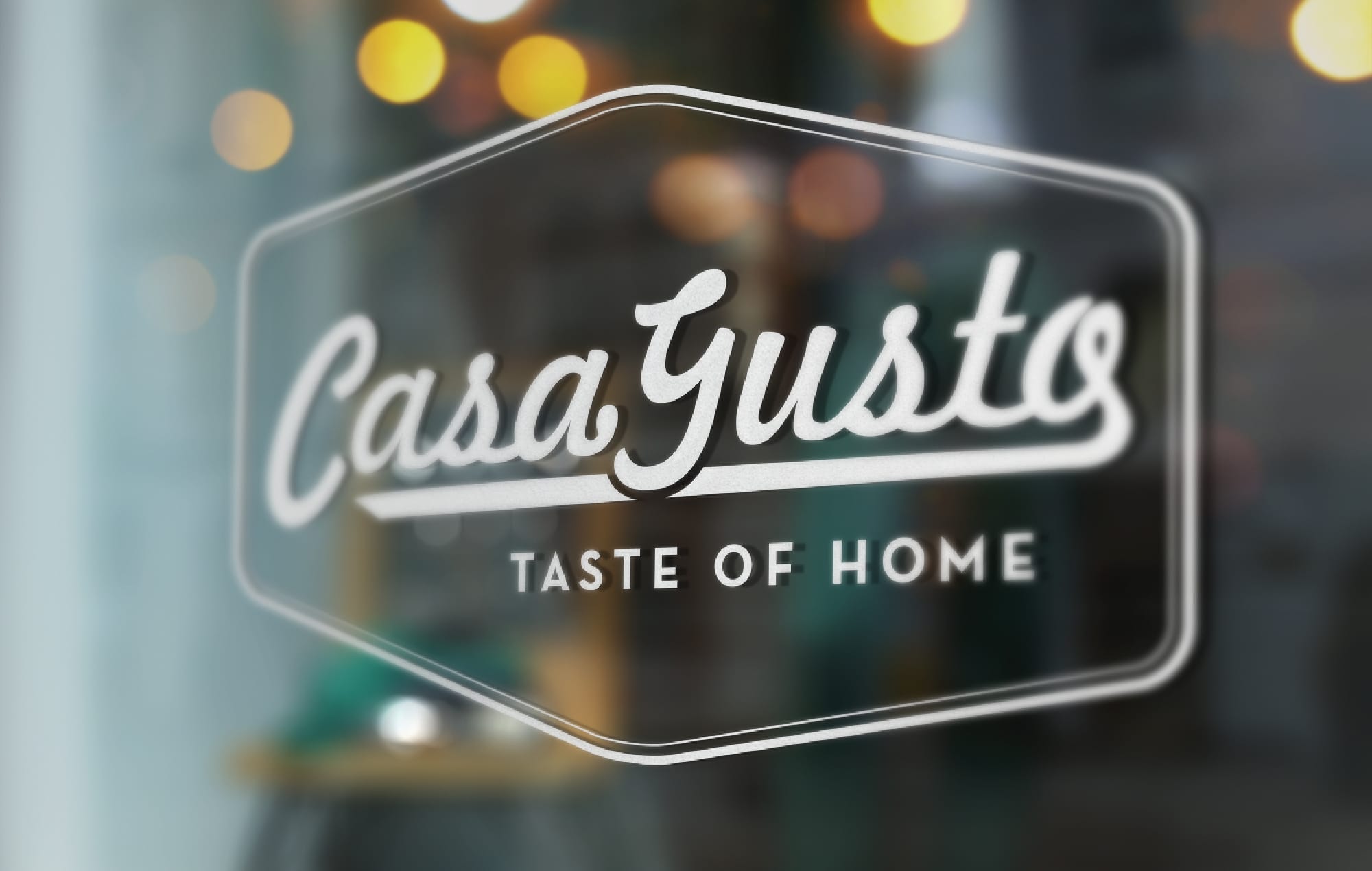
Casa Gusto Brand Development – Bringing Italian Homestyle Warmth to Life
Client
Casa Gusto
Industry
B2B Packaged Food & Ingredients
Our Work
Brand Strategy & Positioning
Visual Identity Development
Packaging Design
Illustration & Graphic Language
Messaging & Tone of Voice
Range Architecture
Foodservice & Retail Application
Region
Australia