Soul Origin

We kicked off the rebranding project by conducting an in-depth workshop with Soul Origin’s original founders and key stakeholders. This was essential to gain a deep understanding of the brand’s ambitions, uncover consumer insights, and diagnose the current challenges.
From there, we established a strategic framework that would serve as a guiding beacon for future growth, positioning Soul Origin to achieve sustained, consumer-driven success.


When crafting a new Soul Origin logo, we wanted to embody quality and craftsmanship, placing strong emphasis on premium design.
A sophisticated font was selected and custom-modified to subtly integrate a smiling face between the S and O, adding a unique and discoverable element to the brand identity.
This clever design feature not only elevates the brand’s visual appeal but also becomes a versatile asset, central to major branding touchpoints and capable of standing on its own. So different; so good.

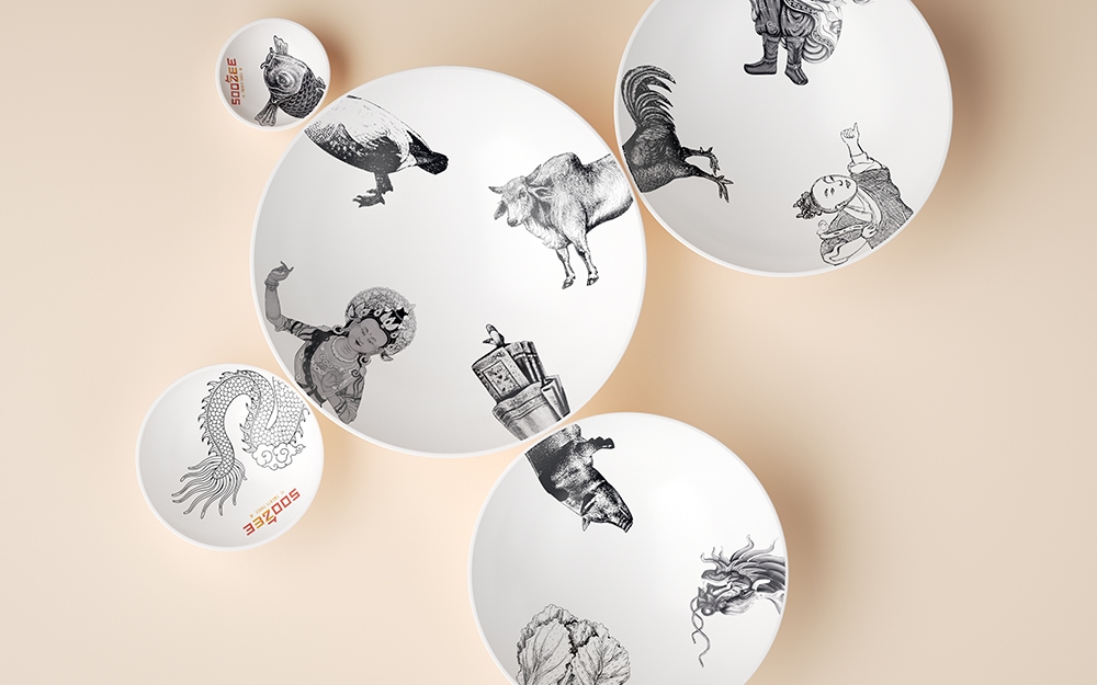
We developed a series of illustrations designed to be timeless and reinforce the brand’s crafted, handmade positioning.
Drawing inspiration from traditional woodcut techniques, we created visuals that honour the past, infused with a modern twist. By combining these classic elements into contemporary, simple collages, we crafted a unique visual language that works across all touchpoints -packaging, store environments, uniforms, websites, menus, and point-of-sale displays. So much craft.


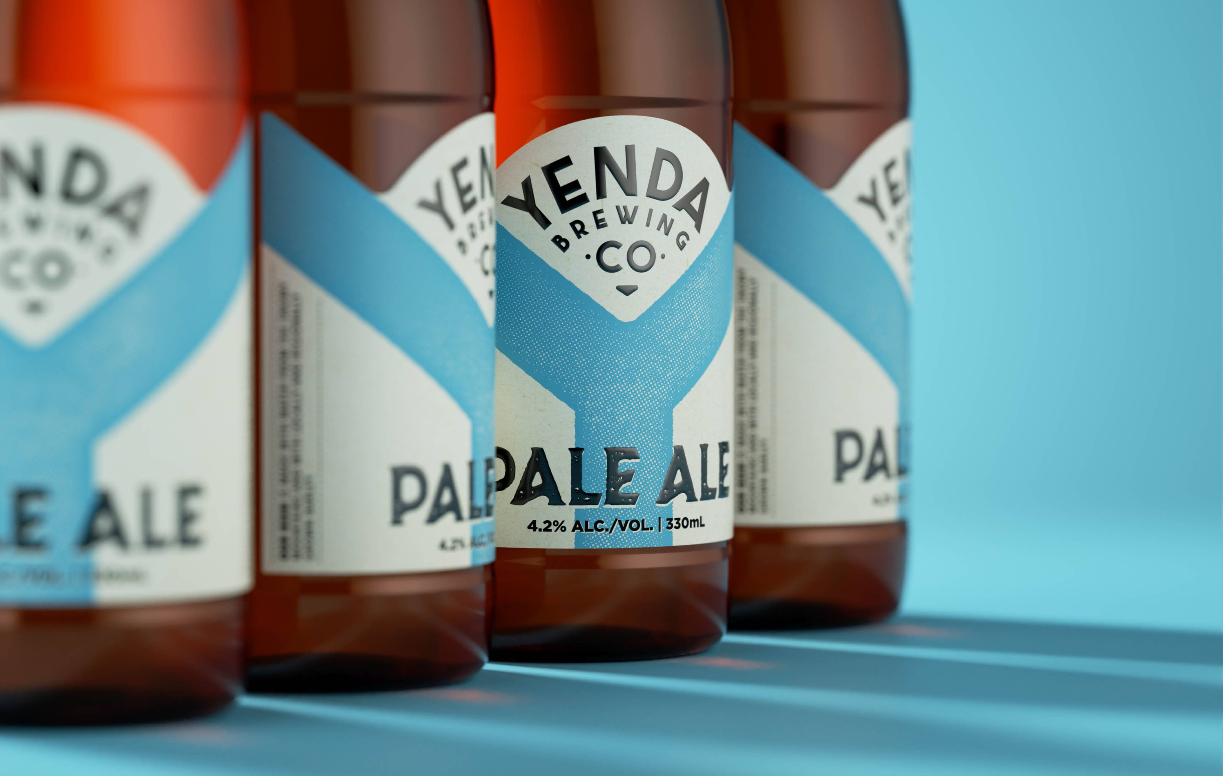
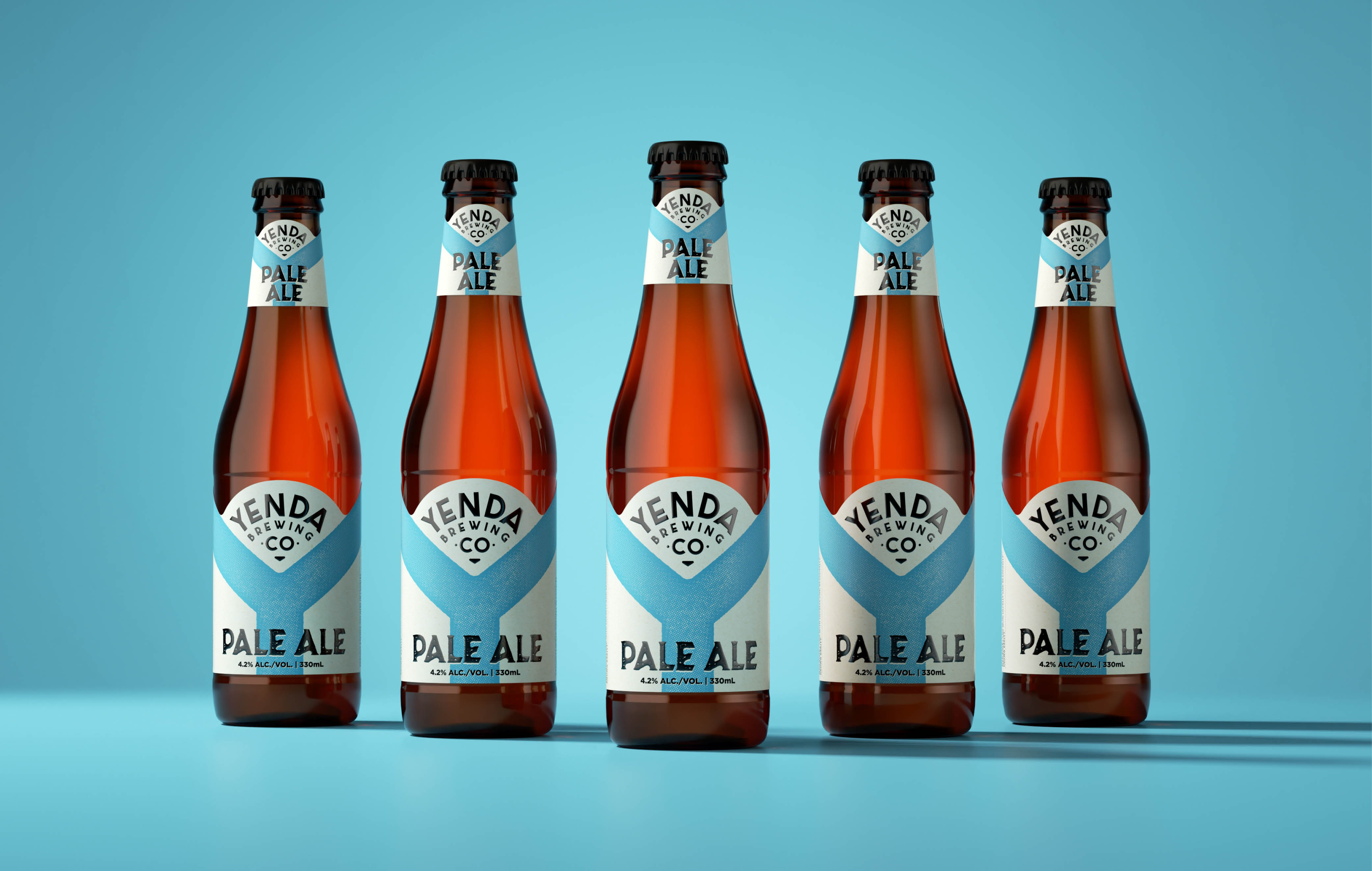
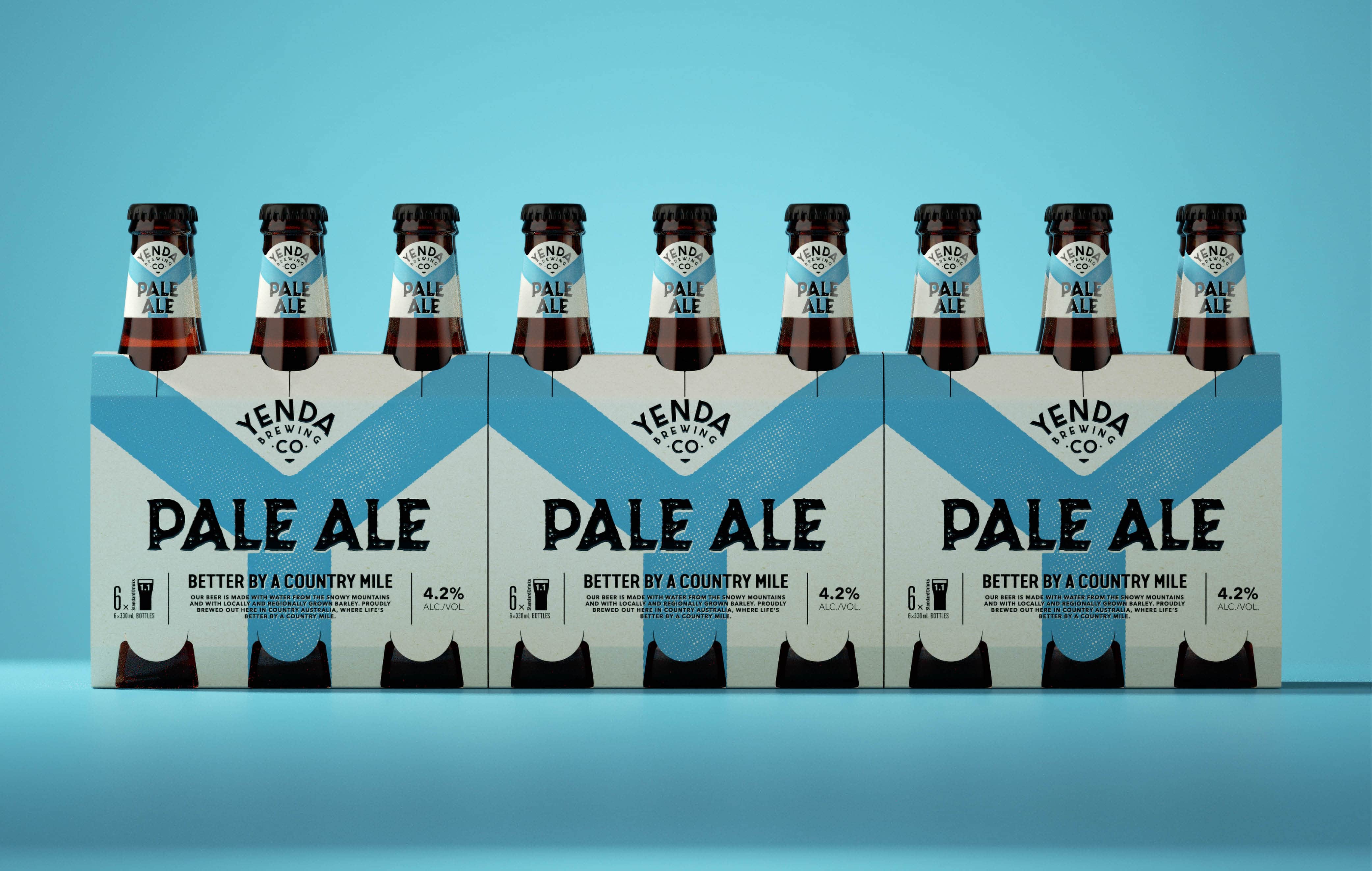
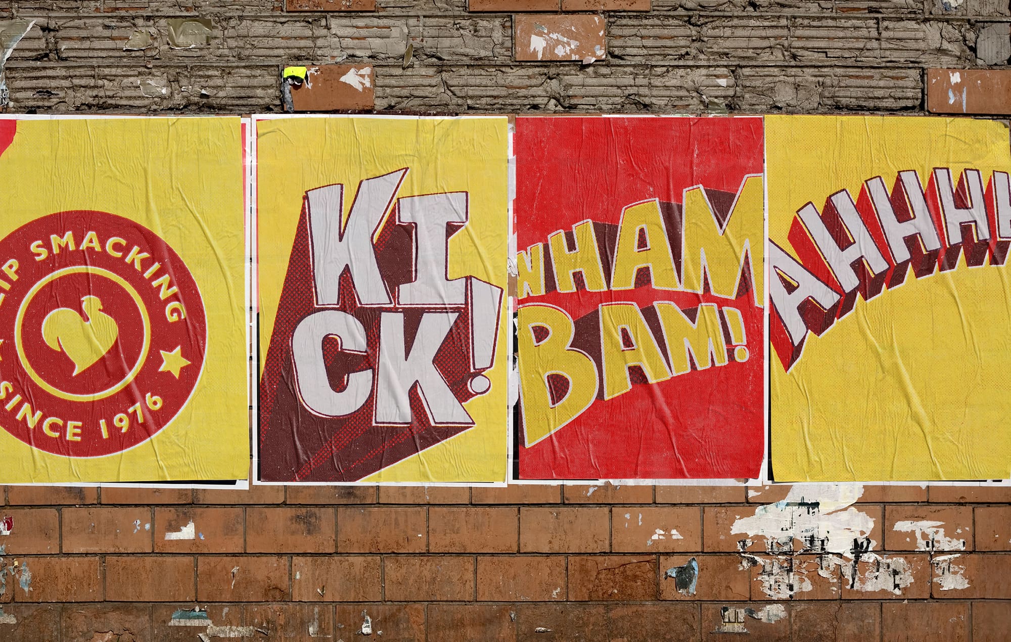
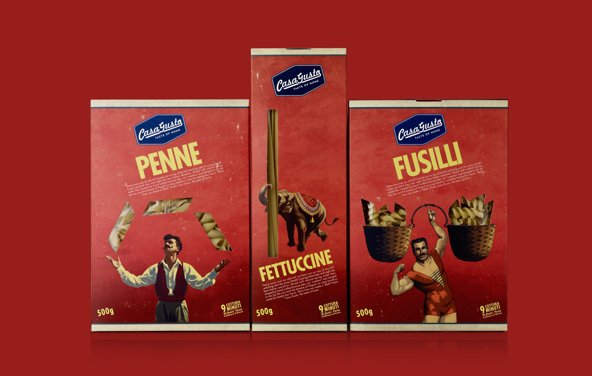
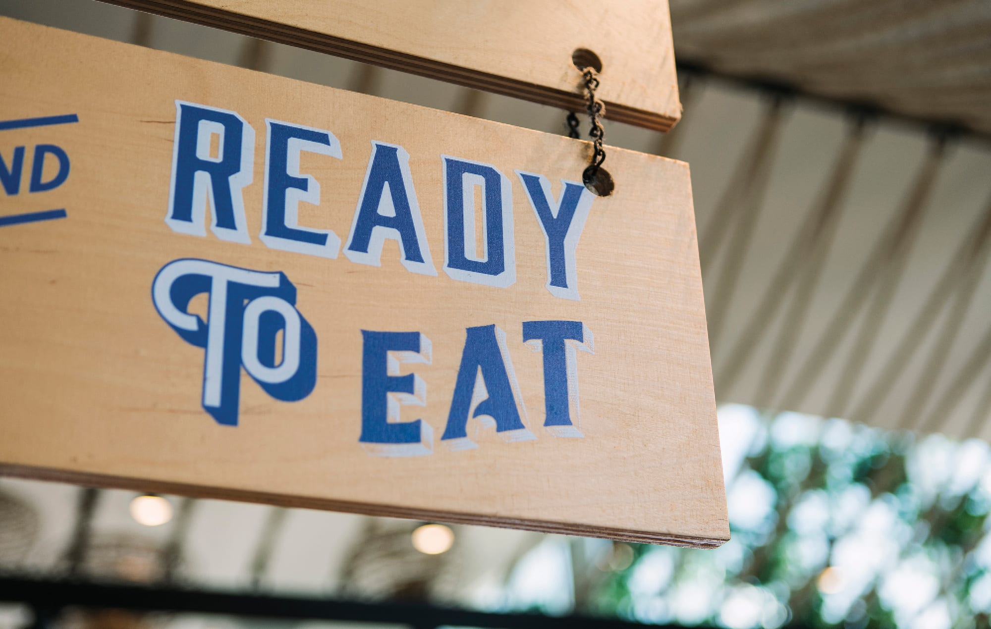
Packaging became a key focus in elevating brand recognition and recall. Our goal was to create packaging that was not only iconic but also instantly recognisable and memorable from a distance.
The bold use of colour ensures quick identification, while clever and witty copy adds an educational element, reinforcing the brand’s personality and making a lasting impression. So bold.


We view uniforms as a powerful platform to amplify a brand’s personality, convey its values, and even educate. Our approach was to design apparel that not only reinforces the brand identity but also provides pieces that both staff and customers would wear with pride. So cool.


The way a brand presents itself, communicates, and connects with its audience is vital. We crafted a versatile series of advertising and communication assets designed to be easily adaptable for any product or message.
Our focus was on freshness, appetite appeal, and a strong brand personality – all essential elements to enhance brand recall and make a lasting impact. So much standout.


For a brand of this scale, maintaining consistency and focus is crucial. We developed a comprehensive brand manifesto that clearly defines the brand’s vision and direction, serving as its unwavering north star.
This was complemented by an in-depth style guide, meticulously detailing the rules and standards for every aspect of the business to ensure a unified and cohesive brand presence across all touchpoints. So in depth.

Soul Origin
Founded in 2011, Soul Origin quickly expanded to over 150 locations across shopping centres, food courts, and airports throughout Australia. While their coffee and food offering was robust, their brand presence and recall lagged behind.
Our strategic challenge was to elevate their visibility, strengthen their reputation for quality food and coffee, and inject a distinct personality into the brand, ensuring it stands out in a highly competitive market.
Client
Soul Origin
Our Work
Brand Strategy
Logo Design
Visual Brand Identity
Copywriting
Packaging
Signage and Wayfinding
Uniform Design
Environmental Graphics
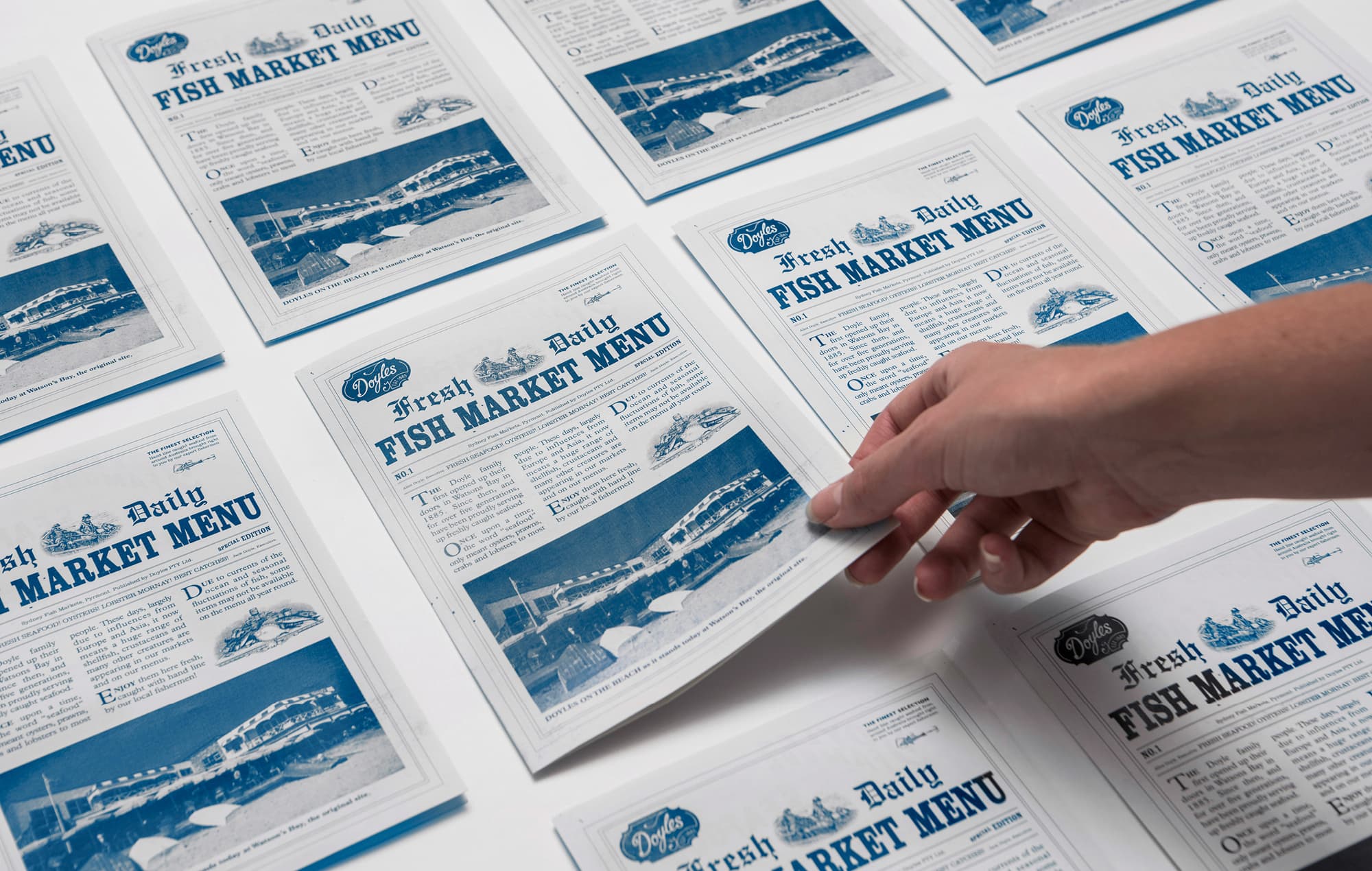
Menu Design
Photography Art Direction
Point of Sale
Social Media Design


")


")
")


 _")
 _2")
 _4")
 _5")
 _7")
 _8")
 _9")
 _11")
 _13")
 _14")
 _15")
 _17")
 _18")
 _19")
 _20")