
Food Packaging Design Rules You Need To Know
Branding
Food Packaging Design: 4 Essential Rules and Strategies You Can’t Ignore
09 April 2021

Let’s be honest – in the brutal world of Fast-Moving Consumer Goods (FMCG), your food packaging design isn’t just wrapping paper with a fancy logo. It’s your product’s chance to capture the consumer’s attention quickly, scream “pick me!” from a crowded shelf, tell your brand’s story in three seconds flat, and create that magical moment when a customer reaches for your product instead of the competition’s.
But here’s the kicker: great food packaging design doesn’t happen by accident. It’s the result of strategic thinking, creative flair, and understanding what makes your target audience tick. So, buckle up as we dive into the essential rules that separate packaging design legends from the also-rans.
What Makes Food Packaging Design Stand Out?
Before we get into the nitty-gritty, let’s talk about what actually makes packaging design work in today’s competitive market. Successful brands understand that effective packaging design is the ultimate combination of art and science – it needs to look stunning while serving multiple practical purposes.
Great packaging design creates an instant connection with your target consumer. It communicates your value proposition without saying a word, establishes your brand identity at first glance, and gives you that competitive edge that transforms browsers into buyers. The best packaging design doesn’t just contain your product; it amplifies it.
Think about the last time you wandered down the cereal aisle. What made you stop? Was it bold colours, clever typography, or perhaps an unexpected design element that caught your eye? That’s the power of strategic packaging design at work – turning a split-second glance into a purchasing decision. Effective packaging helps sell your product by standing out on crowded shelves and encouraging consumers to buy.
How Food Packaging Design Impacts Brand Loyalty
Here’s something that might surprise you: months or even years might have been invested in perfecting your food product, strategising its placement in boutique grocers or chain supermarkets, and fine-tuning the pricing. Yet, the consumer’s first and lasting impression is shaped entirely by your packaging design, the materials you choose, and how your product is packaged.
A well-designed package doesn’t just attract attention – it’s a powerful touch point that communicates your brand’s identity, values, and position in the food industry. When done right, packaging design becomes the foundation of brand loyalty, turning one-time buyers into lifelong customers.
The psychological impact is real. Your packaged product is often the first physical interaction potential customers have with your brand. The way your product is packaged can strongly influence consumer perception and purchasing decisions. It’s your chance to make a promise about quality, communicate your brand story, and position yourself against competitors. Get it right, and you’ve created a silent salesperson that works 24/7 on every shelf.
Food Packaging Design Rule #1: Do Your Research (Or Risk Looking Like Everyone Else)

Before you even think about colours, fonts, or that brilliant idea you had in the shower, you need to do your homework. And we’re talking proper research here – not just a quick Google search and calling it a day.
Understanding your market dynamics is crucial. Study your competitors religiously, identify white space opportunities, and find gaps in the market that your packaging design can exploit.
It’s essential to understand the different markets and consumer segments you want to reach, as effective packaging must resonate across various geographical and demographic markets. This research phase is the foundation of your entire packaging design process.
Take Sultry Sally Potato Chips, for example. They identified a gap for low-fat potato chips and complemented it with high-impact packaging design that resonated with their unique selling proposition. The illustrated character clearly enjoys her chips guilt-free, helping the product stand out in the crowded potato chip market. The silver bag reflects a healthier snacking option, appealing directly to their health-conscious target market.
But research goes beyond competitor analysis. You need to understand:
- Current packaging trends in your category
- Regulatory requirements for food packaging in Australia
- Sustainability expectations from your target audience
- Shelf placement dynamics in retail environments
- Price point positioning through design elements
The most successful packaging design projects start with thorough research. It’s the difference between creating something that looks pretty and creating something that actually works in the marketplace.
Food Packaging Design Rule #2: Discover Your Story and Tell It with Gusto
Every brand has a story, and it’s this narrative that fosters genuine connection and trust with consumers. The problem? Most brands think their story isn’t interesting enough. Trust us – it is.
Our client Casa Gusto is a perfect example. They didn’t believe they had an interesting story for their range of imported Italian food and ingredients. But when we probed deeper into their family history, we uncovered something remarkable: their father had experienced authentic Italian food whilst travelling Italy with the circus as a young man.

We designed the entire brand identity and food packaging around this fascinating tale, bringing their unique story to life through every design element. The result? Packaging that doesn’t just contain products – it tells a story that customers want to be part of.
Your story doesn’t need to involve circuses (though that helps). It could be:
- The family recipe that started it all
- The sustainable farming practices you champion
- The innovative production process you’ve perfected
- The community impact your business creates
- The problem your product uniquely solves
The key is authenticity. Consumers can smell fake stories from a mile away, but they’re drawn to genuine narratives that reflect real passion and purpose. Whether you’re creating a new product or revitalising existing ones, refreshing and improving your current brand assets can lead to better market performance. Your packaging design should be the visual manifestation of that story.
Food Packaging Design Rule #3: Understand Your Target Consumer (They’re Not All the Same)
Here’s where many brands get it spectacularly wrong: they assume all consumers are the same. Spoiler alert – they’re not. Creating packaging that resonates requires an in-depth understanding of your specific target consumer.

Consider our work with Doyles on the Beach – Sydney’s oldest fish and chip shop. We rejuvenated their packaging to appeal to a younger demographic while retaining the rich heritage dating back to 1885. The challenge was massive: how do you modernise a 140-year-old brand without losing its soul?
We created a suite of takeaway food packaging designs using typography, graphics, and language from the late 1880s, bringing the Doyles story to life in a contemporary way. The result successfully positioned Doyles in their target audience’s mind as the best fish and chips in Sydney, proving that understanding your consumer is everything. Your target consumer research should include:
- Demographics (age, income, lifestyle)
- Shopping behaviour and preferences
- Values and priorities (sustainability, health, convenience)
- Communication style and language preferences
- Purchase triggers and decision-making factors
- Brand associations and category perceptions
Remember, you’re not designing for everyone – you’re designing for someone specific. The more precisely you can define that someone, the more effective your packaging design will be.
Food Packaging Options: Choosing the Right Materials and Formats
When it comes to packaging design in the food industry, the materials and formats you choose are just as important as the graphics on the box. The right combination can elevate your food product, making it irresistible to your target market and giving your brand a competitive edge on crowded shelves.
Today’s food packaging options are more diverse than ever. From eco-friendly materials that appeal to environmentally conscious consumers, to innovative formats that make your product stand out, the choices you make should always align with your brand strategy and the expectations of your target consumer. For example, a cereal brand targeting kids might opt for bright colours and playful shapes to maximise packaging appeal, while a premium food product could use minimalist design and high-quality, tactile materials to signal sophistication and quality.
Functionality is key—your packaging needs to protect the product, ensure freshness, and be easy to use. But don’t overlook sustainability. Eco-friendly packaging isn’t just a trend; it’s a powerful way to connect with modern consumers who value responsible brands. Whether you’re creating a new product or refreshing an existing one, always consider how your packaging materials and formats can reinforce your brand’s values and help your product stand out in the market.
The best food packaging design finds the sweet spot between practicality, sustainability, and visual impact—creating a package that not only looks great but also delivers on the needs and desires of your target audience.
Maximising Space in Food Packaging Design: Best Practices
With limited real estate on food packages, every millimetre counts. This is where strategic thinking meets creative execution – you need to use every design element to convey your brand message succinctly whilst maintaining visual appeal. The golden rule? Avoid clutter like the plague. Prioritise information hierarchy and let your key messages breathe. Your packaging needs to communicate effectively from three feet away (shelf scanning distance) and up close (detailed examination).
For the Guzman Y Gomez sauce range, we used authentic and expressive portraits of GYG staff sampling different chilli sauces to convey flavour intensity. This visual approach eliminated the need for lengthy descriptions on the label, proving that sometimes a picture really is worth a thousand words.

Space optimisation strategies include:
- Information hierarchy: Lead with your brand name and key product benefits
- Colour coding: Use colour to differentiate variants and communicate key attributes
- Typography choices: Select fonts that are readable at various sizes and distances
- Image selection: Choose visuals that work hard – showing product, communicating benefits, or reinforcing brand personality
- White space: Don’t be afraid of empty space – it helps important elements stand out
- Regulatory compliance: Ensure mandatory information is included without dominating the design
- Well-designed panels and features: Incorporate design elements that serve as solutions to consumer questions and enhance product presentation
The most effective packaging design makes complex information feel simple and accessible. Your consumers shouldn’t need a magnifying glass to understand what they’re buying.
Designing for Store Displays: Winning at the Shelf
In the world of food packaging design, the retail shelf is the ultimate battleground. With countless food products vying for attention, your packaging needs to do more than just look good—it must instantly communicate your value proposition and make your product the obvious choice for your target audience.
Winning at the shelf starts with understanding what makes your food product unique. Is it a special ingredient, a health benefit, or an innovative production process? Highlight these points of difference through bold design elements, clear messaging, and strategic use of colour and imagery. For example, if your product is the only gluten-free option in its category, make that benefit front and centre on your packaging.
Effective packaging design considers how shoppers interact with products in-store. Most decisions are made in seconds, so your design must be easy to scan, with a clear hierarchy of information and visual cues that guide the consumer’s eye. Use design elements that reinforce your brand identity and make your product stand out from the competition—whether that’s through unique shapes, tactile finishes, or clever graphics.
Ultimately, the goal is to create packaging that not only attracts attention but also converts interest into a purchase. By understanding your target audience and the dynamics of the retail environment, you can design packaging that consistently wins at the shelf.
Food Packaging Design Rule #4: Create a Smile in the Consumer’s Mind
Consumers aren’t just data points on a spreadsheet – they’re real people with emotions, preferences, and the power to choose your product or walk away. Packaging design that evokes positive emotions or “creates a smile in the mind” can leave a lasting impression that translates into brand loyalty.
In rebranding and redesigning Sumo Salad, we gave the natural ingredients featured on the product packaging real character, adding a touch of humour and relatability. The result? Packaging that doesn’t just inform – it entertains.
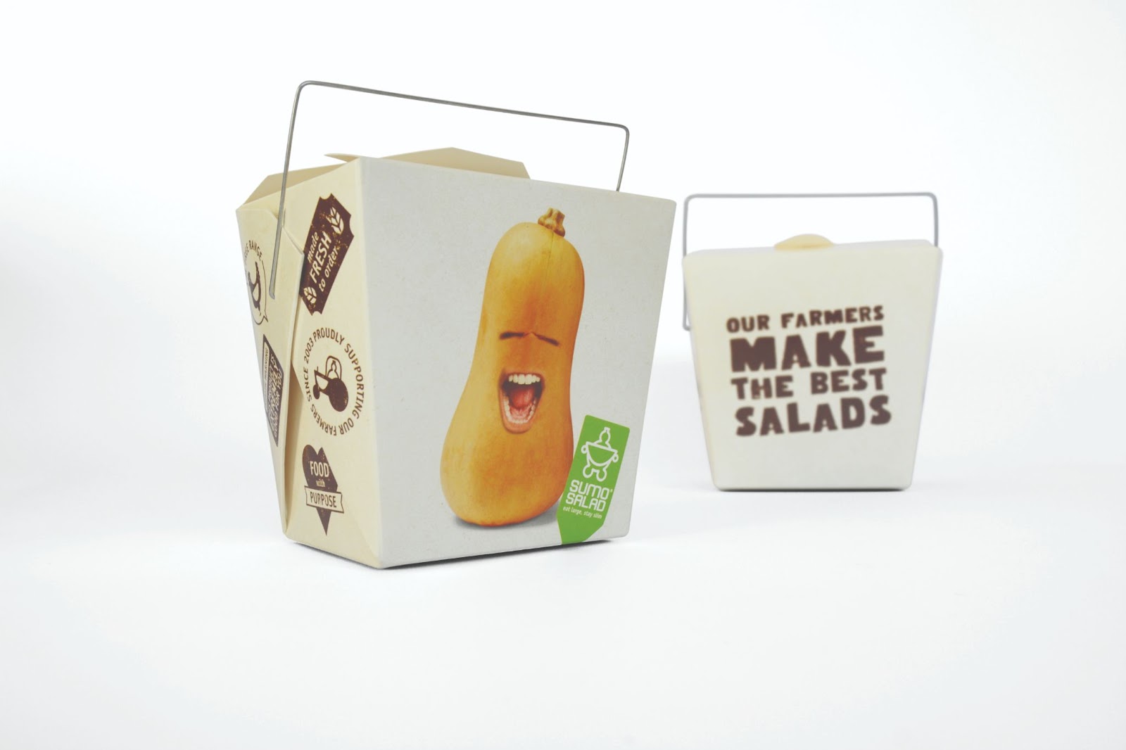

Humour in packaging design can be a powerful differentiator. In an age of choice paralysis, brand recall becomes pivotal in driving repeat purchases. When consumers remember your brand fondly, they’re more likely to choose you again.
Emotional connection strategies include:
- Personality injection: Give your brand a distinct voice and character
- Unexpected elements: Surprise consumers with clever details or hidden messages
- Sensory considerations: Think about texture, finish, and how the packaging feels
- Cultural relevance: Connect with local customs, values, or shared experiences
- Aspirational messaging: Help consumers see themselves using your product
- Problem-solving focus: Position your product as the solution to their daily challenges, while clearly communicating your product’s point of difference through packaging design
The goal isn’t just to be memorable – it’s to be memorably positive. When consumers feel good about your brand, they become advocates, not just customers.
Nonverbal Drivers: The Silent Persuaders in Packaging
Not all communication happens through words—especially in packaging design. Nonverbal drivers like colour, shape, and imagery are powerful tools that can instantly convey your brand identity and connect with your target consumer on an emotional level.
Think about the impact of a natural colour palette and recycled materials on an eco-friendly brand, or the use of bold, geometric shapes to signal innovation and energy. These visual cues work silently but effectively, shaping perceptions and influencing purchasing decisions before a single word is read.
Great packaging design leverages these nonverbal elements to create a cohesive and memorable brand experience. For example, a food product that wants to communicate freshness might use green hues and organic shapes, while a luxury item could opt for sleek lines and metallic finishes.
The key is understanding what resonates with your customers and using design elements that reinforce your brand’s values and story. By combining strong nonverbal drivers with clear messaging, you create packaging that not only stands out but also builds trust and loyalty with your audience—making your product the natural choice in a crowded market.
Sustainable Food Packaging Design: Trends and Tips
Let’s address the elephant in the room: sustainability isn’t just a trend anymore – it’s a consumer expectation. Modern shoppers, particularly younger demographics, actively seek brands that demonstrate environmental responsibility through their packaging choices.
Sustainable packaging design presents unique challenges and opportunities. You need to balance environmental considerations with functionality, cost implications, and visual impact. The good news? Sustainable packaging can actually enhance your brand story when done thoughtfully. Key sustainability considerations include:
- Material selection: Opt for recyclable, compostable, or biodegradable materials where possible
- Packaging efficiency: Minimise material usage without compromising product protection
- Supply chain impact: Consider the carbon footprint of your packaging materials and production processes
- End-of-life planning: Design for easy recycling or disposal
- Consumer education: Include clear instructions for proper disposal or recycling
- Innovative alternatives: Explore new sustainable materials and technologies
Successful sustainable packaging design doesn’t scream “eco-friendly” – it seamlessly integrates environmental responsibility with great design. Consumers shouldn’t have to choose between sustainability and visual appeal.
Food Packaging Regulations: What You Need to Know
Before you get too creative, remember that food packaging in Australia must comply with specific regulations. The Australia New Zealand Food Standards Code sets out mandatory requirements that can’t be ignored, no matter how brilliant your design concept.
Understanding compliance requirements early in the design process prevents costly redesigns and delays. Your packaging design team should work closely with regulatory experts to ensure all mandatory information is included appropriately. Key regulatory areas include:
- Ingredient declarations: Clear listing of all ingredients in descending order by weight
- Allergen information: Prominent display of common allergens
- Nutritional information: Standardised nutrition information panels
- Country of origin labelling: Clear indication of where products are made or grown
- Use-by and best-before dates: Appropriate date marking for food safety
- Storage instructions: Proper guidance for product storage and handling
- Contact information: Business name and contact details
The challenge is incorporating all mandatory information whilst maintaining design integrity. This is where experienced packaging design teams prove their worth – they understand how to make compliance feel seamless rather than intrusive.
Emerging Trends in Food Packaging Design for 2024
The food packaging landscape evolves rapidly, driven by changing consumer expectations, technological advances, and cultural shifts. Staying ahead of trends can give your brand a significant competitive advantage. Current trends shaping food packaging design include:
- Minimalist aesthetics: Clean lines, reduced clutter, and premium simplicity
- Bold typography: Statement fonts that work as design elements themselves
- Transparency and authenticity: Clear windows, honest imagery, and straightforward messaging
- Digital integration: QR codes, augmented reality features, and interactive elements
- Artisanal appeal: Hand-drawn elements, craft-inspired textures, and small-batch aesthetics
- Colour psychology: Strategic use of colour to trigger specific emotional responses
- Flexible packaging: Pouches and flexible formats that offer convenience and sustainability
Remember, trends should enhance your brand story, not replace it. The most successful packaging design projects are achieved through a collaborative approach, ensuring your packaging design project blends current trends with timeless brand principles.
Food Packaging Design Process: From Concept to Shelf
Understanding the packaging design process helps brands make better decisions and set realistic expectations. Great packaging design doesn’t happen overnight – it’s the result of a structured, collaborative process that supports businesses in bringing products to market. The typical packaging design process includes:
Discovery Phase: Research, competitive analysis, and consumer insights gathering
Strategy Development: Defining brand positioning, messaging, and design direction
Concept Creation: Initial design explorations and creative development
Design Refinement: Iterating on preferred concepts based on feedback and testing
Technical Development: Ensuring print production feasibility and regulatory compliance
Production Preparation: Final artwork preparation and print management
Launch Support: Monitoring performance and making adjustments as needed Each phase requires different skills and expertise.
The most successful packaging design projects involve close collaboration between clients, designers, and production specialists.
Packaging Design Testing: Validating What Works
No matter how stunning your packaging design looks on screen, the real test is how it performs with your target market.
That’s where packaging design testing comes in—a crucial step in the packaging design process that ensures your design resonates with your audience and drives real-world results.
Testing can take many forms, from online surveys and focus groups to in-store trials and A/B testing. Each method provides valuable insights into how your packaging is perceived, what stands out, and what might need refinement.
By involving your target audience early and often, you can validate your design choices and make data-driven adjustments that enhance packaging appeal and align with your brand strategy.
A successful packaging design process doesn’t end with the first draft. It’s an ongoing cycle of creation, feedback, and optimisation. By prioritising testing, you ensure that your packaging not only looks great but also performs effectively in the market—helping your brand connect with consumers and achieve its business goals.
Launch and Distribution: Bringing Your Packaging to Market
After investing time and creativity into your packaging design, the next critical step is launching and distributing your product. This phase is where your packaging design process comes full circle, transforming a great concept into a tangible brand experience that reaches your target market.
A successful launch strategy considers every detail—from how your packaging will be displayed in stores to the marketing campaigns that will introduce your new product to the world. Aligning your launch with your brand identity and packaging appeal ensures a cohesive message that resonates with consumers and retailers alike.
Distribution is equally important. Whether you’re working with boutique retailers or national chains, your packaging must be designed for efficient shipping, easy stocking, and maximum shelf presence.
Partnering with a full-service packaging design agency can help you navigate these complexities, ensuring your packaging is not only created to the highest standards but also delivered to market with tangible results.
By combining creativity, industry knowledge, and a deep understanding of your target audience, you can create a launch and distribution strategy that helps your packaging stand out, drives sales, and builds lasting brand loyalty—turning your new product into a market success story.
Consumer Psychology and Purchasing Decisions
Understanding consumer psychology is crucial for effective packaging design. Research shows that consumers make purchasing decisions within seconds of seeing a product, often based on subconscious emotional responses to visual stimuli. Key psychological factors include:
- Colour associations: Different colours trigger specific emotional responses and category expectations
- Shape and form: Package shapes communicate product attributes and brand personality
- Typography choices: Font styles influence perceptions of quality, tradition, or innovation
- Imagery selection: Product photography, illustrations, or graphics that resonate with target consumers
- Information processing: How consumers scan and process package information, which is also influenced by strategic product placement on shelves
- Social proof: Reviews, awards, or endorsements that build trust and credibility
Successful packaging design leverages these psychological principles to create positive associations and drive purchase intent. It’s not manipulation – it’s strategic communication that helps consumers make informed choices.
How to Choose the Right Design Agency for Food Packaging
Not all design agencies understand food packaging. The food industry has unique requirements, regulations, and consumer expectations that require specialised knowledge and experience. When selecting a packaging design partner, consider:
- Food industry experience: Look for agencies with proven success in food packaging projects
- Process understanding: Ensure they understand both creative and technical aspects of packaging design
- Regulatory knowledge: Verify their understanding of Australian food packaging regulations
- Production expertise: Confirm their ability to manage print production and quality control
- Strategic thinking: Assess their ability to connect design decisions with business objectives
- Portfolio quality: Review their previous work for creativity, effectiveness, and diversity
The right agency becomes a strategic partner, not just a service provider. They should challenge your thinking, bring fresh perspectives, and help you achieve measurable business results through great design. For inspiration on what’s possible, explore our comprehensive portfolio and see how strategic design transforms brands across different categories, including our drinks packaging design work which demonstrates cross-category expertise.
Creating Competitive Edge Through Design Innovation
In crowded food categories, innovative packaging design can create significant competitive advantage. Innovation doesn’t always mean revolutionary – sometimes it’s about doing familiar things better or finding new ways to solve old problems. Areas for design innovation include:
- Functional improvements: Easier opening, better storage, or enhanced convenience
- Sustainability advances: New materials or processes that reduce environmental impact
- Technology integration: Smart packaging features or digital connectivity
- Personalisation opportunities: Customisable elements or limited edition variants
- Cross-category inspiration: Borrowing successful concepts from other industries
- Cultural relevance: Connecting with specific communities or cultural moments
The key is balancing innovation with practicality. Innovative packaging design should enhance the consumer experience, not complicate it.
Measuring Success: Packaging Design Performance Metrics
How do you know if your packaging design is working? Successful brands track specific metrics to measure packaging performance and guide future improvements. Key performance indicators include:
- Sales velocity: How quickly products move off shelves
- Market share: Growth in category share following packaging changes
- Brand recognition: Consumer recall and recognition testing
- Purchase intent: Willingness to buy based on packaging appeal
- Consumer feedback: Direct feedback about packaging preferences and experiences
- Retailer acceptance: Buyer enthusiasm and shelf placement improvements
Regular performance monitoring helps optimise packaging design over time. The most successful brands treat packaging as a living asset that evolves with their business and market conditions.
Building Your Food Packaging Design Strategy
Creating effective food packaging design requires more than good aesthetic sense – it demands strategic thinking that connects design decisions with business objectives. Your packaging strategy should align with your overall brand strategy whilst addressing specific category requirements. Essential strategy elements include:
- Brand positioning: How your packaging communicates your unique market position
- Target audience definition: Specific consumer segments you’re trying to reach
- Competitive differentiation: What makes your packaging stand out from alternatives
- Value proposition communication: How packaging supports your key selling points
- Scalability planning: Ensuring your design system works across different products and sizes
- Evolution roadmap: Planning for future packaging updates and improvements
Remember, great packaging design isn’t just about looking good – it’s about working effectively to drive business results. The most successful food brands understand that packaging is a strategic business asset that deserves serious investment and ongoing attention.
The Future of Food Packaging Design
The food packaging industry continues evolving rapidly, driven by changing consumer expectations, technological advances, and sustainability imperatives. Brands that stay ahead of these changes will have significant competitive advantages. Emerging developments include:
- Smart packaging technologies: Interactive features and digital connectivity
- Advanced sustainable materials: Innovative biodegradable and compostable options
- Personalisation capabilities: Mass customisation and targeted messaging
- Augmented reality integration: Enhanced consumer experiences through AR features
- Supply chain transparency: Packaging that tells the complete product story
- Health and wellness focus: Designs that support consumer health objectives
The most successful food brands will be those that embrace change while maintaining strong brand fundamentals. Your packaging design should evolve with your business and market conditions whilst staying true to your core brand values.
Conclusion: Your Next Steps
Food packaging design isn’t just about making products look pretty – it’s about creating powerful connections between your brand and your customers. Every design element should work strategically to communicate your value proposition, differentiate your products, and drive purchase decisions.
The companies that understand this distinction are the ones that build lasting competitive advantages through great packaging design. They know that effective packaging design requires strategic thinking, creative execution, and ongoing optimisation based on real market feedback.
Whether you’re launching a new food product or refreshing an existing brand, remember that your packaging is often the most important marketing investment you’ll make. It’s the one marketing tool that reaches 100% of your customers at the moment they’re making purchase decisions.
Ready to create packaging design that actually works? The key is finding the right combination of strategic thinking, creative flair, and industry knowledge to bring your vision to life.
Related Articles


TAGS