

The Challenge
Healthy food brands and fast-casual restaurants have a habit of blending into each other. Same wellness clichés. Same muted palettes. Same overly polished personality.
Founded in Parramatta in 2017, Sol Bowl had built a loyal community around fresh, wholesome food designed for real life, but the existing brand identity no longer reflected the quality, energy or personality behind the experience.
As the healthy QSR category became increasingly crowded, Sol Bowl needed a more distinctive brand that could help the business stand apart while still feeling approachable, memorable and genuinely human.
The challenge was to modernise the brand identity, logo and packaging design system without losing the warmth and accessibility that made customers connect with Sol Bowl in the first place.
The Insight
Many healthy food brands lean heavily into wellness language and minimal aesthetics, often at the expense of personality.
But consumers don’t just want healthy food anymore. They want food that feels vibrant, enjoyable and full of life. They want restaurants and brands that create a sense of connection, trust and community.
Sol Bowl already had that energy in the product itself. The opportunity was to bring the same personality into the brand experience across packaging, interiors, digital touchpoints and the website.
Rather than creating another polished wellness brand, we focused on building a more expressive and culturally relevant identity system inspired by fresh ingredients, human interaction and the fun side of healthy eating.
The Creative Solution
We refreshed the Sol Bowl brand with a more confident and personality-led visual identity system designed to feel fresh, vibrant and instantly recognisable within the QSR and hospitality space.
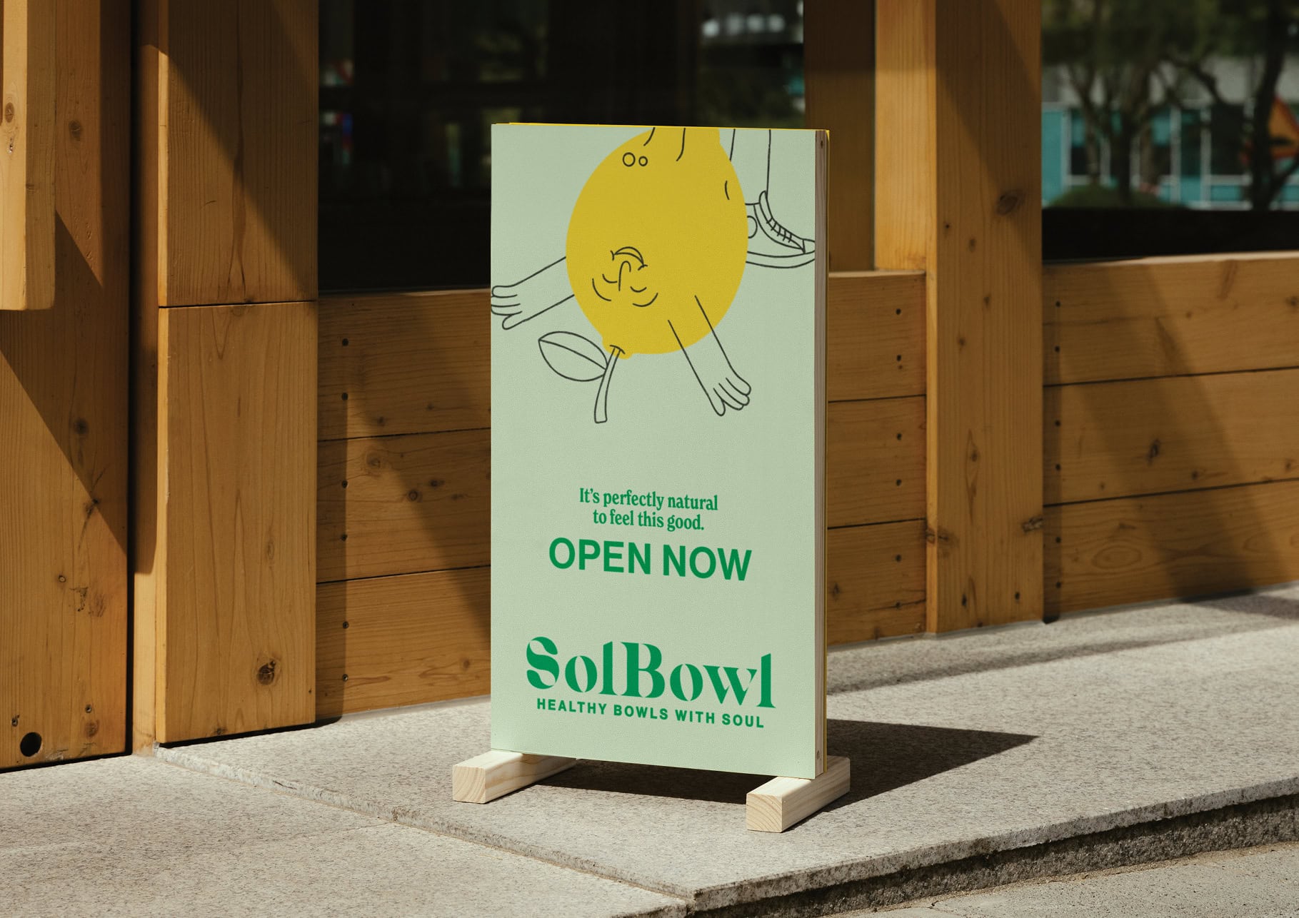
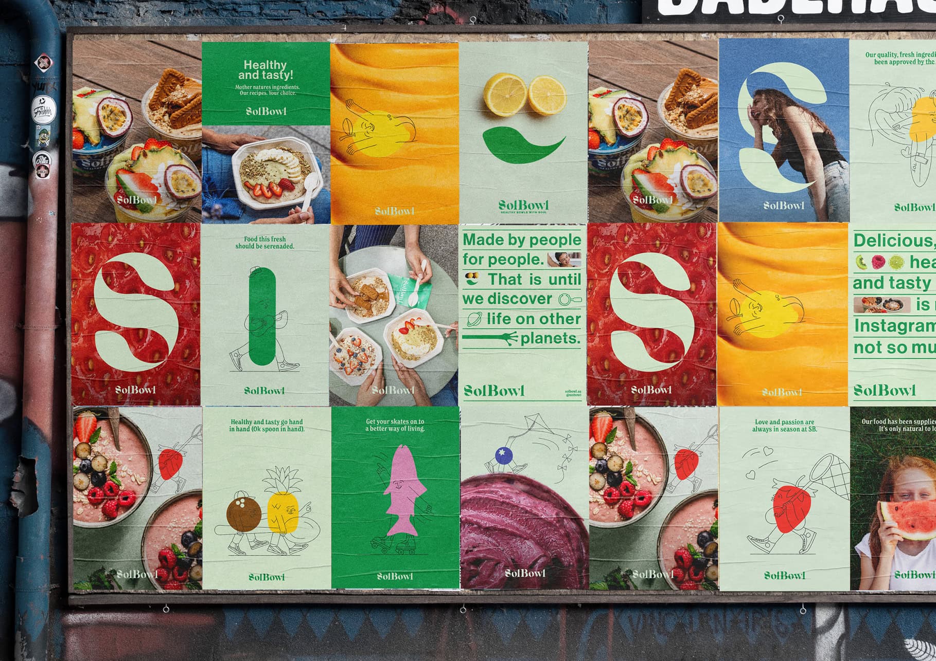
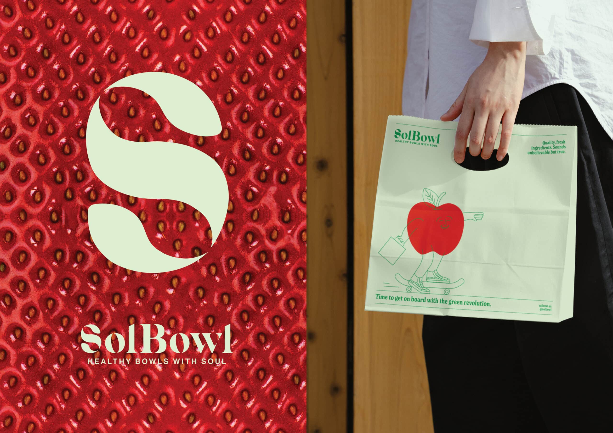
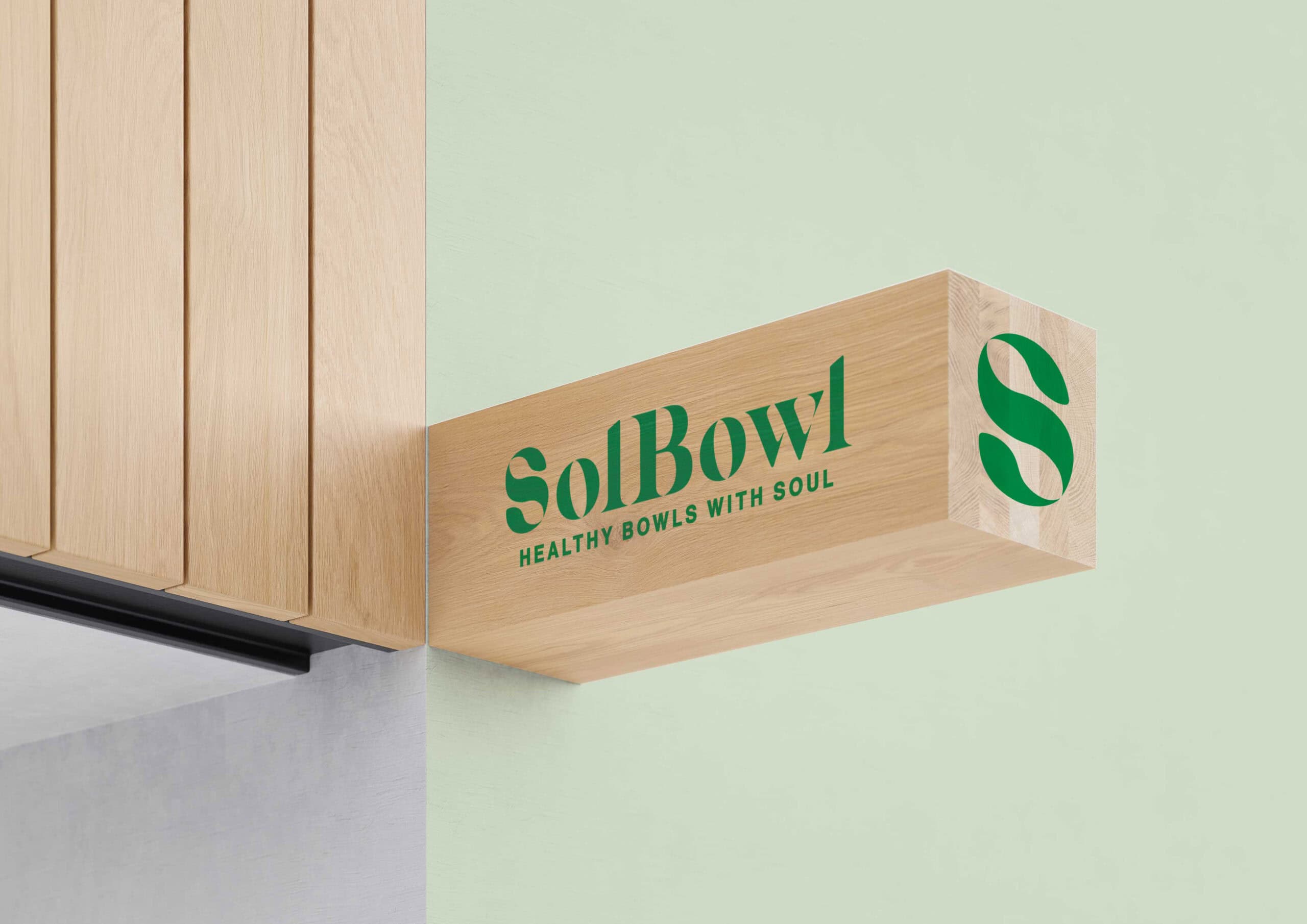
At the centre of the brand identity is a custom ‘S’ logo marque featuring hidden spoons and leaf forms within the negative space, paired with a customised wordmark and a colour palette inspired by natural ingredients and produce.
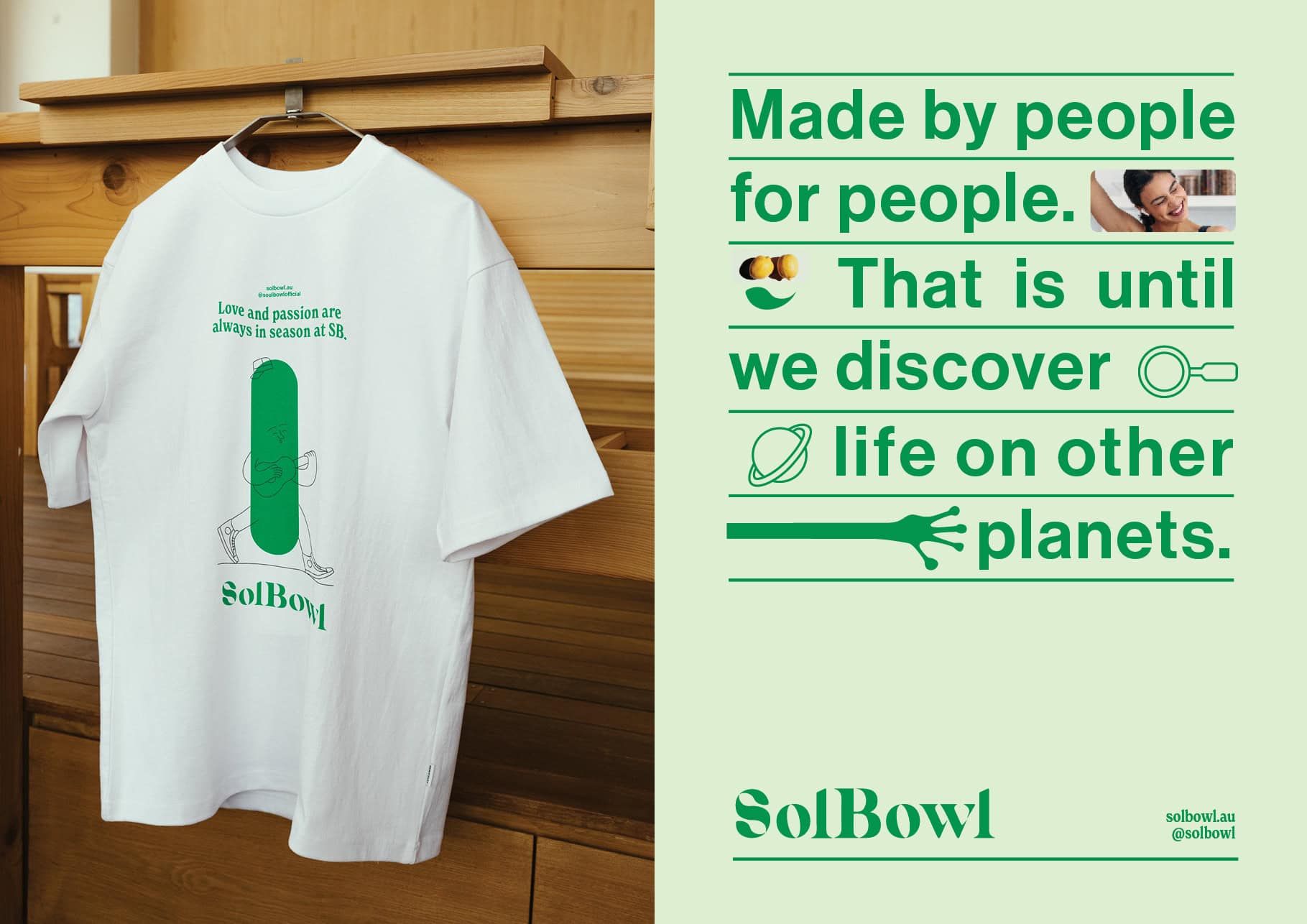
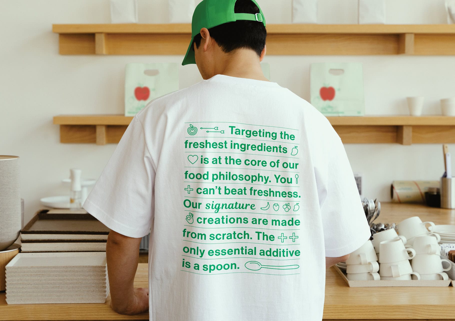
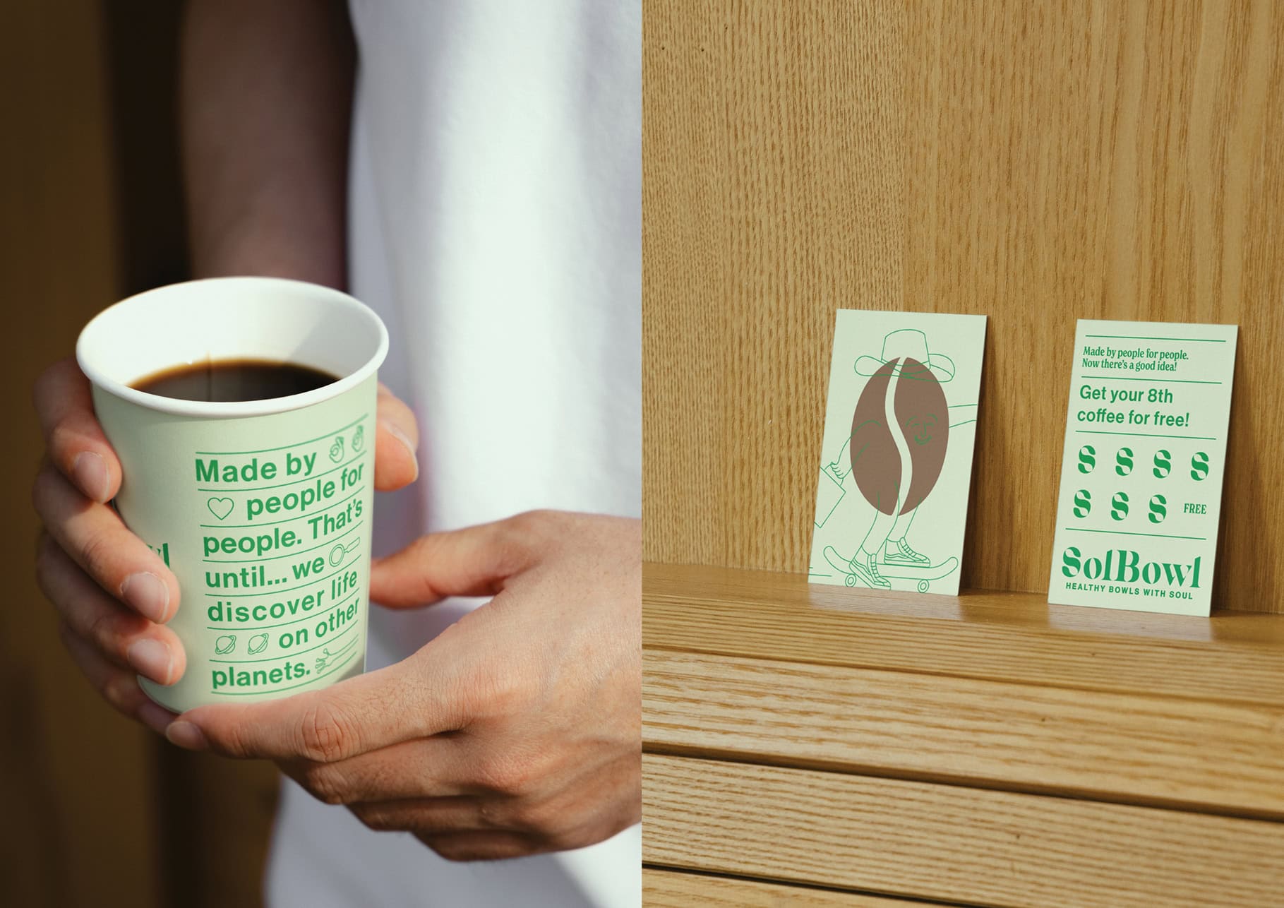
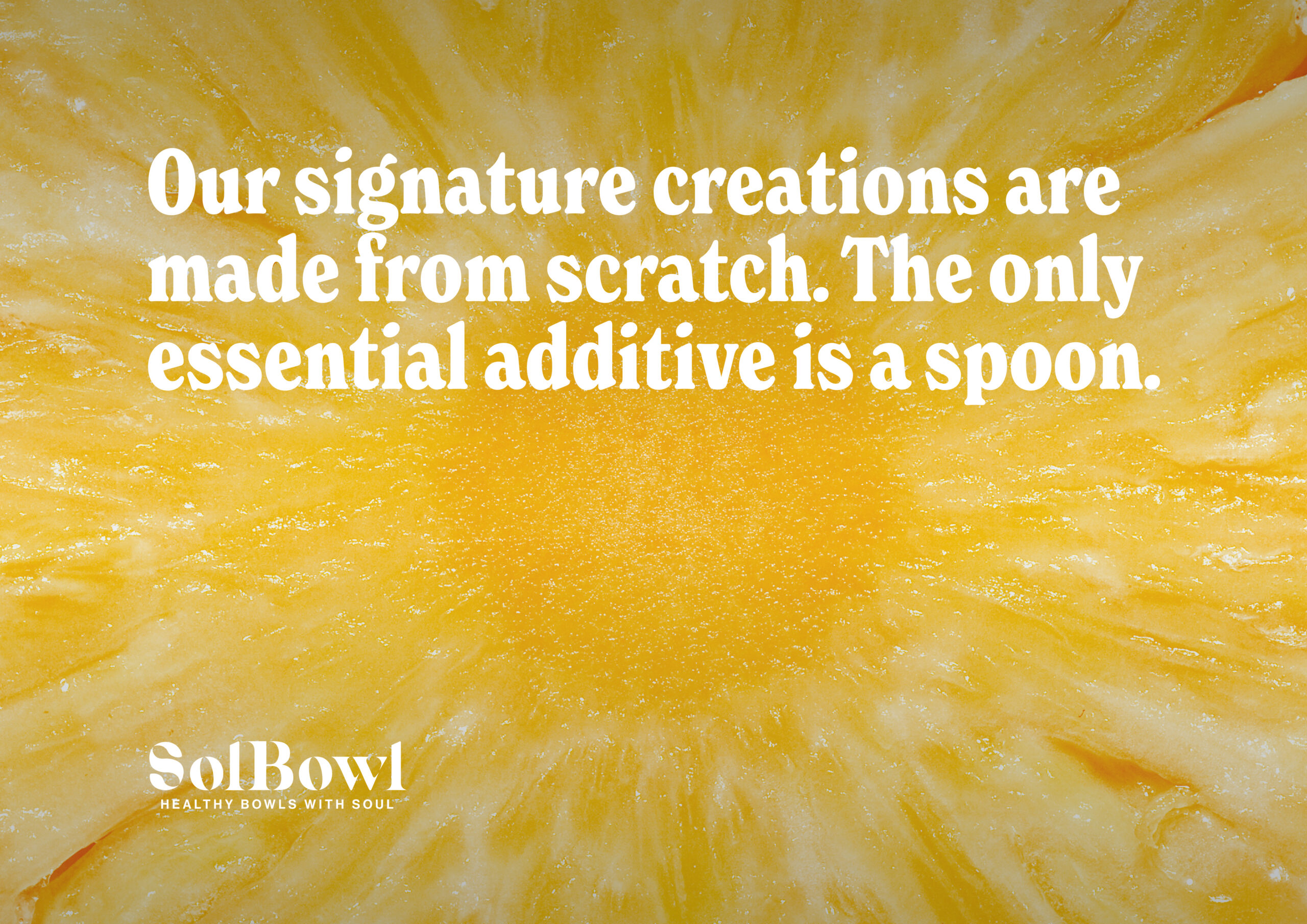
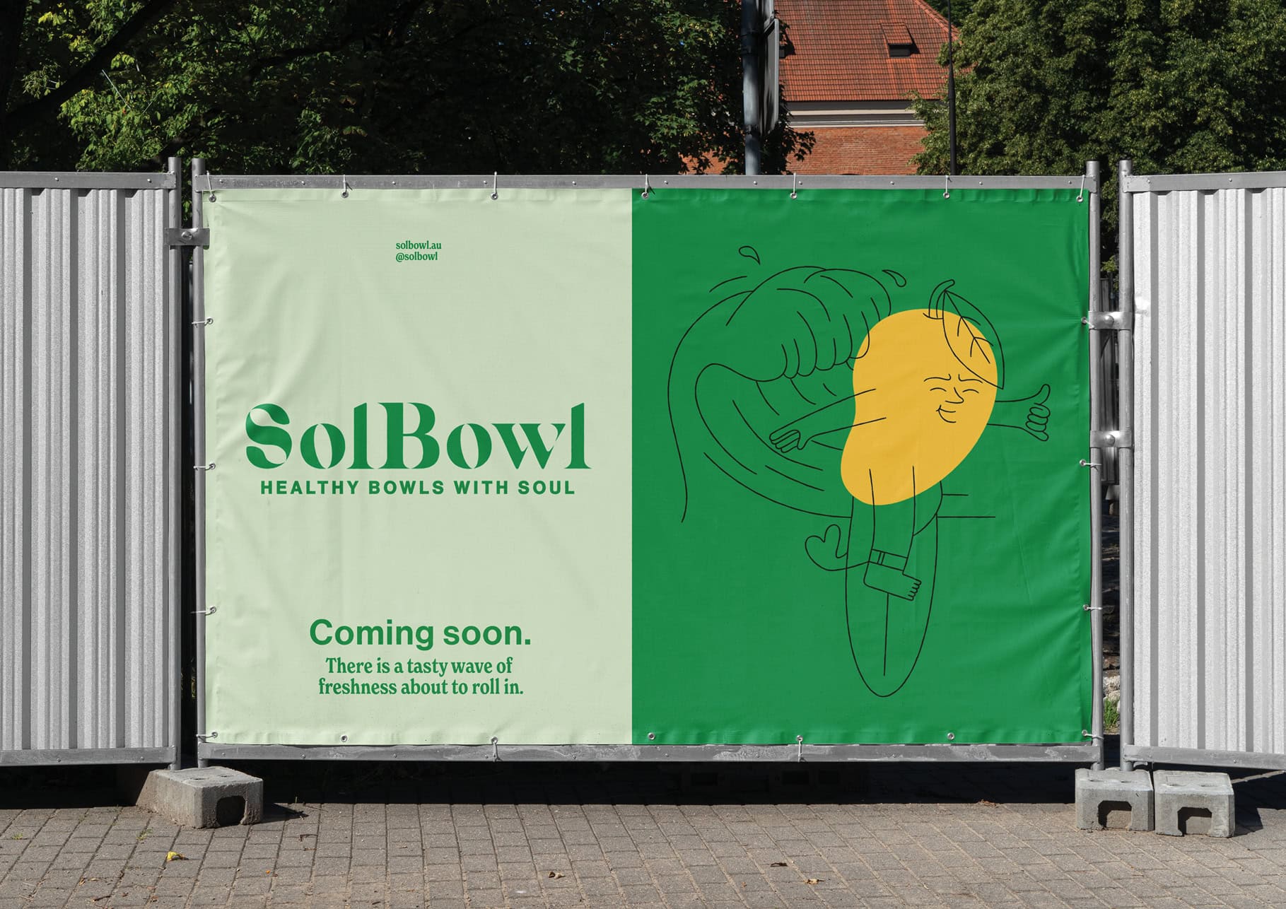
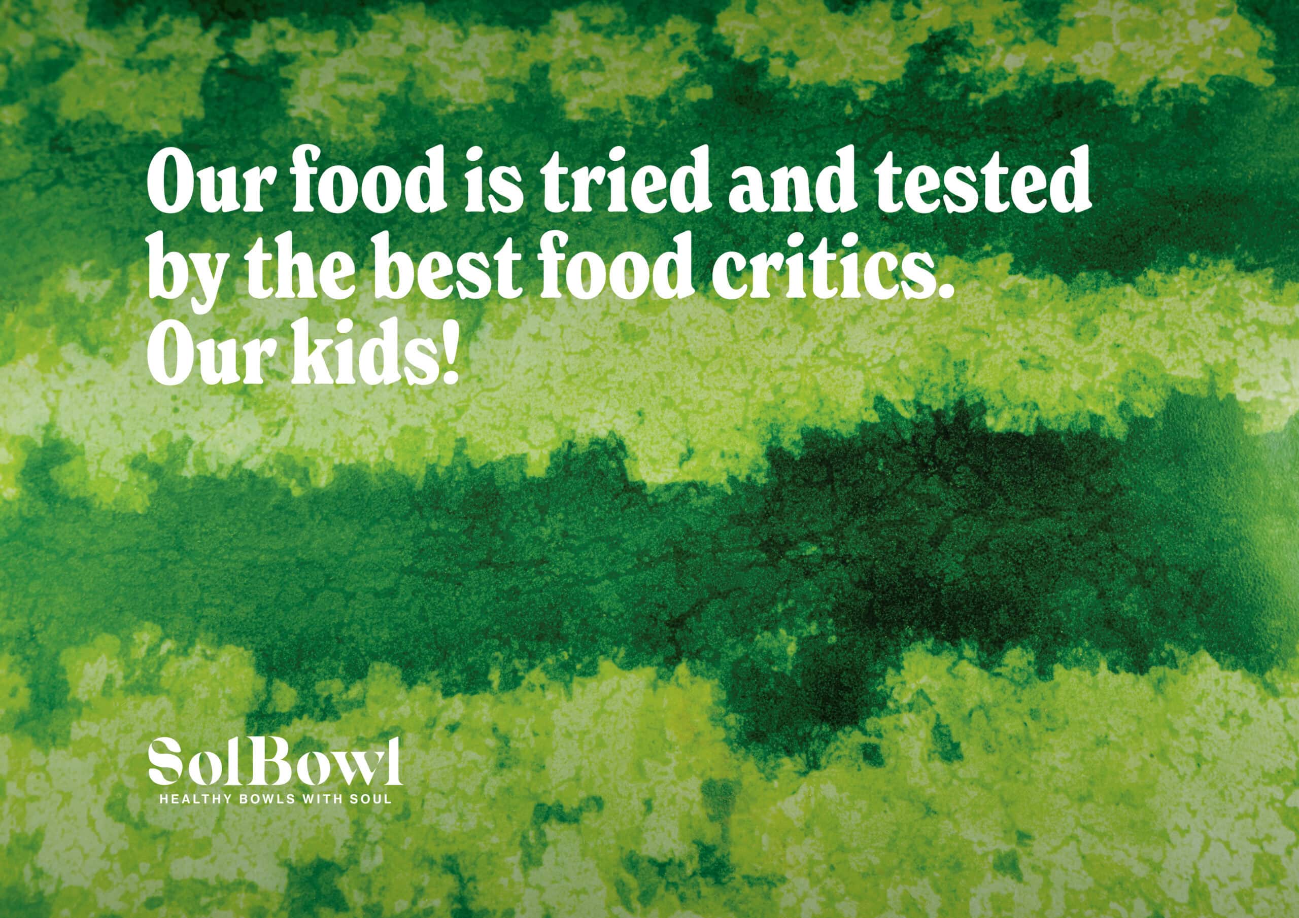
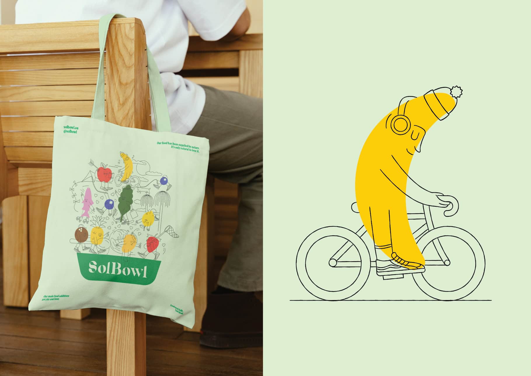
To bring more depth and personality into the system, we developed a series of playful illustrations combining ingredient silhouettes with hand-drawn everyday characters. Expressive copywriting, stacked typography and bold visual elements were used throughout the packaging design to create a more memorable customer experience across every location.
The identity system was designed to work seamlessly across food packaging, signage, uniforms, interiors, website applications and environmental graphics, helping ensure consistency across the growing business.
The Result
The refreshed identity transformed Sol Bowl from a more generic health food brand into a distinctive and memorable hospitality brand with far stronger personality and shelf presence.
The new system gives Sol Bowl the flexibility to scale consistently across physical and digital environments while helping the business feel more contemporary and culturally relevant within an increasingly competitive market.
Most importantly, the refreshed brand captures what made Sol Bowl appealing in the first place: fresh food, made for real people, with genuine soul.


Sol Bowl Brand Identity Refresh
Distinctive QSR Branding with Personality
Client
Sol Bowl
Industry
Healthy Fast Casual / Quick Service Restaurant (QSR)
Expertise
Brand Strategy & Positioning
Brand Identity & Logo Design
Food Packaging Design
Environmental Graphics
Tone of Voice Development
Illustration & Visual Storytelling
Retail & Store Experience
Brand Guidelines