
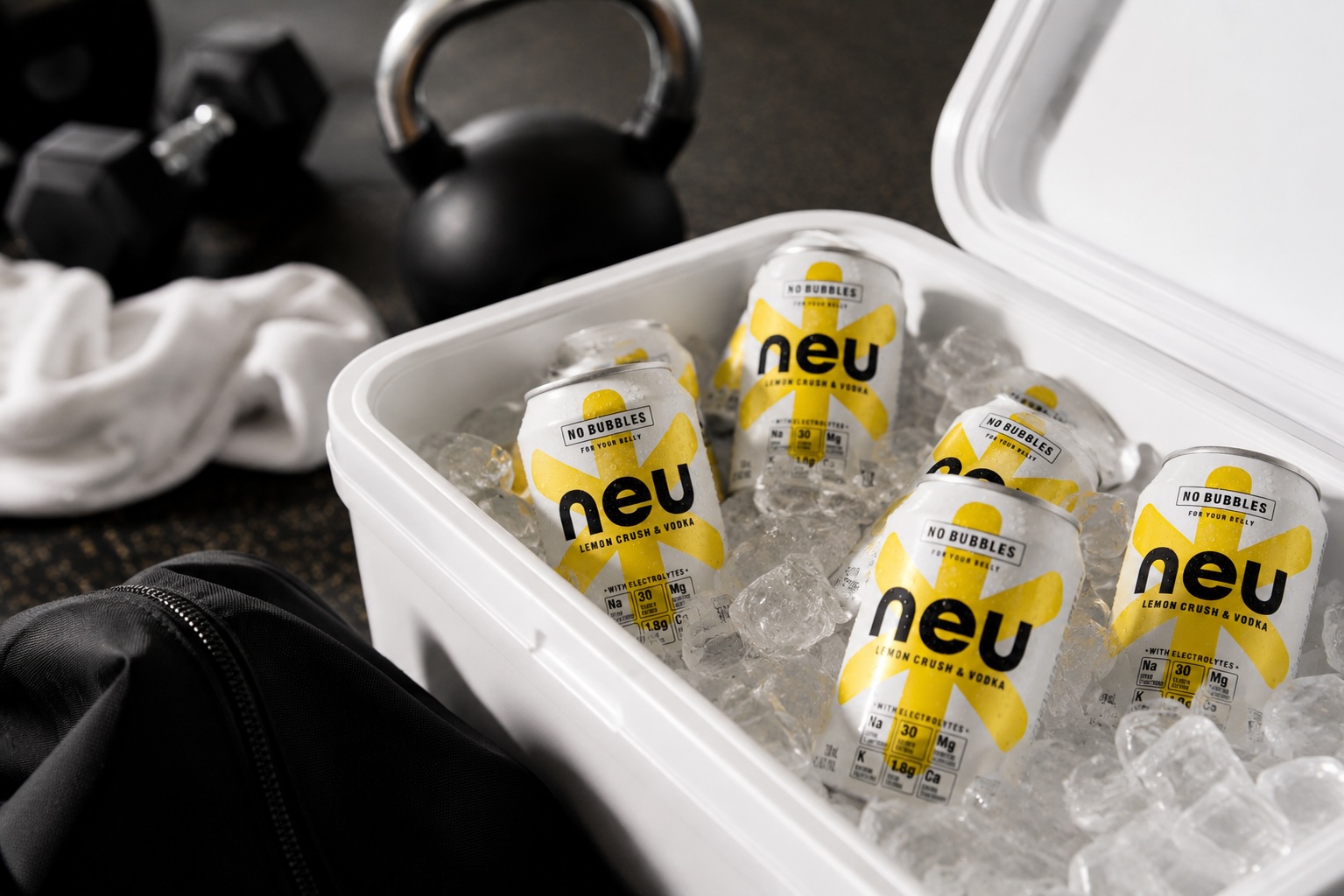
The ready-to-drink category has never been more competitive.
Consumers are faced with more choice than ever before, with every new beverage competing for attention through flavour, packaging design, branding and marketing. Whether they’re choosing RTDs, spirits, wine, beer, coffee, energy drinks or sparkling water, decisions are often made within seconds. In today’s packaging world, standing out has become just as important as what is inside the can.
NEU was created to offer something different.
A premium vodka RTD with a lighter, more considered proposition, NEU challenged many of the conventions that define the category. Our role was to create a distinctive visual identity and packaging design that helped consumers instantly understand what made the product different while navigating the strict regulations surrounding alcohol marketing.
The result is a distinctive alcohol packaging design that earns attention on shelf, creates immediate recognition and provides a scalable platform for long-term business growth.
The Challenge
Creating a new RTD is one thing. Creating one that introduces a different way of thinking about the category is something else entirely.
NEU wasn’t competing on flavour alone. It offered a lighter, more considered proposition in a category where consumers make decisions quickly and retailers are constantly evaluating new products.
That meant the packaging had to do more than look good.
It needed to explain the proposition within seconds, create immediate shelf presence and build confidence in a completely new brand, all while working within the strict regulations surrounding alcohol marketing. Every aspect of the packaging needed to work harder because consumers had no previous awareness of NEU.
Consumers rarely stop to analyse every label. The packaging needed to communicate what NEU was, who it was for and why it deserved attention almost instantly.
Rather than adding more visual noise to the packaging, we saw an opportunity to remove it.
The Insight
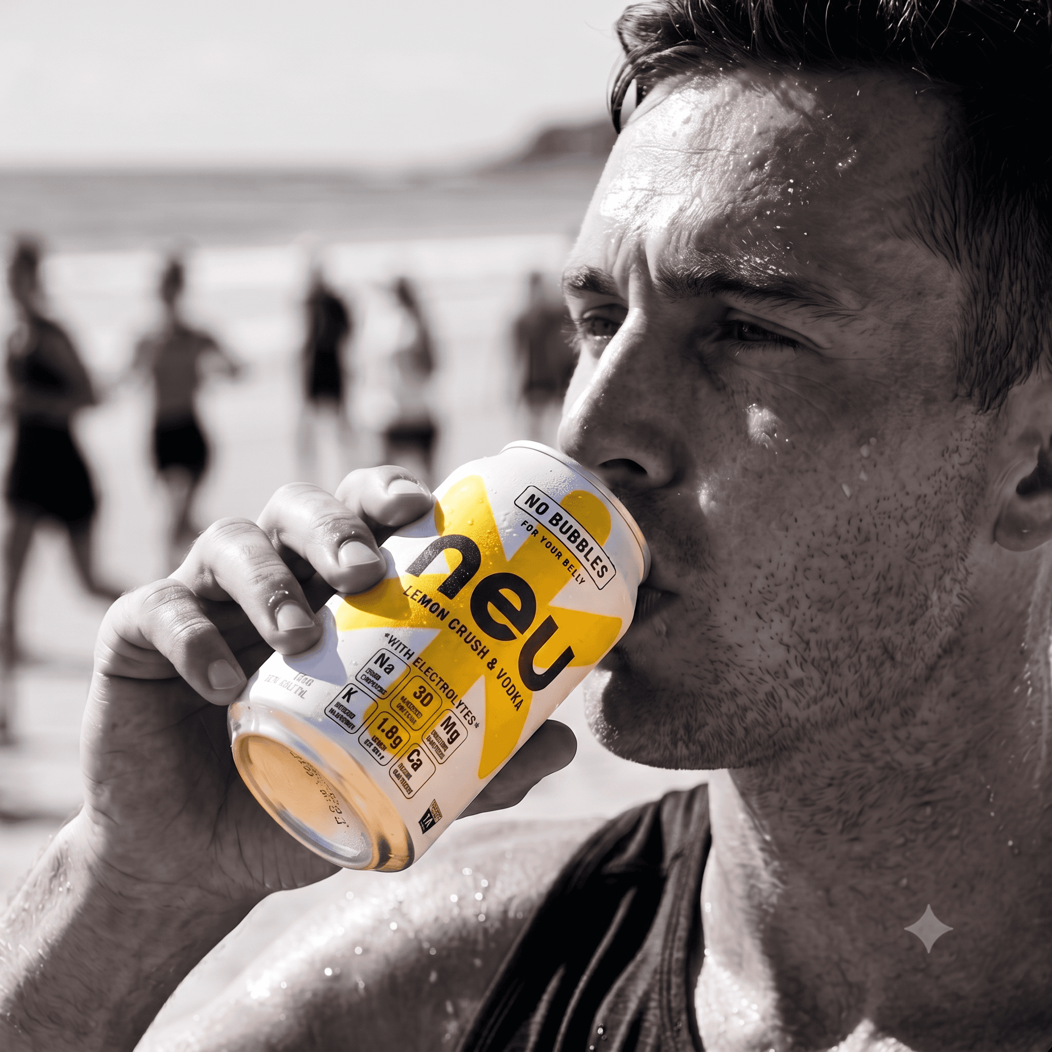
The next generation of drinkers isn’t turning away from alcohol. They’re becoming more intentional about the brands they choose.
Consumers still want to socialise, celebrate and enjoy premium drinks, but they’re increasingly looking for products that reflect a more balanced lifestyle. Simplicity, quality and moderation now influence purchase decisions alongside flavour and occasion.
Yet many competitors in the RTD category continue to communicate in the same way.
High-energy branding. Busy packaging. Bigger claims.
That created an opportunity.
Rather than following established category conventions, NEU could speak to a different audience through confidence, restraint and clarity. Instead of competing by saying more, the brand could create distinction by saying less.
The Creative Solution
The project encompassed brand identity, alcohol packaging design, graphic design, artwork and creative direction, creating a cohesive packaging system from strategy through to execution.
Every creative decision was guided by one objective: make the proposition immediately understandable.
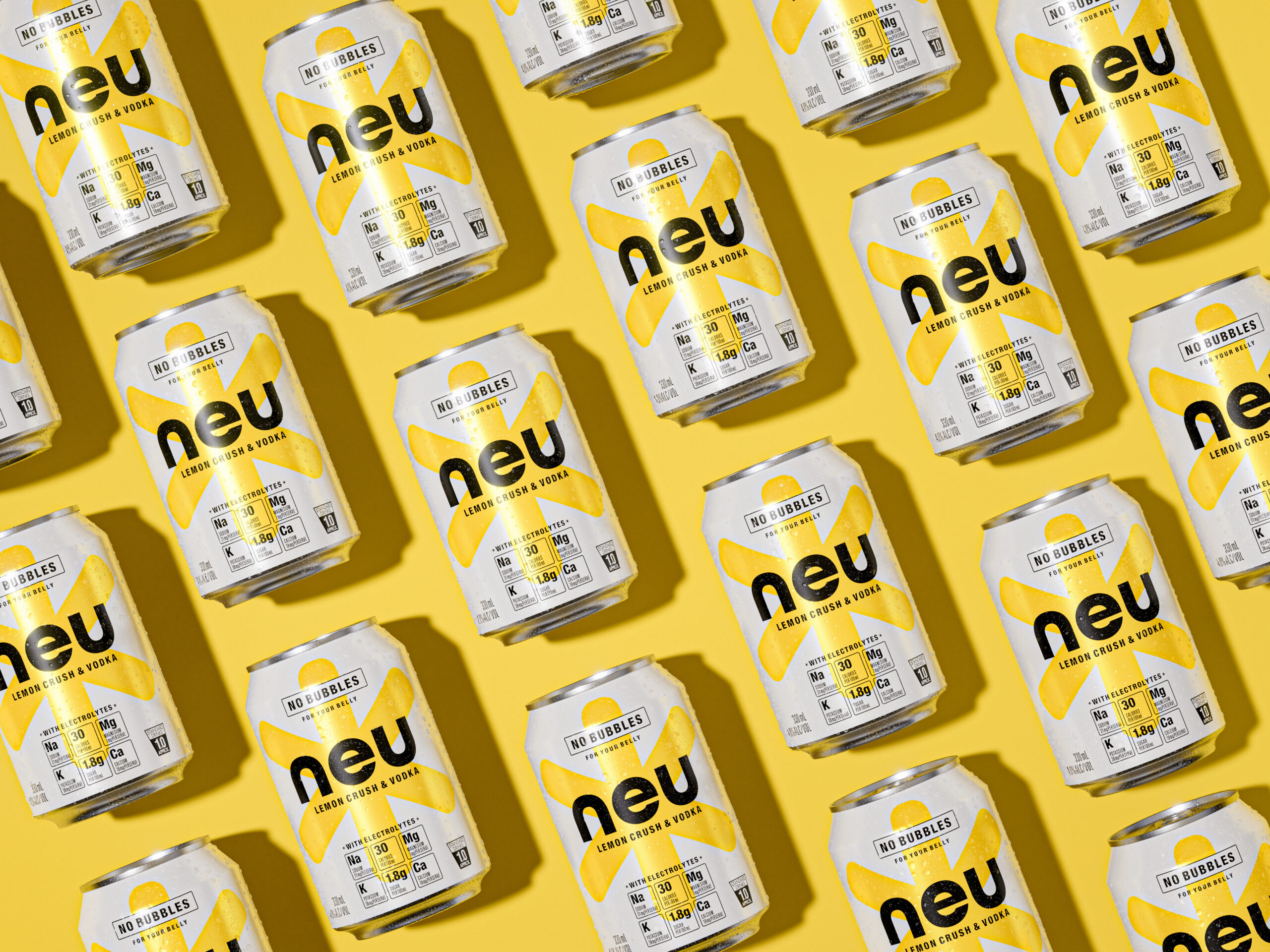
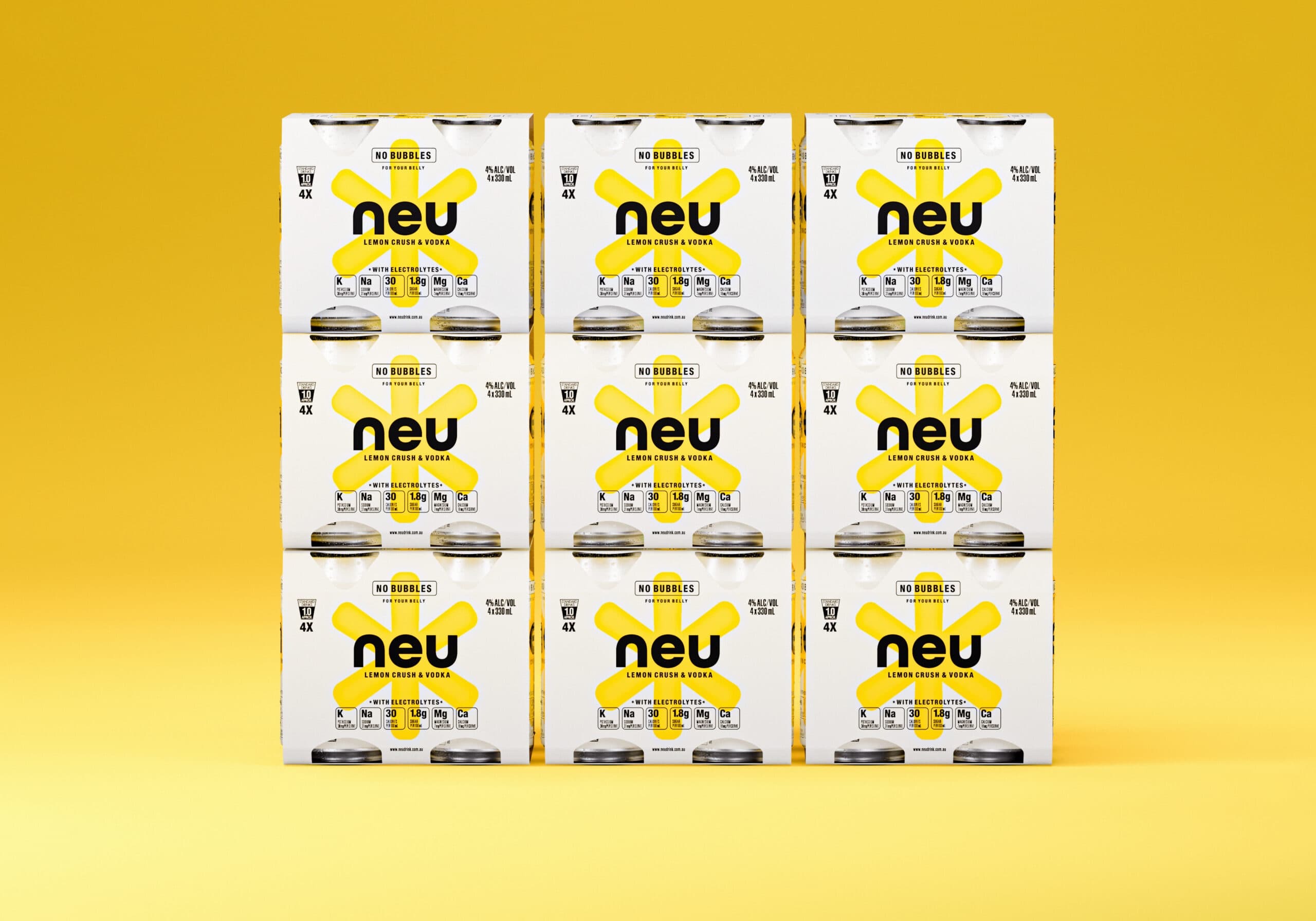
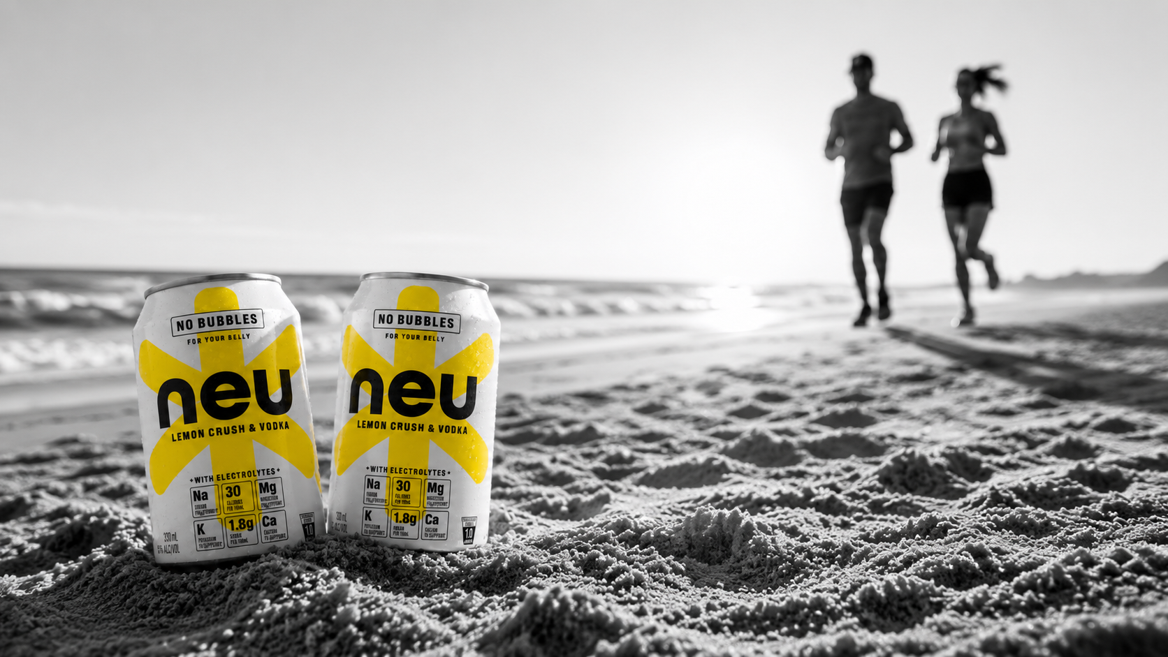
The visual identity embraces simplicity, allowing the product to become the hero. A crisp white base creates immediate contrast within the category, while bold typography and a disciplined information hierarchy ensure the key messages are understood within seconds.
The oversized yellow graphic device gives NEU a distinctive, ownable asset that captures attention from a distance while creating consistency across future ranges. Together with restrained typography and generous white space, the identity feels premium, contemporary and refreshingly uncomplicated.
Rather than competing through louder graphics or more claims, the system focuses on clarity. Every element, from the logo and typography through to colour, artwork and layout, was developed to work together, helping consumers understand the proposition quickly while creating a distinctive presence on shelf.
More importantly, the identity was created as a scalable system rather than a one-off launch.
As the business grows, it can flex across future products, flavours and innovations while maintaining consistent quality, strong shelf recognition and a clear connection with consumers. The flexible structure allows future cans and limited editions to retain the same visual personality while protecting long-term recognition as the range continues to evolve.
The Result
The strategy translated into strong commercial results from launch.
Launching initially within a concentrated group of Eastern Sydney retailers helped the business build visibility before expanding distribution, creating momentum where it mattered most and building confidence with both retailers and customers.
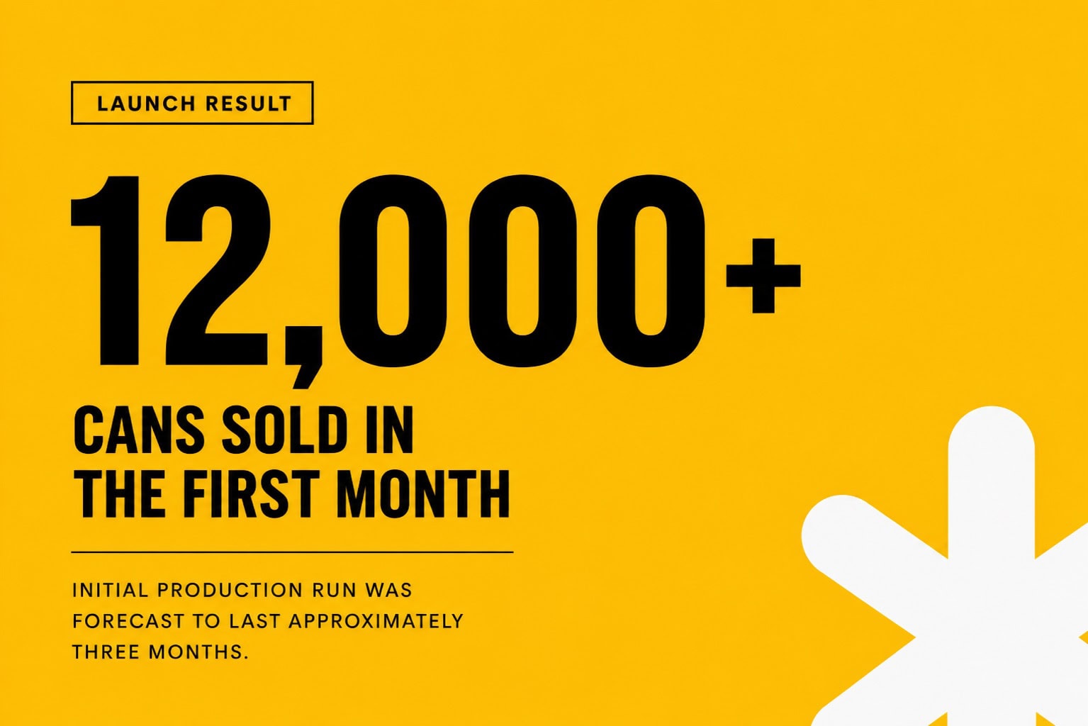
Within the first month, more than 12,000 cans were sold despite the initial production run being forecast to last approximately three months.
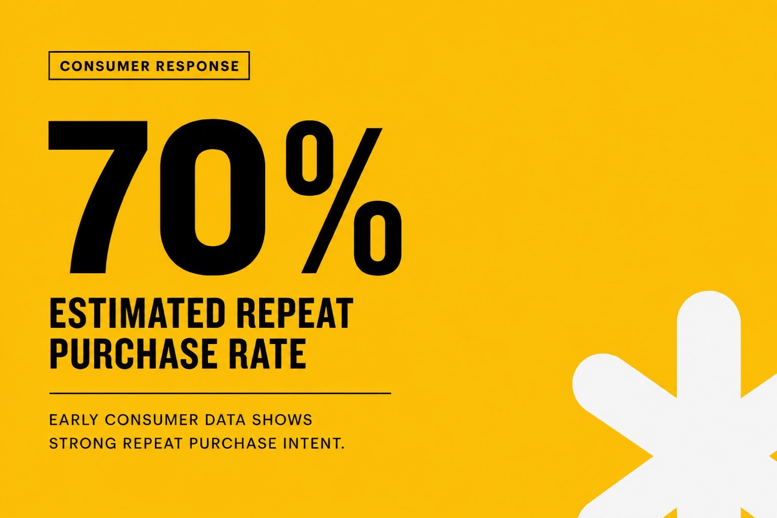
Early consumer data also indicated an estimated 70% repeat purchase rate, suggesting the proposition resonated well beyond initial curiosity and laying the foundations for long-term customer loyalty.
NEU demonstrates how strategic alcohol branding and alcohol packaging design can transform product innovation into commercial success. By aligning strategy, visual identity and beverage packaging, the project created a distinctive presence that captured attention, encouraged trial and established a strong platform for future growth through considered alcohol packaging.
For a new brand entering one of Australia’s most competitive categories, it represents a strong start and reinforces the value of creating a clear proposition that consumers can understand at a glance.
“The Creative Method understood the opportunity from the very beginning. They didn’t just design packaging; they created a brand that clearly communicated what made NEU different, with a premium, contemporary look and feel that cuts through in a highly crowded vodka RTD category and stands out on shelf. The response from consumers and retailers has exceeded our expectations.”
– Paolo Marinoni, CMO at NEU
NEU Alcohol Branding & Drinks Packaging Design
Creating a distinctive RTD packaging design for a new generation of mindful drinkers.
Client
NEU
Industry
Alcohol / RTD / Drinks Packaging and Banding
Expertise
Brand Positioning
Brand Identity
Alcohol Packaging Design
Creative Direction