The Challenge
Henrietta was the bold new charcoal chicken concept from MKR star Ibby Moubadder – built on real flavour, real hospitality and real neighbourhood energy. But entering an increasingly saturated charcoal chicken landscape meant the brand needed more than great food. It needed a character – a personality that could lead the category rather than blend into it.
Most chicken brands rely on flames, feathers or farmyard clichés. Henrietta needed an identity that captured the human warmth behind the food, expressed Ibby’s cheeky confidence, and carved out a space that felt stylish, contemporary and full of heart.


The Insight
Henrietta wasn’t just another chicken shop. She was a muse – a character inspired by the spirit of the brand and the people behind it. The name already hinted at personality; our job was to bring that personality to life with authenticity and charm.
Rather than focusing on functional cues (charcoal, marination, technique), we realised the emotional edge lay in crafting a brand world that felt lived-in, expressive and full of story. A brand that made people smile, lean in and want to discover more.
In a sea of sameness, character becomes the competitive advantage.


The Creative
We developed a character-led identity with a playful twist.
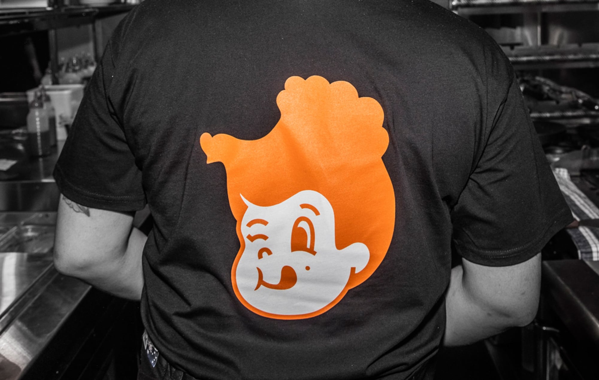
At the heart of the visual identity is Henrietta herself – a modern, charismatic figure who embodies the brand’s warmth and wit. The illustration is simple but full of attitude, with one extraordinary detail that rewards a closer look: a chicken, cleverly hidden in her hair.
This “discoverable moment” became a signature element of the brand’s semiotics – a visual wink that captures the brand’s humour and craft. It transforms Henrietta from a static icon into a piece of storytelling. Customers notice it unexpectedly, smile, then point it out to someone else. That small moment of joy becomes part of the brand experience.
This hidden chicken also reinforces a deeper truth: Henrietta isn’t a mascot; she’s the keeper of the flame – the spirit of the kitchen, the character who brings the brand to life.

A visual system designed with flavour and attitude
– Strong black-and-white contrast reflects the char and smoke of charcoal cooking.
– Organic, hand-crafted shapes echo culinary movement, texture and the human art of preparing food.
– Bold typography delivers confidence with a wink – clear, stylish and full of personality.
The overall system feels modern without losing warmth; expressive without losing control; crafted without becoming precious.

Packaging that talks as much as it tastes
Henrietta’s packaging world is bold, humorous and unmistakably her. Playful copy and expressive layouts turn every box, bag and cup into a piece of branded theatre. More than generic containers, they’re mini storytelling canvases that extend Henrietta’s personality into every customer’s hands.
A tone of voice with charm, cheek and confidence
Henrietta speaks like someone you’d want at your table – warm, witty, genuine. The tone balances sophistication with street-level charm, reinforcing the brand’s position as a modern, personality-led charcoal chicken experience.


The Results
Henrietta now owns a distinctive and emotionally resonant space in the charcoal chicken category.
– A character-led brand world customers instantly connect with
– Highly memorable packaging and identity, reinforced through the hidden chicken detail
– A scalable system ready for future stores, digital campaigns and new product lines
– Clear differentiation in a market saturated with generic chicken cues
Henrietta isn’t just a place to eat – she’s a personality customers return to again and again that has allowed the brand to extend from Surry Hills to Bondi Beach and Parramatta.

“There are a few things that we are certain of when we open a new venue and one of them is that we will use The Creative Method for our branding.
“Not only do we like the work they do, but we love the process from start to finish. It is exciting and the results are always outstanding.
“Tony and his team are a bunch of creative geniuses which is why we always get incredible results, memorable branding and we come back again and again.”
Ibby Moubadder, Restauranteur

For more Esca brands, visit esca.group/
Henrietta Brand & Packaging – Charcoal Chicken with Character
Client
Henrietta
Industry
Fast Casual Restaurant
Our Work
Brand Strategy
Brand Identity & Logo Design
Visual Language & Illustration
Packaging Design
Tone of Voice & Copywriting
Signage & Environmental Graphics
Menu Design
Uniform Design
Website Design
Systems Guidelines for Rollout
Region
Surry Hills, Sydney
