
The Challenge
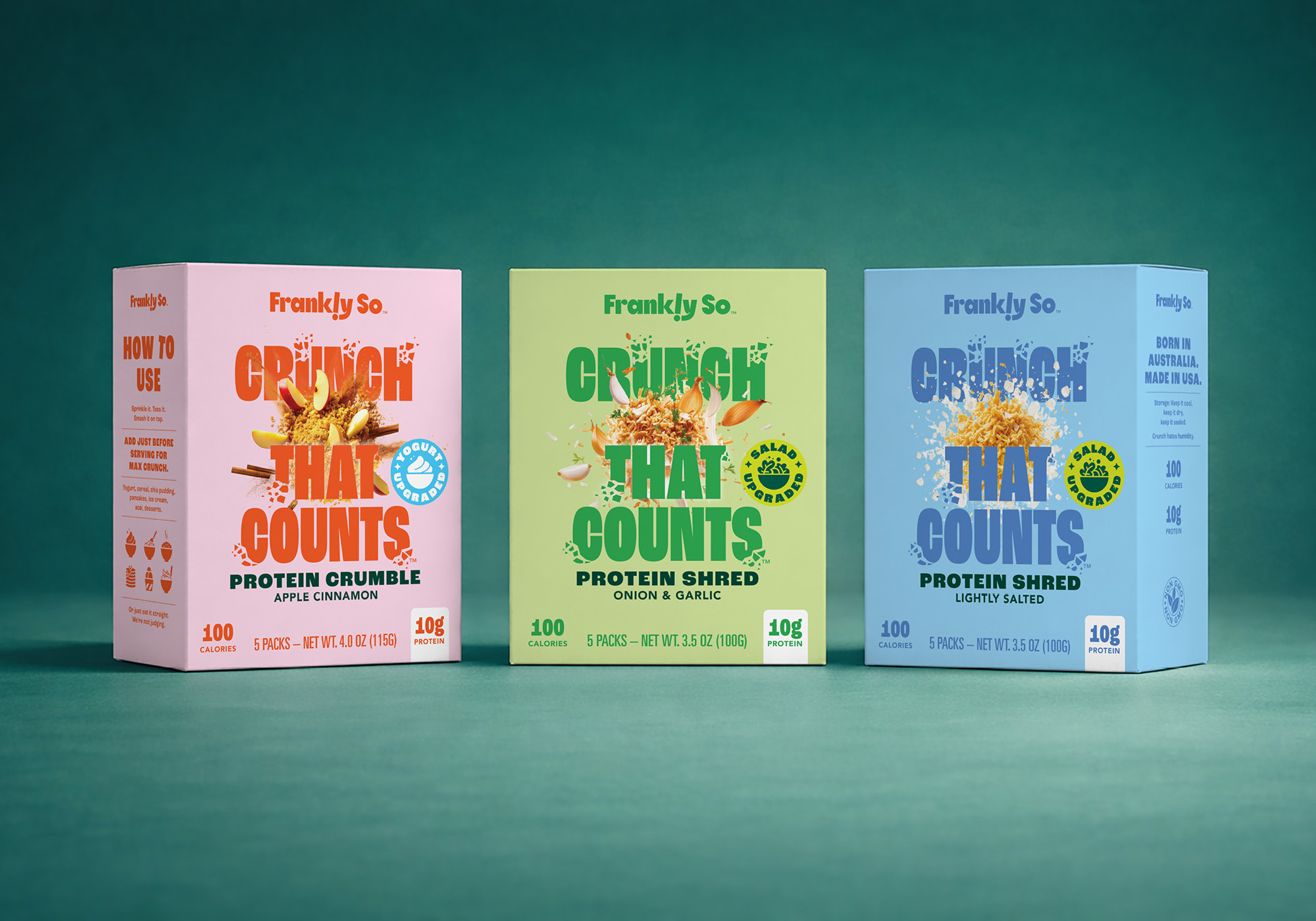
Harvest B approached The Creative Method with a clear ambition: create a distinctive, lifestyle-led food brand that challenged the conventions of the functional food category.
Designed for the US market, Frankly So was conceived by the Harvest B team for people who care about what they eat but have little interest in being lectured about it. Confident, culturally aware and refreshingly direct, their vision was for Frankly So to feel more like a lifestyle brand than a traditional protein product.
Our challenge was to translate that philosophy into a visual identity and packaging design system capable of standing out in an increasingly crowded market, while creating a flexible platform that could stretch across future product formats, flavours and occasions. The brand needed to disrupt category conventions and capture attention, while still communicating the product offer quickly and clearly.
The Insight
Harvest B came to us with a clear understanding of the opportunity. While functional benefits play an important role in the category, many brands still communicate primarily through product credentials, nutritional claims and technical language.
Frankly So was built on a different belief: people don’t need a lecture to make healthier choices. They don’t need to subscribe to a wellness philosophy. They simply want products that fit naturally into their lives and help them achieve their goals.
Our role was to bring that thinking to life through the brand identity and packaging design. Rather than talking like a nutritionist, Frankly So would talk like a person.
Every element of the brand was designed to balance distinctiveness with clarity, helping consumers quickly understand the offer while creating a more memorable and engaging brand experience.
The Creative Solution
We developed a bold and distinctive brand identity that brings Harvest B’s vision for Frankly So to life through a straightforward, confident visual language.
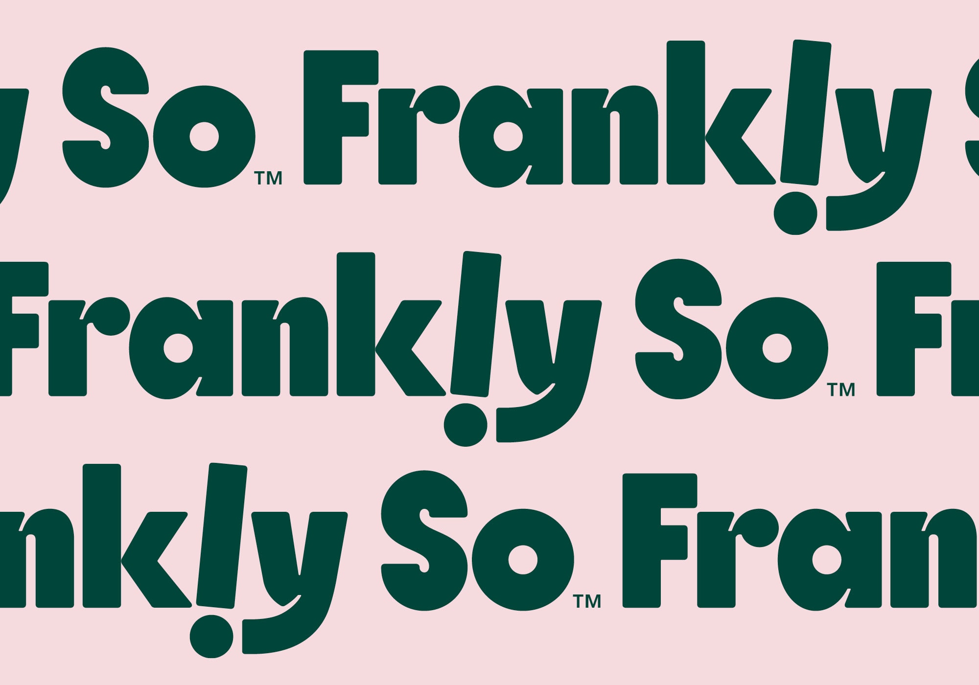
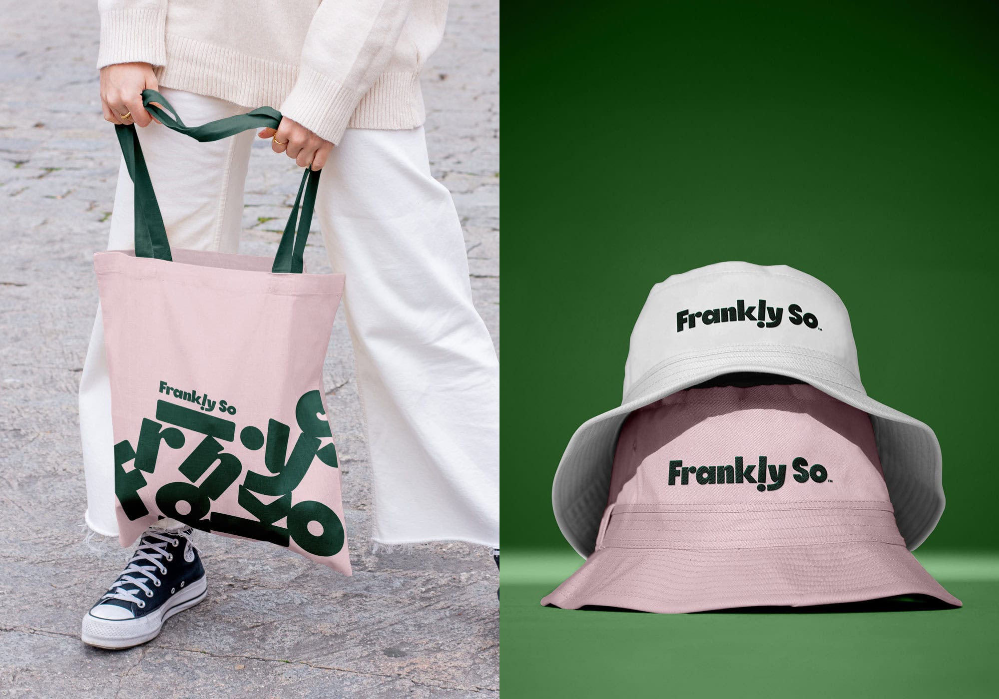
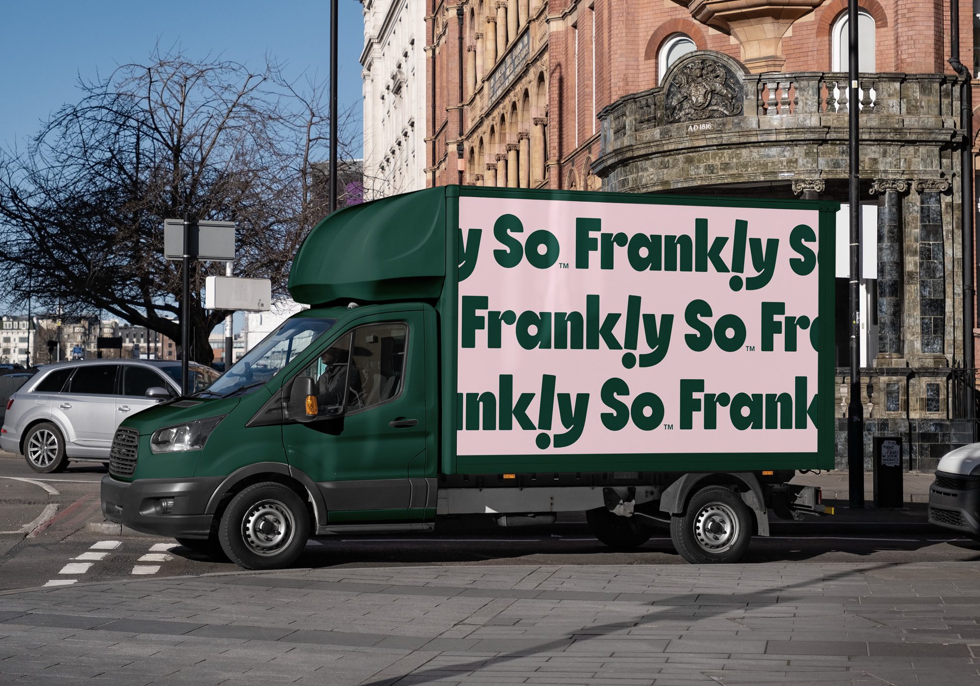
At the heart of the system is a playful yet assured wordmark, featuring punctuation-inspired details that reinforce the conversational nature of the brand. Simple, memorable and highly recognisable, it provides a strong foundation across packaging, digital and retail touchpoints.
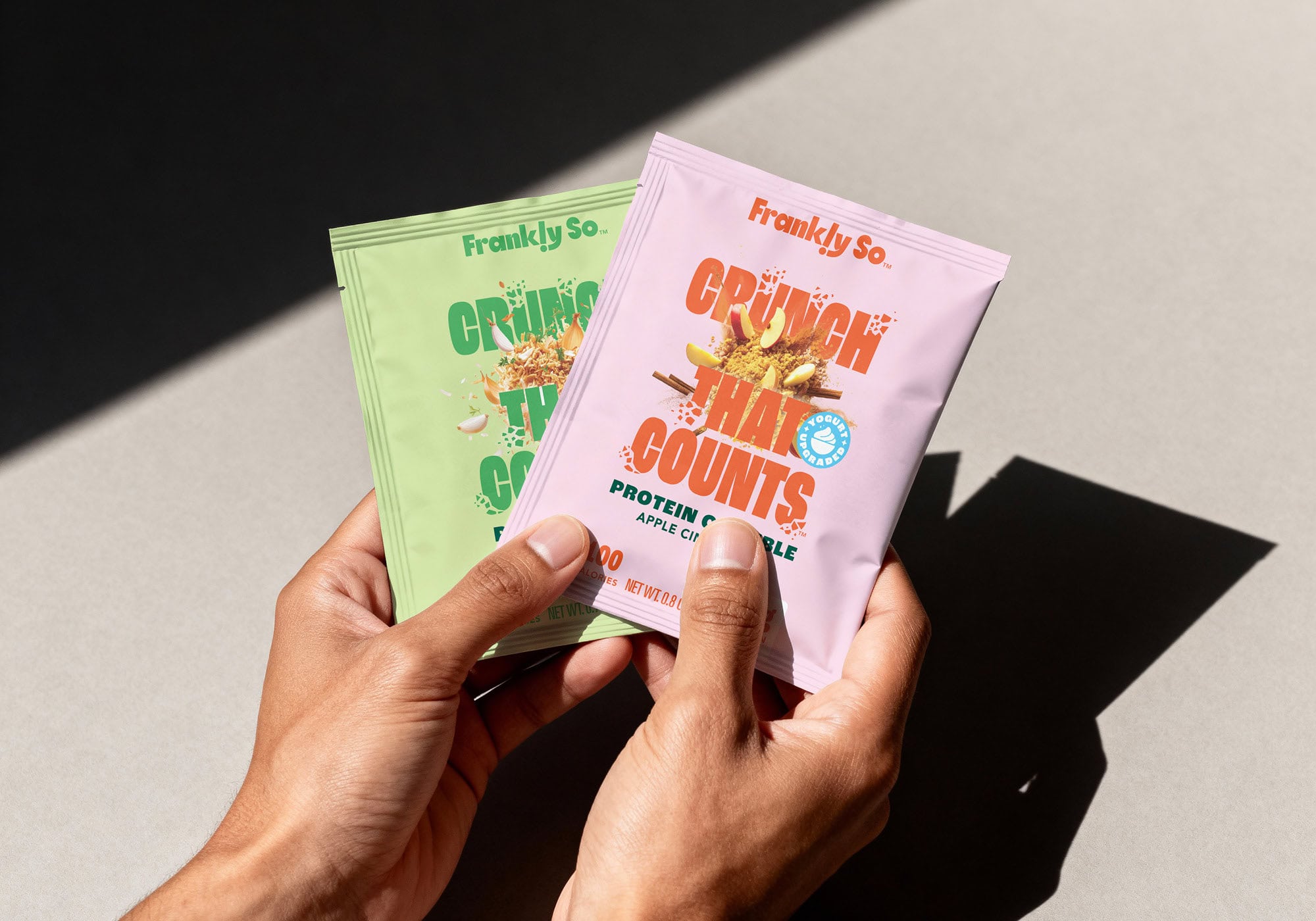
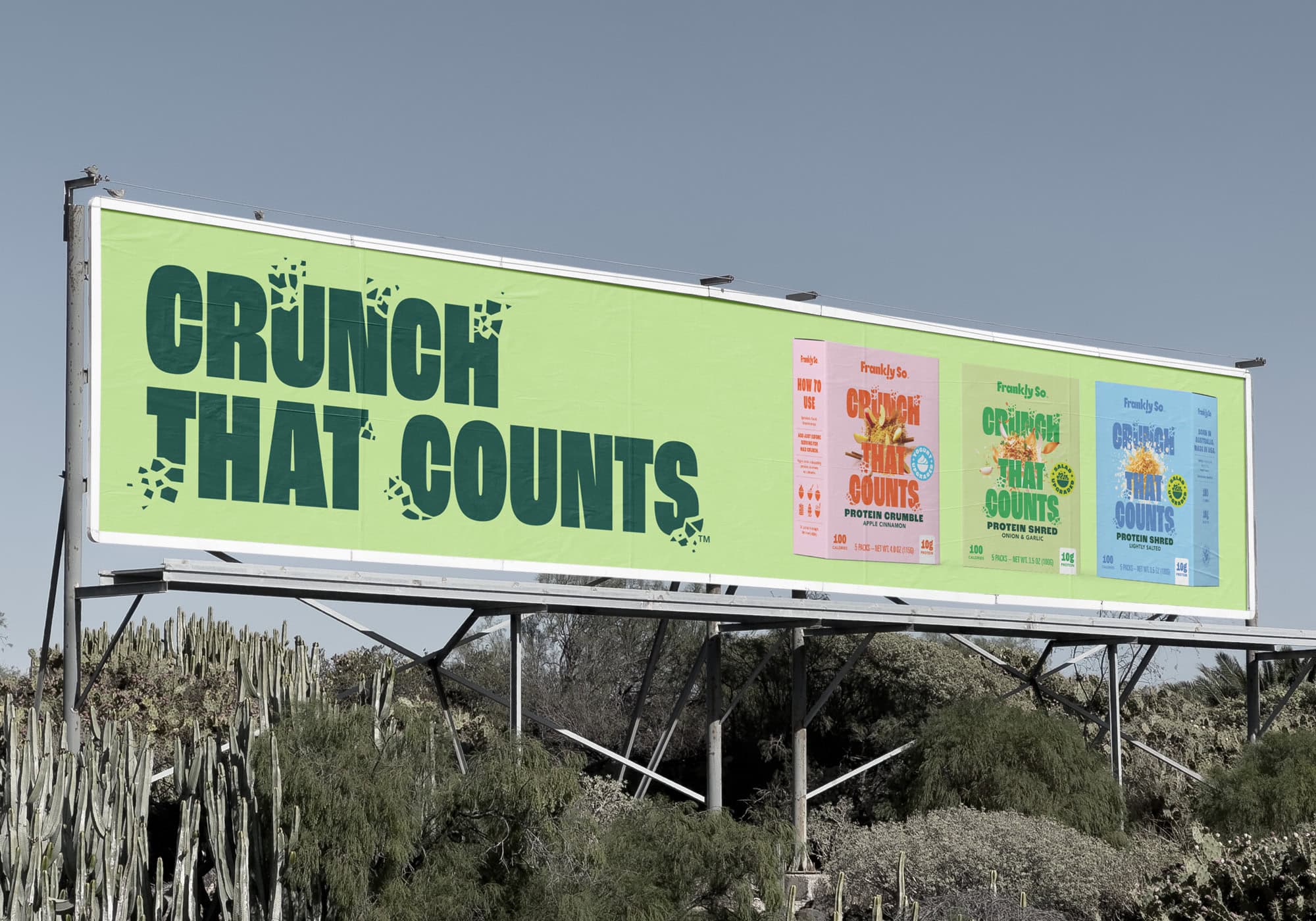
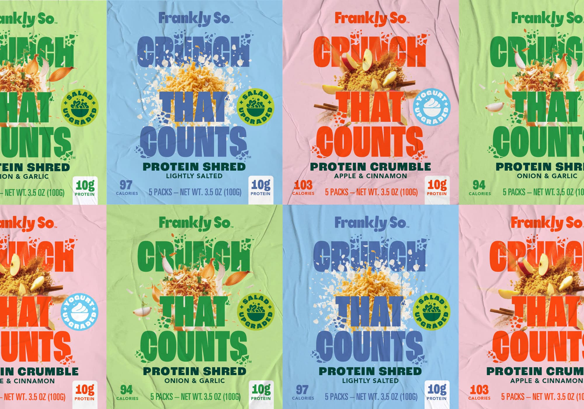
The packaging design embraces a deliberately single-minded approach to communication. Rather than competing for attention through multiple claims and nutritional callouts, each product focuses on one clear idea delivered with confidence and impact. By moving away from many of the visual cues commonly found throughout the category, the system creates strong shelf presence while helping consumers quickly understand the product proposition.
Oversized typography, vibrant colour palettes and straightforward messaging balance disruption with clarity. Product benefits are communicated simply, while appetite appeal and bold graphic elements inject energy and personality into the range.
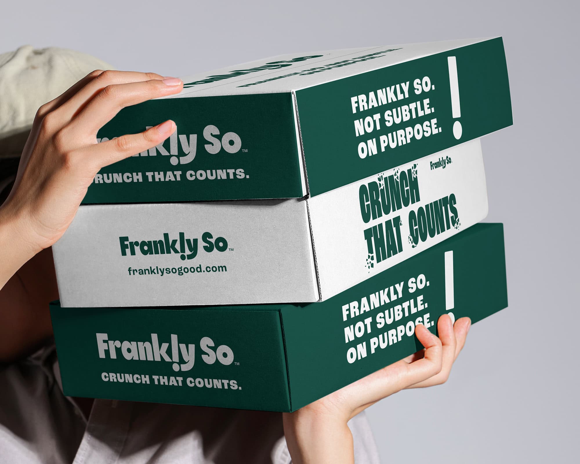
A flexible packaging system was developed to support future flavour extensions, product formats and category growth, giving Harvest B a strong platform for the brand to scale while maintaining a consistent and distinctive presence.
The result is a food packaging design system that feels refreshingly direct. Confident without being preachy. Functional without feeling clinical. A brand that brings Harvest B’s original vision to life through personality as much as product.
The Result
The Results
Frankly So entered the US market with a brand built to compete in a fast-moving and increasingly crowded category.
For Harvest B, the launch marked the beginning of a broader ambition for Frankly So, with a brand designed to move beyond a single product and grow into new formats, flavours and occasions.
Frankly So Brand Identity & Packaging Design
A bold new functional food brand designed for the US market
Client
Harvest B
Industry
Food & Beverage | FMCG | Functional Foods
Expertise
Brand Identity
Logo Design
Packaging Design
Visual Identity
FMCG Branding
Copywriting