
The Challenge
Walk into almost any fried chicken restaurant and you’ll find the same visual language. Bold reds. Script logos. Stars, stripes and Americana. Every restaurant wants to feel authentic, yet many end up looking remarkably similar.
Flappy’s had the opposite problem.
The food was anything but generic. Inspired by the flavours and traditions of Louisiana and refined over years of relentless experimentation, the business had built a loyal following around exceptional fried chicken. The food had earned a loyal following, but the restaurant brand needed to work just as hard.
As the business continued to grow, Flappy’s needed a more distinctive brand identity that reflected the quality of the product and created a stronger first impression. A successful restaurant brand needs to do more than look good. It needs to communicate its brand personality, meet customer expectations and create an emotional connection that turns first-time visitors into loyal customers.
More than a logo refresh, Flappy’s needed a cohesive visual identity that could maintain brand consistency across packaging, menu design, signage, interiors, social media, online ordering and future store rollouts.
The Insight
The category doesn’t have a shortage of personality. It has a shortage of distinction.
Our competitor analysis revealed a sea of familiar visual cues. Script logos, bold reds and Americana-inspired graphics dominate the category, making it increasingly difficult for restaurant brands to build recognition. Louisiana heritage often became a visual style rather than a story, with many brands borrowing the same references without creating anything uniquely their own.
The opportunity wasn’t to move away from Louisiana. It was to express it differently.
Rather than creating another American-inspired fried chicken brand, we looked for something only Flappy’s could own.
Fortunately, it was already there.
Behind the business was a founder who had spent years chasing the perfect Louisiana-style fried chicken. Travelling through America’s southern food scene, learning from neighbourhood institutions and then returning to Australia to obsess over every detail of the recipe, he’d built something with genuine depth. One and a half years perfecting the chicken. Four years refining the gravy. Countless batches, tweaks and late nights.
The story wasn’t something to invent. It was something to reveal.
The Creative Solution
We developed a distinctive restaurant brand identity that reflects the founder’s passion for Louisiana-style fried chicken while creating a memorable experience across every customer touchpoint.
The founder’s story became the thread that connects the entire identity. His relentless pursuit of the perfect recipe informed the messaging, brand voice and personality, giving customers something to connect with beyond the food itself.
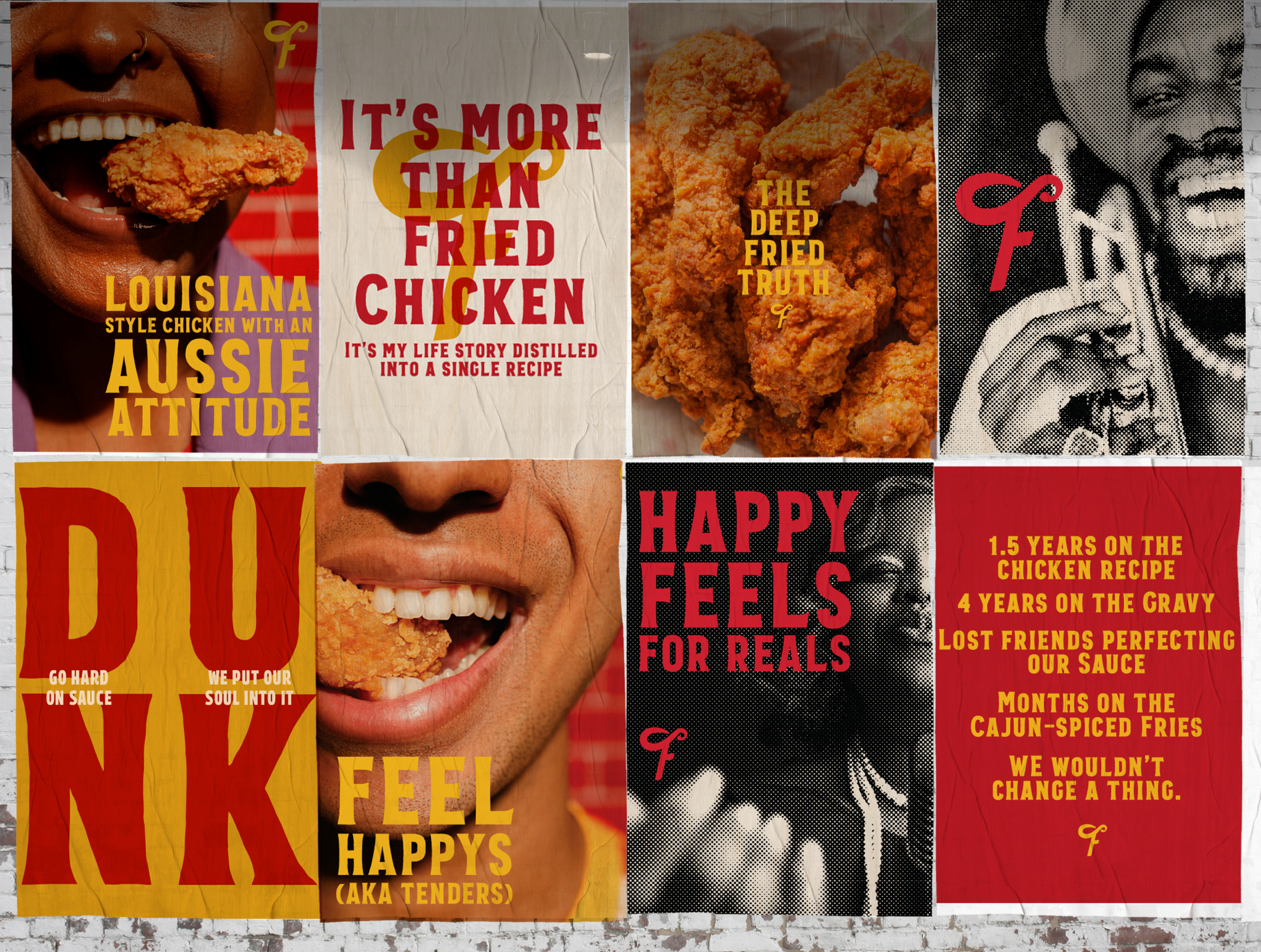
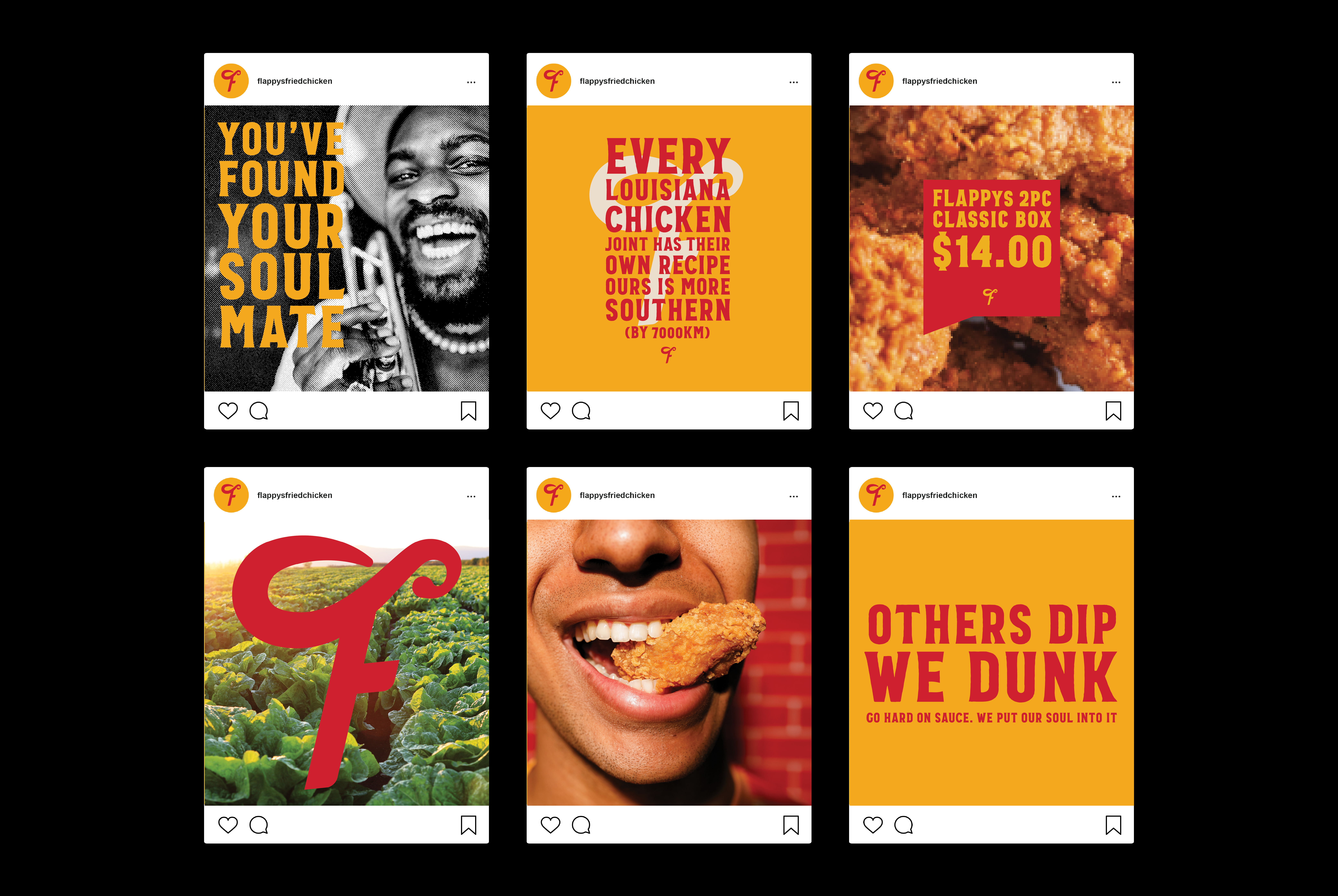
Visually, the identity draws inspiration from the energy, craft and culture of Louisiana rather than its stereotypes. Hand-painted signage, neighbourhood eateries, vintage print ephemera and local music culture influenced an expressive visual language that’s authentic, confident and unmistakably Flappy’s.
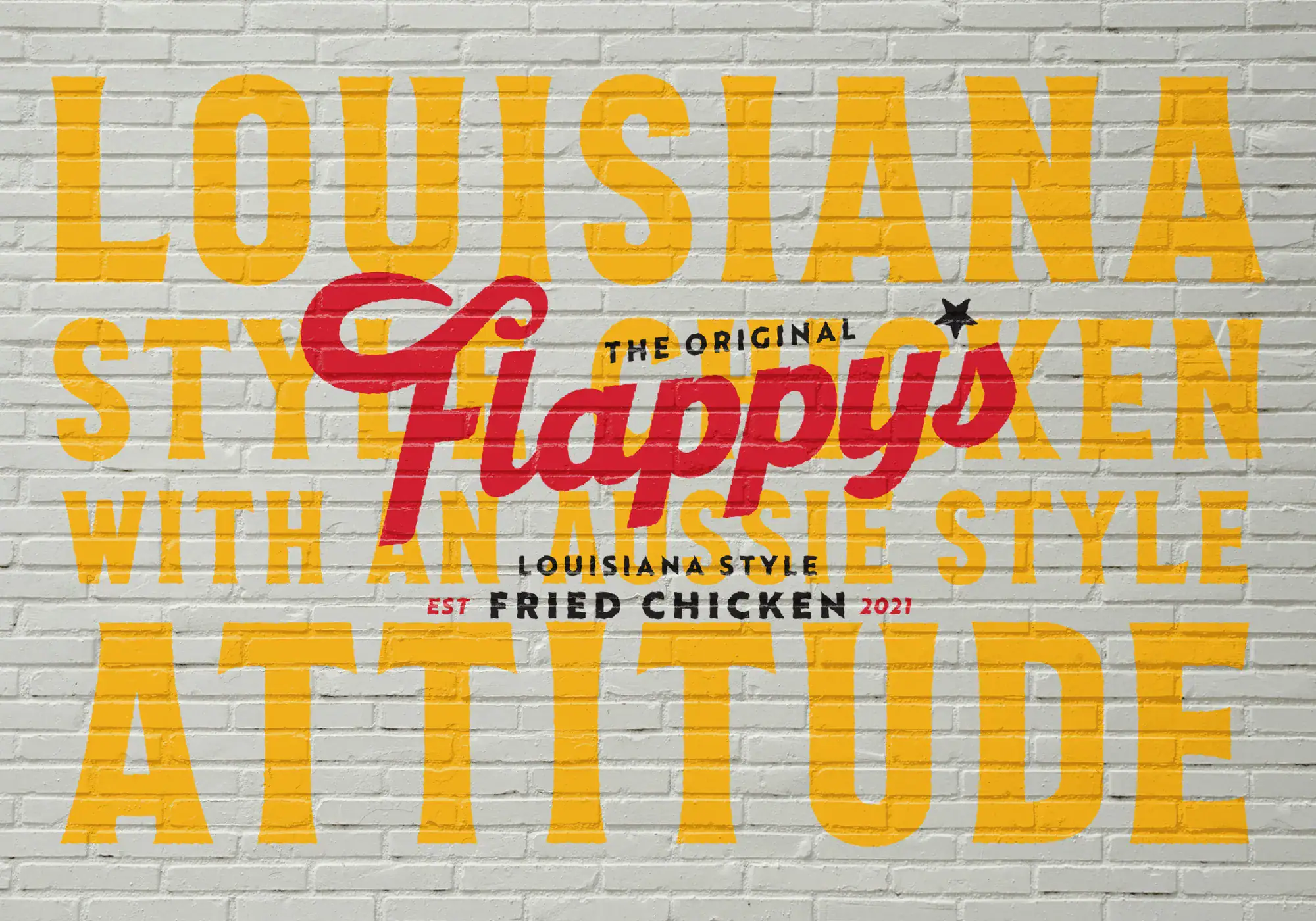
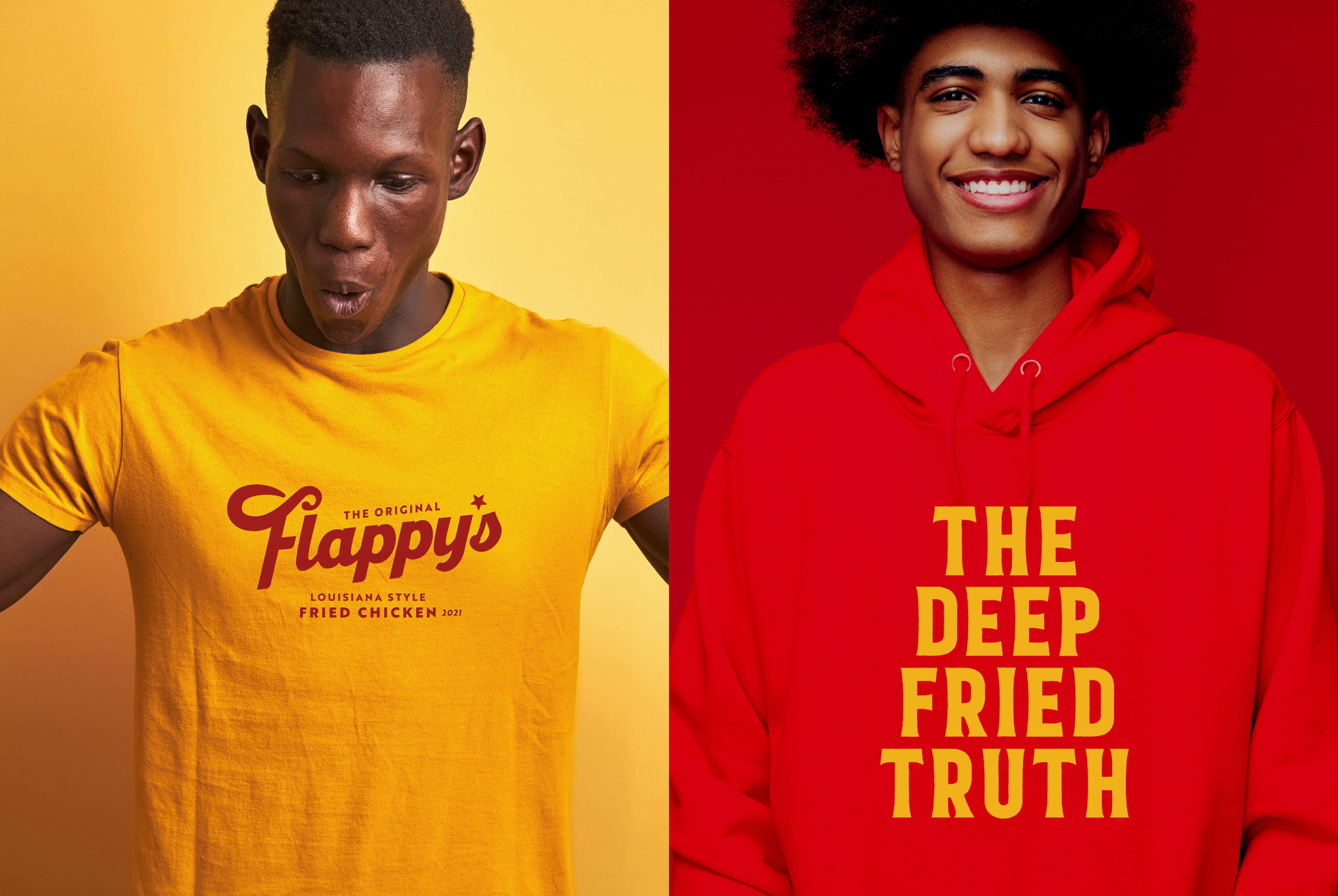
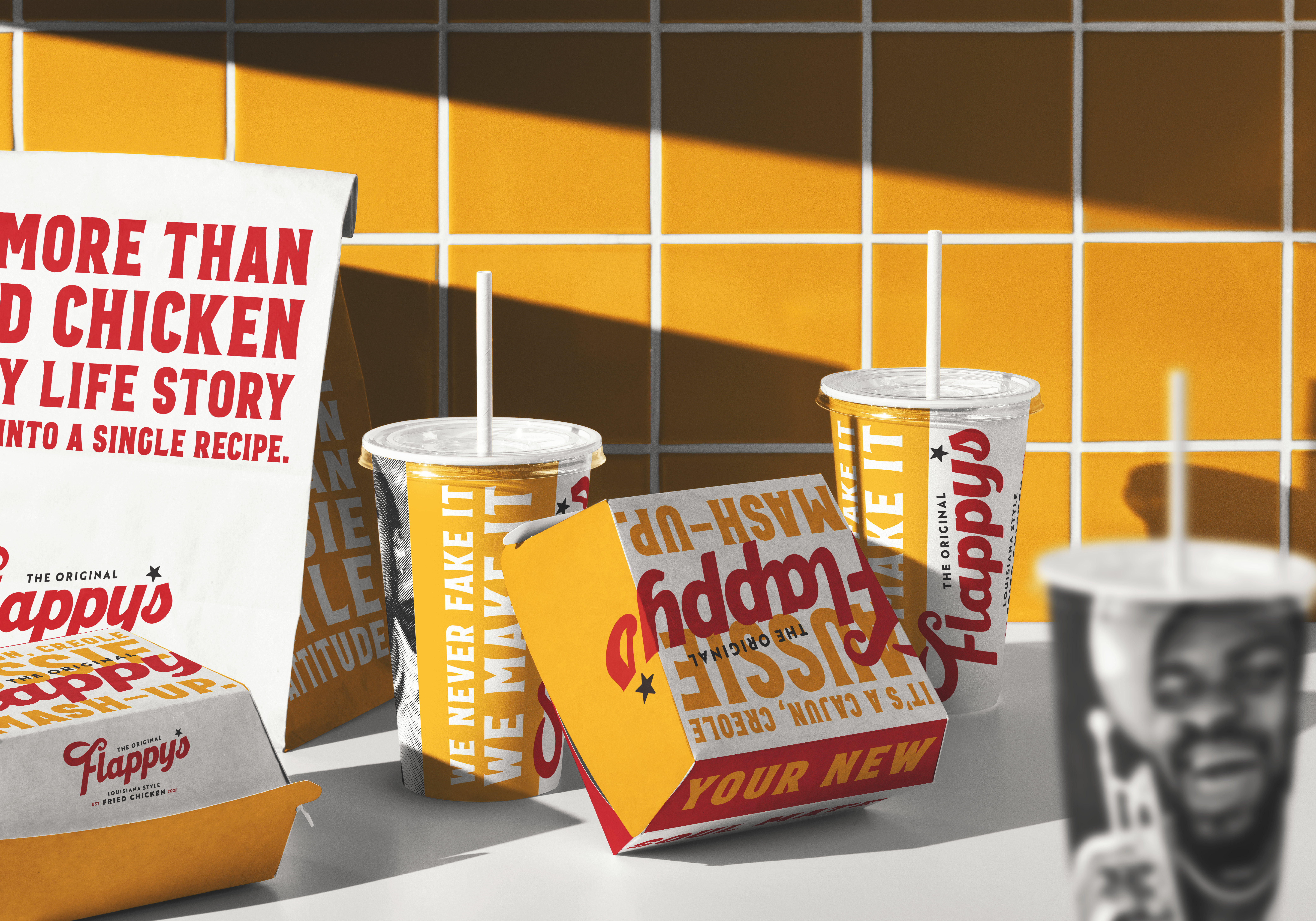
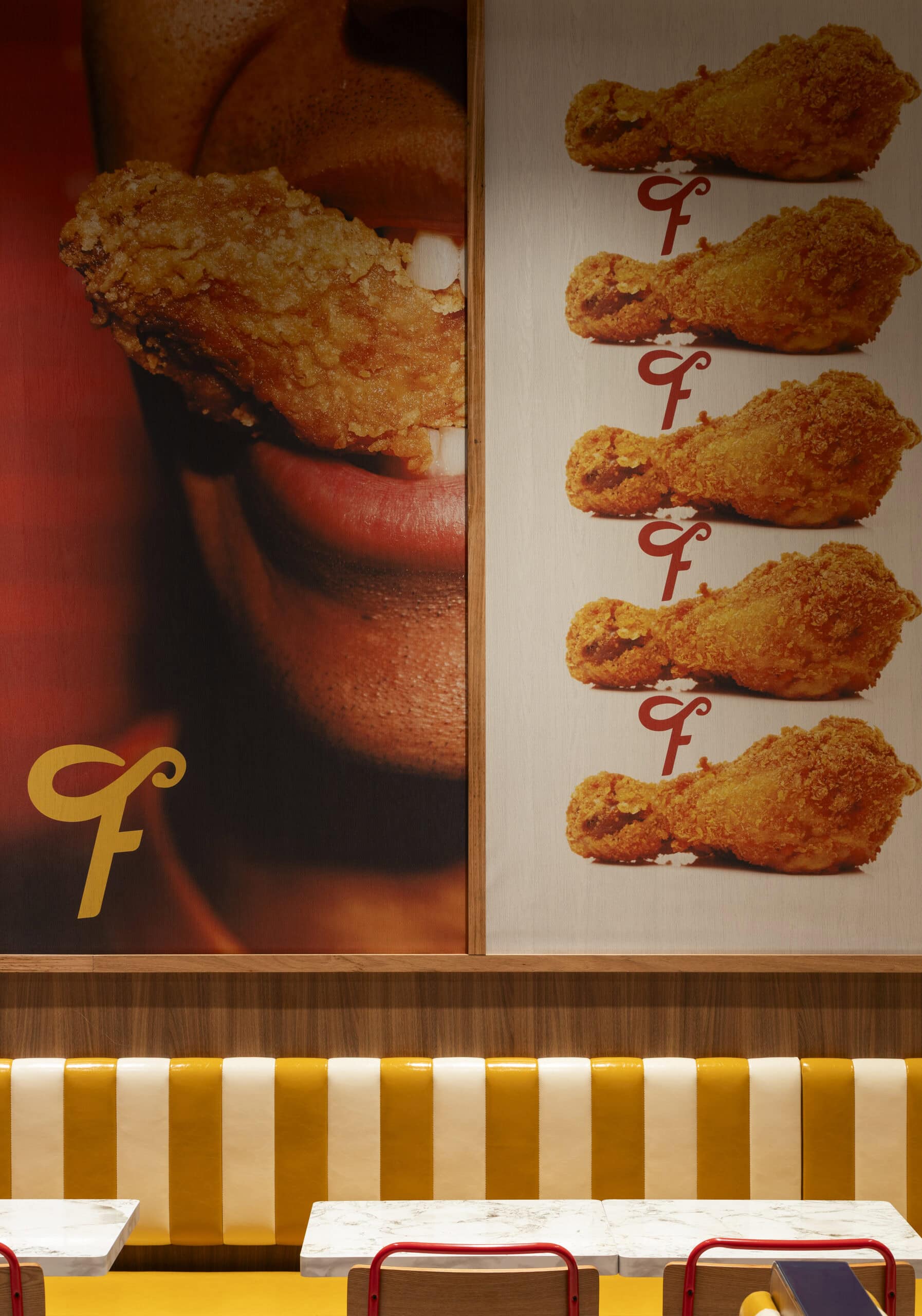
A custom wordmark featuring the distinctive drumstick ‘F’ creates an instantly recognisable logo, while bold typography, layered graphics and a confident colour palette create memorable brand assets across packaging, menu design, signage, environmental graphics, uniforms and digital marketing.
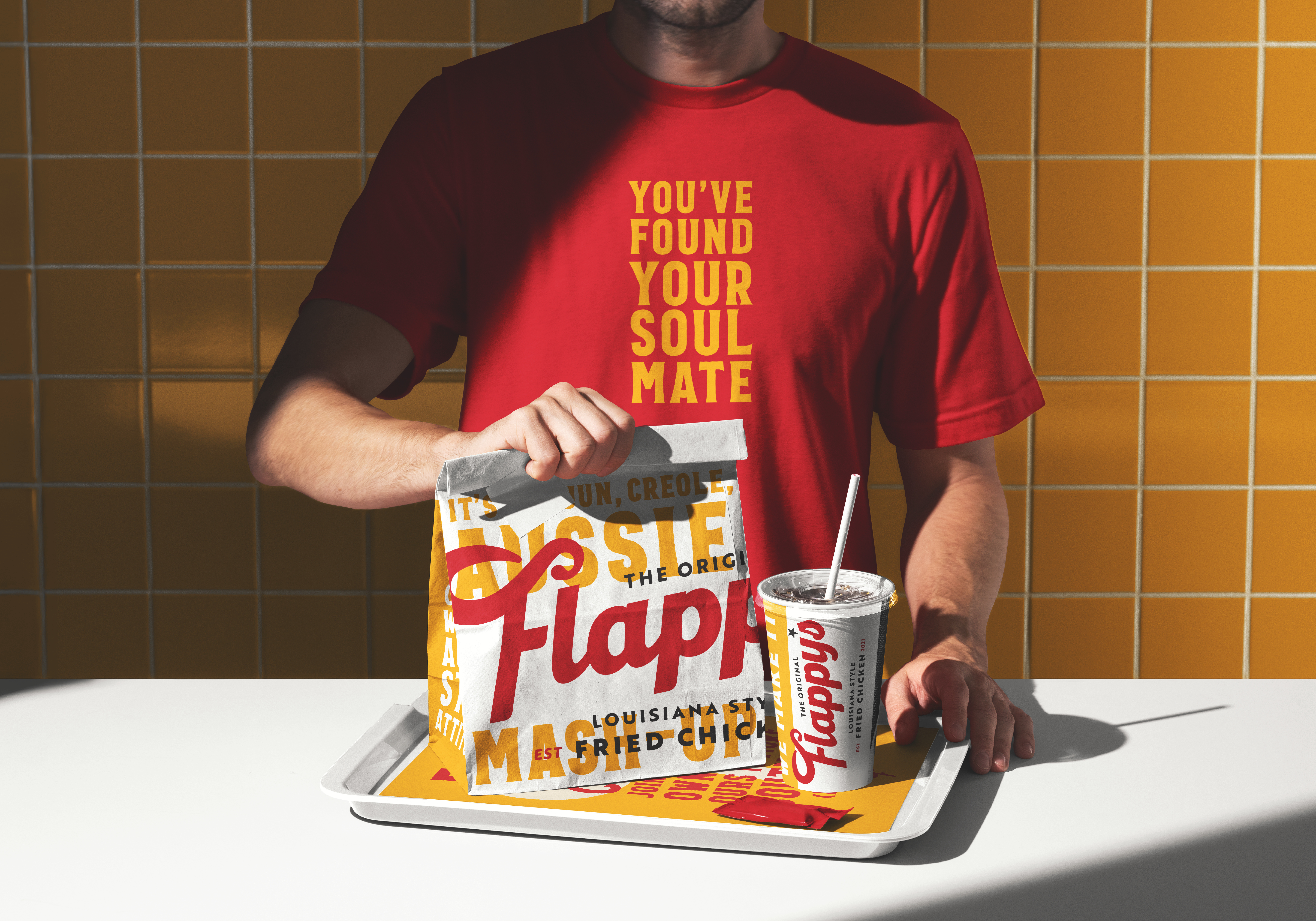
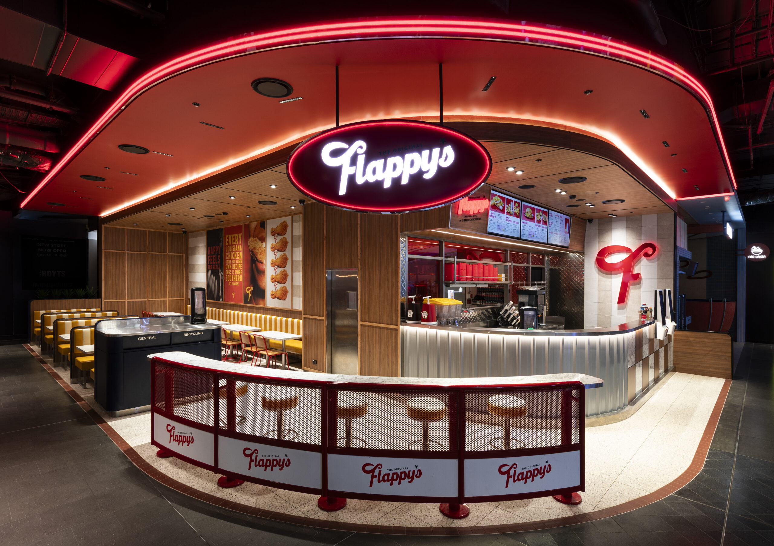
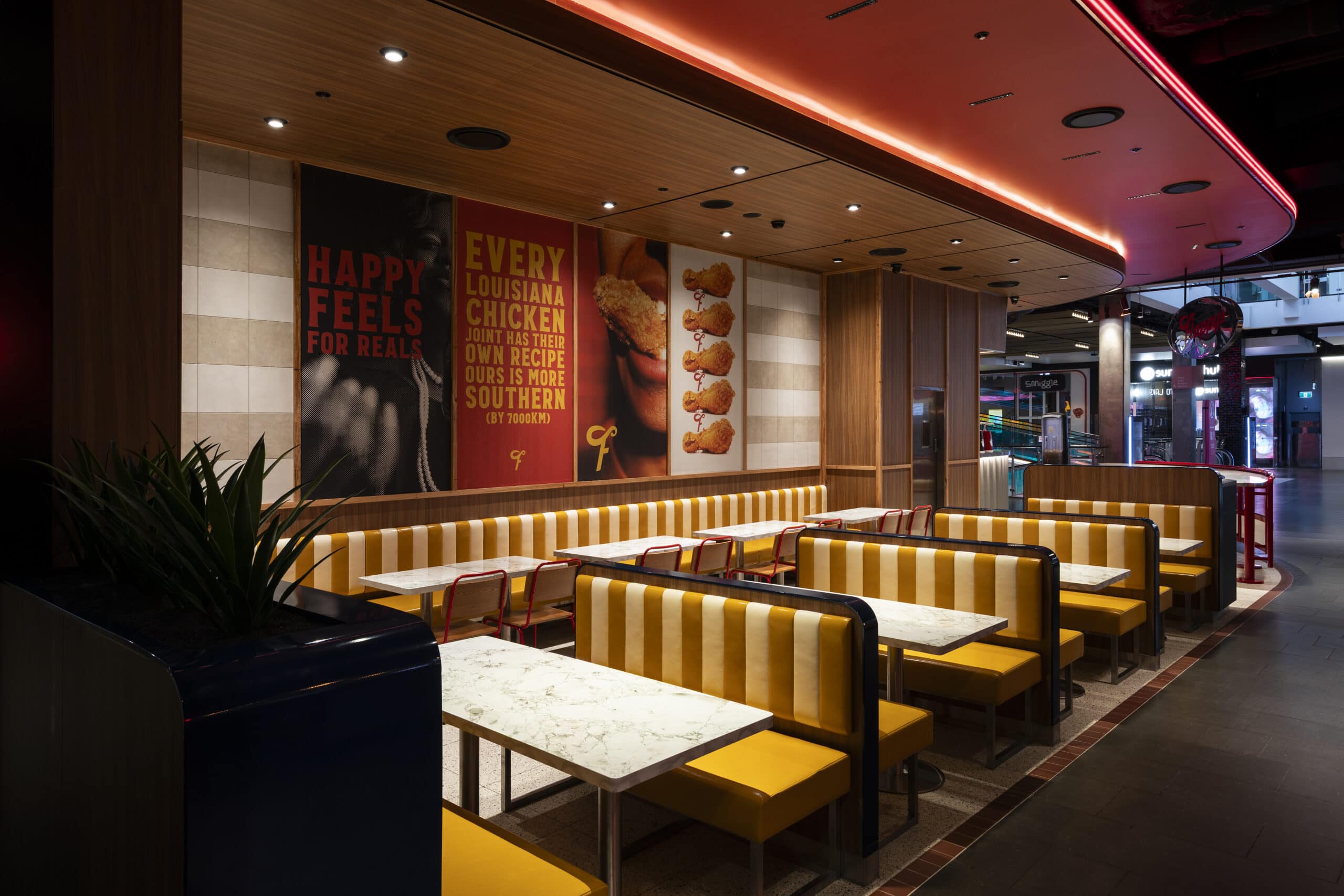
The identity was designed as a complete system rather than a collection of individual design elements. From packaging and menu design to interior graphics, photography direction, social media posts and brand guidelines, every touchpoint reinforces the same personality and creates a consistent customer experience.
Whether someone discovers Flappy’s through the website, orders online or walks into a restaurant for the first time, the brand tells the same story. Consistent branding across every interaction helps customers recognise the business more quickly, strengthens brand loyalty and creates a memorable experience that keeps customers coming back.
The result is a restaurant brand that feels handcrafted without becoming nostalgic, playful without feeling gimmicky, and authentic without relying on familiar category clichés.
The Result
Flappy’s now has a stronger and more distinctive restaurant brand that better reflects the quality of its food and the passion behind the business.
From takeaway packaging and menu design to signage, interiors, uniforms and digital touchpoints, every interaction reinforces the same story and creates a stronger emotional connection with customers. The refreshed brand identity provides a scalable platform for future growth while ensuring the business remains recognisable, consistent and unmistakably Flappy’s wherever it appears.
More importantly, Flappy’s now has the foundations of a successful restaurant brand. One built around a genuine story, a clear personality and a cohesive identity that works just as hard as the food itself.
Flappy’s Fried Chicken Brand Refresh
Building a Distinctive Restaurant Brand Inspired by Louisiana Soul
Client
Flappy’s Fried Chicken
Industry
Quick Service Restaurant (QSR)
Expertise
Brand Story & Messaging
Brand Identity Refresh
Logo Design
Packaging Design
Menu Design
Environmental Graphics
Signage
Uniform Design
Photography Direction
Social Media Guidelines
Brand Guidelines